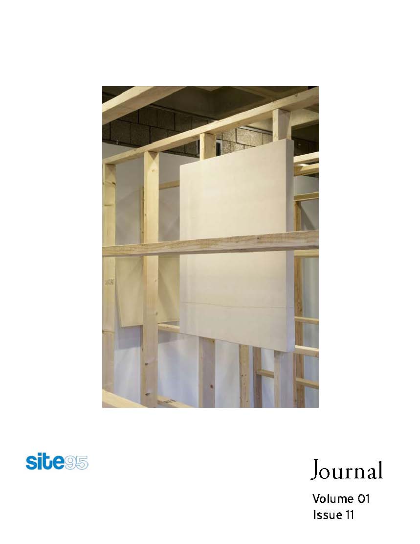
01 11
Vol. 01 Issue No. 11
 Read the Journal: site95_Journal 01_11e
Contributors: Lisa Williamson, Trombly Rodriguez, Nicole Lenzi, Jennifer Williams, Bradford Robotham, Jill Daves, Colette Robbins, Erickson Lassiter, Stacy Gibboni, Leah Beeferman, Matthew Harvey, and Emmy Thelander
From the Editor: The core of the site95 mission is to directly engage with a space (physical or virtual) in order to foster artists to push their own boundaries in creating new work. Within these variable perameters new ideas and concepts are widely developed and brought to fruition. This issue in particular is dedicated to site specificity as it juxtaposes work that, regardless if it is spontaneous or pre-planned, considers the space while creating the installation and objects inside.
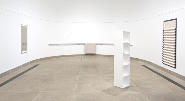
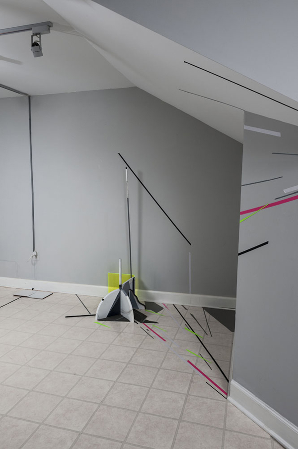
“The Fabric of a Space” was designed by Trombly Rodriguez specifically for the lobby gallery of the Abrons Arts Space in the Lower East Side. As the installation curved congruently with the room, the gridded structure signals us to question not only how objects are made but the spaces themselves that they are presented in.
Lisa Williamson’s interview gives insight on her strategies in preparing for a space while working alone or collaborating with others. The three artist projects created for this Journal by Trombly Rodriguez, Nicole Lenzi, and Jennifer Williams create a unique link to Emmy Thelander’s interview with Parallelogram designers Leah Beeferman and Matthew Harvey as artists consider creating intangible work for a cybercommunity.
My great thanks to everyone involved in this issue and the “Fabric of a Space” exhibition including Alberto Ibarguen, The Knight Foundation, Frances Trombly, Leyden Rodriguez-Casanova, Jonathan Durham, Carolyn Sickles, Lisa Williamson, Nicole Lenzi, Jennifer Williams, Emmy Thelander, Bradford Robotham, Jill Daves, Colette Robbins, Erickson Lassiter, Stacy Gibboni, Jennifer Neff, and Cary Whittier.
More to come, Meaghan
Carving out a language: Interview with Lisa Williamson by Meaghan Kent 11.9.2012
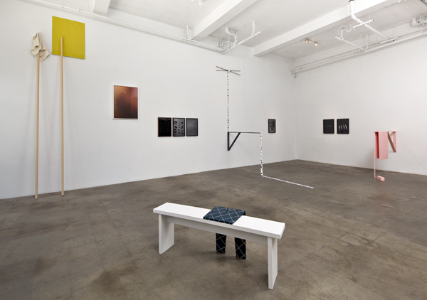
Exhibition view, “Made in L.A.,” The Hammer Museum, Los Angeles, June 2 – September 2, 2012, photo credit: Brian Forrest, all images are courtesy of the artist and Shane Campbell Gallery, Chicago
LA-based artist Lisa Williamson creates idiosyncratic objects that are often linked to abstract narratives and texts, blending a Minimalist aesthetic with Surrealistic effects. The physical site of her exhibitions is integral in her preparations as elements of the space inspire specific pieces. Her recent exhibition at the Hammer Museum read as a tableau: a ballet bar, hand painted acrylic forms, a horizontally folded bed shade, an elongated flute, and a white bookshelf with bold imprints are placed throughout the curved space as an impression of a staged performance. The enigmatic lure of her work prompted this interview in order to learn more about her practice, process, and collaborations with other artists.
Meaghan Kent: I’m interested in learning more about your process. How does the work develop from idea, to object, to exhibition?
Lisa Williamson: I’m trying to make work that follows an internal logic as honestly as possible, letting objects and images take form at a pace that makes sense to me. Things develop in the studio in different ways. I’ve made bodies of work that revolve around a specific idea or set of ideas, in which each work is in conversation with another. This has been a valuable way for me to better organize my thoughts, to rein it in a bit. In general, I think my brain and by default the works themselves, are tangential and sort of full of content. I’m becoming less interested in defining a subject and increasingly interested in making work that follows a line of thought in the most literal way. As a result the work is becoming more distilled, self-confident, or resistant, individual objects basically acting as individuals. I’m making an effort to think through material and let things just develop from the head.
MK: How does it typically change from exhibition to exhibition?
LW: I like the idea of objects landing in a space, arriving and finding their essential place as if they were always meant to be there. The shape of a room, or the trim that goes around a ceiling, helps me to begin to imagine how artworks might move in. A couple of years ago I started making models for imagined exhibitions, miniature artworks housed in miniature spaces. This was generative because there was no real commitment, it was totally internal and for no specific purpose. I’ve continued to make models for actual exhibitions and artworks, which has been a helpful way for me to wrap my brain around a space and figure out what I want the work to be. Making work for an exhibition is challenging because it is an inherently external thing to do. It can change the work into something better or at times worse depending on how you look at it. But at its best, each exhibition can clarify and push the work forward in necessary and interesting ways. I think all of this takes time to figure out.
MK: There have been some interesting and widely varied references to your work including: Conceptualism, New Image Painting, Richard Tuttle and Frank Stella. Who do you cite as direct influences?
LW: Different art histories have made their way into my work at different times. Looking at the past while making art in the present made sense to me, almost like an inherent sub-subject. I see this changing more recently. By addressing influence I can now sort of move on. Many of the references that have been singled out have been surprising because I don’t necessarily relate to movements like Minimalism or Conceptualism any more than I would Abstract Expressionism or Impressionism, etc. Can you say that you are just influenced by art? Because really there are so many artworks, artists, and strange moments in history that completely blow my mind. And I hugely admire artists such as Rosemarie Trockel, Trisha Donnelly, Yayoi Kusama, Anni Albers, Lawrence Weiner, Oyvind Fahlstrom, Jasper Johns, Joe Goode. Mason Williams, whose poems I love, once wrote about Joe Goode’s milk paintings as being “the loneliest paintings ever painted.” I think about Goode’s early paintings and this description all the time. There is something about this work that is so completely resilient and unique and Williams’ description for whatever reason has had a lasting affect on me.
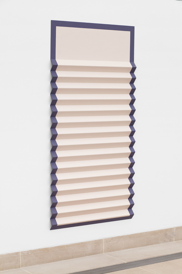
Lisa Williamson, Bed Shade with Margins, 2012, acrylic on powder-coated aluminum, 72 x 36 x 2in
MK: There is a sense of theatricality in your work, is your work intended to create a specific narrative or serve as types of props?
LW: I’ve described my work as a rolling series of markers, pauses and prompts, and while narrative runs throughout my work, it is knowingly implicit rather than explicit. I’m interested in the expressive potential of an object and try to make choices that feel intrinsic to each work. For me it is important that the objects feel of this world, related not just to the figure but to more specifically have tangible, human qualities. Even the most reduced forms have personality embedded within them. Ideally you reach far back into your head to create something distinct. You begin to form relationships between disparate objects and by default narratives begin to emerge.
MK: In the past, you have also described your work as a way of carving out a language. How does your writing come into play with your work? Does the narrative make the work more elusive or descriptive?
LW: In many ways writing is much easier for me than making art. As a result I think I’ve naturally latched on to the way I might piece together a text and transferred this over to my thinking in the studio. The whole point of becoming an artist is to carve out a language from the bottom up, to build from the inside out and to articulate in new ways. The texts I’ve written take on different forms at different times. I may borrow from the structure of a script, an interview, a press release, a book, or a poem. I don’t tend to write texts that describe or explain my work but rather run alongside a series of works. And I definitely don’t want a text or an object to lean too hard on one or the other. Instead I think these forms are one in the same, equivalents that can bounce or spin off each other, relate, but still function individually.
MK: There is also a certain element of humor inherent in your installations and exhibitions, how do you think it provokes or challenges ideas in art?
LW: Humor does find its way into my work though I wouldn’t say that this is always necessarily intentional. The objects I make act as stand-ins for myself or for another person, they may feel like a figure even if there are very few figurative qualities. I look at artworks as thinking-objects, forms hanging in a space, cohabitating with architecture, personalities pressed into a chosen material. Sometimes I think humor finds its way into my work because of certain lacks on my part. I’m terrible at drawing but I love drawing so I make a sculpture that feels like a line drawing even though it isn’t. I’m not a painter but I love what a painting is so I try to figure this out by making works that act like paintings. Sometimes this manipulation of materials makes it hard to know what exactly you are looking at which is interesting to me. These lacks and contradictions, imperfections and irregularities make their way into the work and this sometimes ends up being kind of funny or animated, even if I’m thinking or working in a serious way. There is a lot of imagination in the work so maybe in the end that is what comes through the most.
Exhibition view, Lisa Williamson and Sarah Conaway, “Weird Walks Into a Room (Comma),” The Box, Los Angeles, June 4 – July 9, 2011, photo credit: Fredrik Nilsen
MK: You have done a few collaborations with Sarah Conaway, most recently at The Box, Los Angeles, in 2011. How did you prepare for that particular exhibition?
LW: That exhibition was really important for me for a few different reasons. Sarah and I have been friends for maybe 10 years or so and have spent a lot of time talking about art, what it is, and what’s the point of it all. These conversations had been previously co-opted into an artist book and also into a performance. The exhibition at The Box was another iteration of this ongoing discussion. While the work that we showed was distinctly by Sarah or by myself, (with the exception of one collaborative sculpture in the basement) every part of the show was sorted through and figured out together. We spent time trying to retain a certain resonance or internal spirit in each work and pushed each other to not over-finish something, to not edit too much, to let things move from the head, to the studio, to the gallery in a way that we felt good about. We let the work remain open and tried hard to not suck the life out of it. It was a really satisfying and meaningful project for me. We also made a book together as part of the exhibition that included a poem by Sarah, which I love, and these interior drawings with captions that feel a little bit like bad New Yorker illustrations.
MK: Are you anticipating any further possible collaborations with Conaway or other artists?
LW: Well actually I just moved into a new studio with Sarah and another great artist, LeRoy Stevens. The space is in Sun Valley, which is outside of LA proper, and it is beautiful and autonomous and inspiring. Sharing studios with them is exciting and I could see future collaborations with both. In addition to his own work, LeRoy has an art publishing company called Small World and we’ve been talking about putting out a comedy album or doing some sort of book project. And I’d like to do more writing projects with Sarah in the future. I’ve also begun in the last year to work with my friend Eric Blumberg, who is a very talented fabricator and I’ve been learning a ton by working with him. That collaboration is relatively new for me and has opened up a lot of possibilities in my work.
MK: Your exhibition “Made in L.A.” at the Hammer Museum this past summer feels more minimal in nature, is this something that you are shifting more towards? Or was this specific to the Vault Gallery space at the museum?
LW: The group of works that I made for the Vault Gallery was definitely created with the space in mind, and as a result the installation was quiet, contemplative and still. I wanted the room to feel like an intermission of objects, where everything slowed way down, as far as possible. The shape, acoustics and overall architecture of the Vault are incredible and it was great to be able to make work specifically for this room. In general I would say that my work has been changing and it sometimes feels more distilled or reductive but I wouldn’t say this is an endpoint or even a goal. There is a kind of stillness, a hover, or a meditative sensibility in some of the more recent works and I’m interested to see where all of this goes.
MK: What was the most challenging aspect of working in the Vault Gallery at the Hammer, did the work change while you were installing or was it pretty close to your original vision?
LW: I think that when I first started to work out what I might possibly like to do for the Vault Gallery I almost had beer-goggles on. It was this coveted space in my mind that I loved, and I could picture all these different possibilities. I was so into it that I hadn’t really noticed some of the room’s inherent eccentricities, like the low seam that bisects the wall from the ceiling or the high kick along the edge of the floor. I continued to visit the gallery, re-measured often, re-worked the model and the artwork maquettes over and over and basically it started to work itself out. The strangeness of the gallery found its way into my work and in the end I was really happy with how it all came together.
MK: What are you working on now?
LW: I just finished an installation, “Bromeliad Colors Prefer Soft Light,” for The Finley Gallery, an apartment/stairwell gallery in Los Feliz run by Sarah Lehrer-Graiwer and Jeff Hassay. They are excellent and the gallery is really interesting. I made a series of drawings that look like hair or plants (depending on how you look at it) and had them printed on transparency. They hang in a stairwell and have large blocks of color partially obscuring each image. There is a viewing platform outside of the apartment complex so you look through the windows, which I decided to frost in certain areas. The installation came out feeling like Kabuki Theater. I’m also continuing to work on a series of hovering wall sculptures based off of simple line drawings. The scale is really important to these works so I make cardboard models at scale that then get measured and photographed. The works eventually are re-made in steel and finally hand-painted by myself to feel as materially ambiguous as possible. Other than that I’m just working on the new studio and starting over again, which I think is a good place to be.
Born in 1977, Lisa Williamson lives and works in Los Angeles. Williamson’s work was recently featured in “Made in L.A. 2012” at The Hammer Museum, Los Angeles and solo exhibitions of her work were shown at Shane Campbell Gallery, Chicago in 2011 and Frieze New York in 2012. She has a current exhibition at The Finley, Los Angeles through January 3, 2013. Her work has been presented at galleries and museums throughout the United States and Europe including: the Orange County Museum of Art, Newport Beach, CCA Andrtax Kunsthalle, Mallorca, The Box, Los Angeles, David Kordansky Gallery, Los Angeles, Wallspace, New York; Nicelle Beauchene Gallery, New York, Renwick Gallery, New York, Romer Young Gallery, San Francisco, Hilary Crisp, London, Layr Wuestenhagen, Vienna, Brand New Gallery, Milan and Unosunove Arte Contemporanea, Rome. Williamson received her MFA from The University of Southern California in 2008. The artist is represented by Shane Campbell Gallery, Chicago.
lisawilliamsonart.blogspot.com
Artist Project: Nicole Lenzi
My main interest as an artist is to push the boundaries of how to see and experience drawing. To this end, I question how drawing and space can each affect and redefine the other. Avis Newman’s idea, “a mark is a sign of thought,” informs my practice. I explore an expanded notion of drawing, one in which the medium opens up into a reciprocal dialogue with its surroundings. My multi-dimensional works are based on the tenets of Taoism. The Taoist fluctuation between opposites acts as a propeller for my drawings, expanding it into a gallery space. The contrasting male and female elements interplayed in my works are metaphors for the philosophy’s many facets. By following the principles of this Eastern philosophy as I work, a drawing effloresces and a flow of things emerges amongst art and architecture. I seek balance in the spaces in between for greater reflection.
Avis Newman writes that drawing is “as close to the action of an artist’s thought as one can get.” The mark is the first attempt of translating an idea. In my works, the materials and methods used to make marks are questioned. They are made with string, tape, tiles, moldings, shelving units, shadows, and anything else that relates to a given environment. I paint shadows and mark on materials to transcend them past what they literally are. Drawing with materials opens the door to new ways of perceiving space and experiencing mark making.
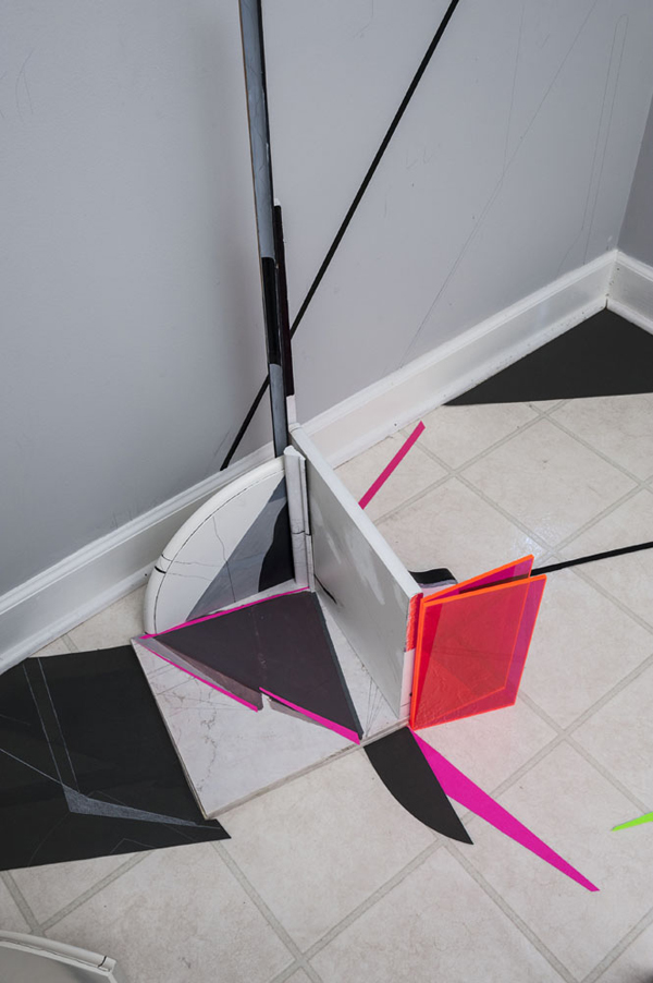
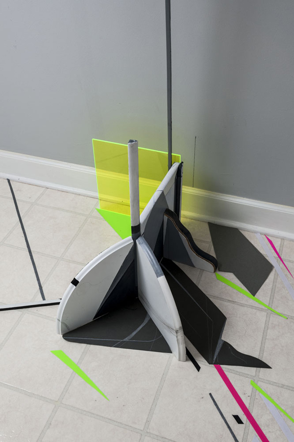
Nicole Lenzi, Conglomerate Hot Pink No. 2, 2012, shelving units, moldings, tiles, acrylic, pencil, paper, plexiglass, 37 x 50 x 45in
My work is influenced by Lao Tzu’s Taoist script the “Tao Te Ching” and Luce Irigaray’s contemporary feminist work, “Elemental Passions.” Both works poetically contemplate how opposites can be balanced in terms of gender relations. This is gradually achieved by overcoming the closed masculine and yielding to the softer, open feminine side of the Tao. Hard and soft marks, tones, shapes, and edges signify male and female in my work. They interact in varying states of tension and flow. This push and pull action perpetuates a drawing outward into an environment. Moments of stillness and balance occur when conflicting art elements align and harmonize.
Small scale combinations of materials, called Conglomerates, set the stage for dialogues between male and female. They are built at intersection points in a room. Opposites interplay in these structures. High and low end materials come together; laminate, glass, plastic, moldings, shelving units, and, tiles, and marble. Diverse edges, shapes, and tones are juxtaposed and rest on the floor, leveling any hierarchy. Shadows are recorded onto materials and floor in many shades of gray.
Nicole Lenzi, Conglomerate Neon No. 2, 2012, shelving units, moldings, tiles, acrylic, pencil, paper, plexiglass, 47 x 60 x 55in
The feminine overcomes the masculine in Conglomerates to expand a drawing into its surroundings. Moldings are placed in between materials to act as flexible joints; metaphorically easing tension between male and female. Marks are drawn over and under surfaces, shapes, and shades to forge connections and dialogues. Rounded feminine curves invite unrestricted movement to marks while upright masculine edges cause abrupt stops. Refraction is employed to break lines past these barriers. This action extends them outward into the gallery.
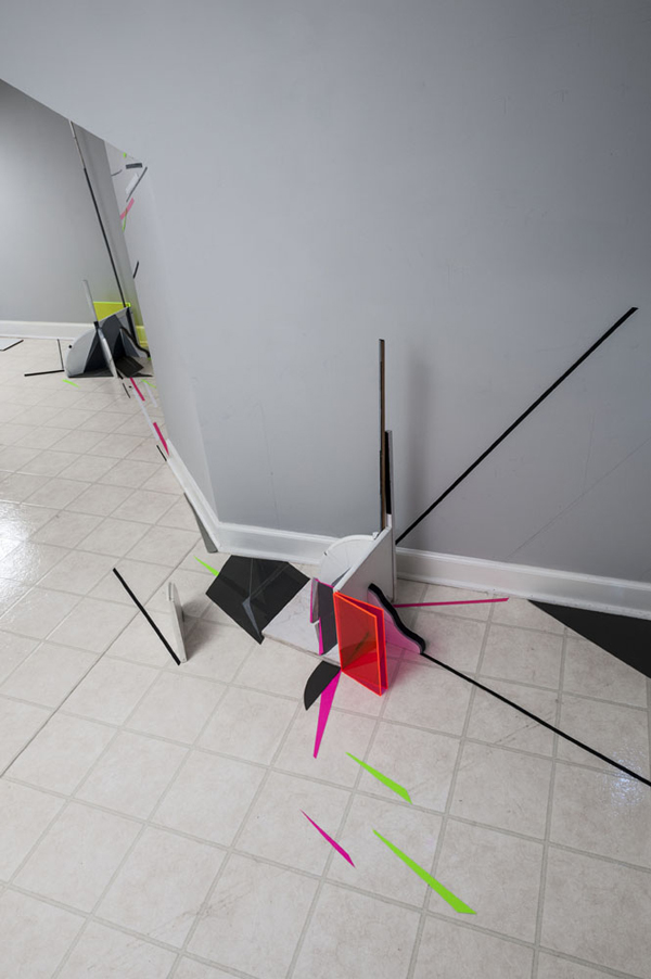
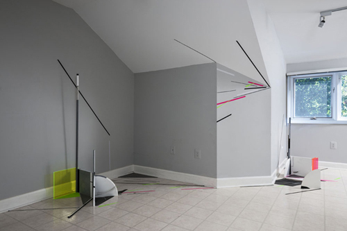
Nicole Lenzi, Green to Red, 2012, shelving units, moldings, tiles, acrylic, pencil, paper, plexiglass, 87 x 100 x 95in
My installations, or spatial drawings, follow along the same lines; as contrasting edges, lines, shapes, and tones are interrelated in a room. A flow of things emerges when these divergent elements line up. Echoes and harmonies stir between opposites throughout a space. The boundaries between what is art and architecture blur. Each installation focuses on a particular aspect of Taoism. By using Eastern philosophy as the conceptual base of my work, drawing in space is very improvised and experimental. The unexpected is welcome and lead a drawing into new territories. A new space offers distinct and unexpected layouts, angles, lighting conditions, and materials to respond to that push the boundaries of how to see and experience the medium.
Nicole Lenzi, Green to Red, 2012, shelving units, moldings, tiles, acrylic, pencil, paper, plexiglass, 87 x 100 x 95in
Nicole Lenzi, Green to Red, 2012, shelving units, moldings, tiles, acrylic, pencil, paper, plexiglass, 87 x 100 x 95in
Like the fluctuating Tao, relationships in my works shift over time in the spaces in between. These changes open up new dialogues, so that drawing and space continue to extend and redevelop the other.
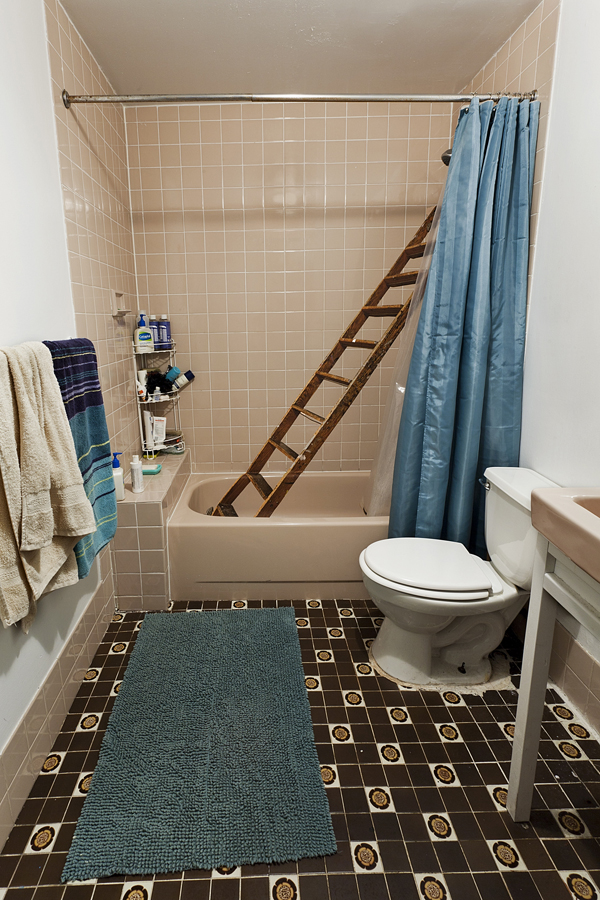
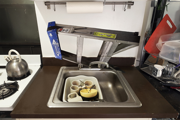
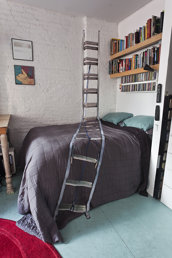
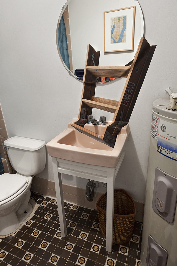
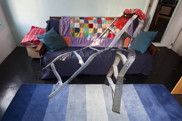
Artist Project: Jennifer Williams Episodic Drift #4
Ladders allow passage into unreachable, unfrequented spaces. Unlike stairs, which offer permanent, safe pathways, ladders are designed to be portable, temporary, and movable. Their verticality causes a momentary physical and mental shift out of the horizontal planes we occupy. Using a ladder proficiently is a skill; one must trust it to provide a solid base while simultaneously trusting oneself to find a balance for the task at hand.
My series titled “Episodic Drift” explores the concept of the ladder as thought pattern, life path, and problem solver. As we age our world becomes infinitely more complex, and the certainties of youth begin to unravel. A chain of beliefs is often thrown into question while existential chaos sets in. The journey from point A to B is rarely a straight line, moving forward isn’t always the solution, etc. “Episodic Drift” traces the path between memory and reality, placing a form on time, leading towards a new awareness and clarity.
“Episodic Drift #4” is a site-specific photographic project created for site95 Journal. It occupies spaces inside my home where linear thoughts are free to wander, causing the unconscious to create connections that lead to epiphanies, theories, and solutions.
10.29.12 Stacy Gibboni
10.22.12 Erickson Lassiter
10.15.12 Colette Robbins
10.8.12 Jill Daves
10.1.12 Bradford Robotham
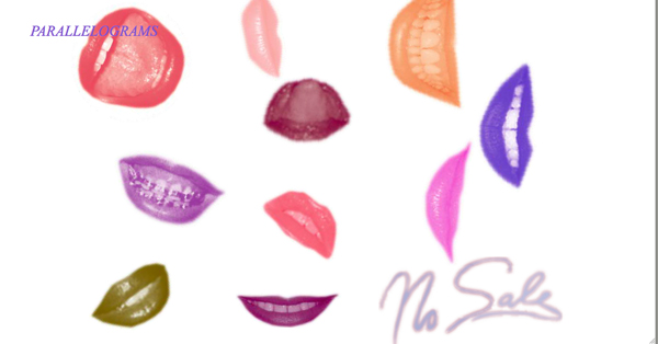
11.10.12 Interview with Leah Beeferman and Matthew Harvey about Parallelograms by Emmy Thelander
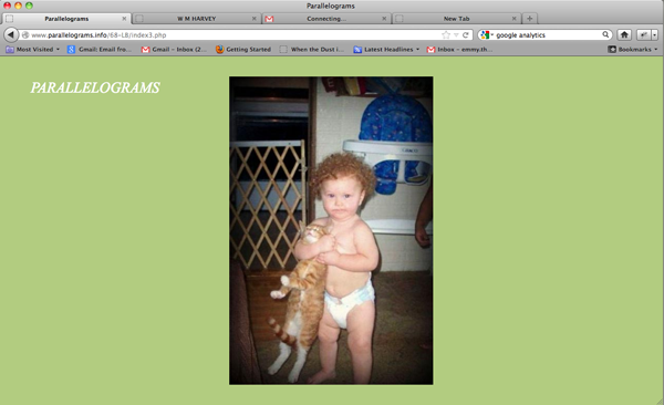
Screenshot of Linus Bill’s project for Parallelograms, 10.31.12
Walter Benjamin’s essay, “The Work of Art in the Age of Its Technological Reproducibility” initiated a conversation about the reproduced image’s loss of specific time and place. David Joselit reexamines Benjamin’s text in his latest book, After Art, in light of the dispersion of images produced by the internet. In the first chapter, “Image Explosion,” Joselit equates Benjamin’s concept of aura with site-specificity; writing in regards to the incredible dissemination of images today, he states, “Images are no longer and probably can never again be site specific…” (I)
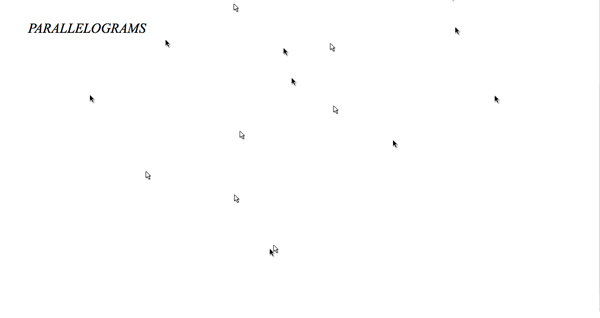
Leah Beeferman and Matthew Harvey’s project, Parallelograms, asks artists to use the browser window as the context for a work of art. Although, like the reproducible image, the browser is “everywhere at once” (II) and its parameters are variable, these qualities paradoxically become the criteria for site-specificity on the web.
Matthew and Leah provide the artist with a jpeg they have culled from Google searches and the artist formulates a response coded in HTML. Some of the responses are interactive (a series of loosely related jpegs the viewer can click through or a text adventure game) while some are single pages with moving images or sound. A defining trait of the artists’ responses is that most activate the full space of the browser (unlike a typical website with margins), highlighting that the viewer’s window is the intended locale of the work.
Following is an e-mail exchange I engaged in with Leah and Matthew about Parallelograms. Matthew was traveling in Berlin for work, but Leah was able to act as the middle point to coordinate our trans-Atlantic communication.
Emmy Thelander: How did you two form the idea behind Parallelograms?
Leah Beeferman and Matthew Harvey: In part, it was an offshoot of another project we used to do, called Tessellations, in which we would alternate posting found images to create some kind of narrative. That project ran for several years, and we hoped to find a way to get other artists involved but we never figured it out. Parallelograms came up, initially, as an idea in response to this desire.
Ultimately, though, Parallelograms is a way to approach other ideas we had both been thinking about, otherwise: meanings of and potential for found images, and an interest in broad “artistic process” and how different types of artists, designers, etc. respond to material and generate ideas. We’re interested in how an artist’s practice is impacted by the massive number of images he/she encounters on the internet, both actively and casually. With Parallelograms, we wanted to provide a wide range of creative individuals with a place to engage in generative internet processes; but rather than simply reposting found images (as with other blogs or tumblrs), they would create new work from the mass of “stuff” found on the internet.
Of course, Parallelograms is about making art for the web rather than just putting work on the web, and trying to initiate some new kind of activity that would encourage artists to think about the web as an opportunity for “site-specific” work rather than merely a place to put a portfolio and publicize oneself.
Finally, we are both very excited by and involved with printed matter, in its various forms. We’re both artists who use and think about books and publications regularly, and Matt works as production manager for a photography publisher in Manhattan, so deals with books and printing on a daily basis (that’s why he’s in Europe right now, actually, printing). Parallelograms is in large part inspired by printed publications and distribution, and that helped inspire our initial schedule of publishing one project every week (unfortunately, we’re not able to keep up that pace anymore), compiling a mailing list, etc.
ET: What were your expectations for the project and how have the results differed?
LB and MH: We’re not sure either of us expected it to last this long! It’s become the project that never ends, as we constantly discover new artists and designers who we want to invite. But, we’re also not sure we knew what to expect. It was a spur of the moment idea when we were out to dinner one night a few years ago, after which Leah said, “I know who to invite first.” And we just ran with it, since those friends (excellent designers Everything Studio) pulled through with an amazing first project. When Parallelograms began, we imagined or, really, hoped that it would be something like it is. Realistically, it’s surpassed anything we could have initially expected.
Screenshot of Manuel Fernández’s project for Parallelograms, 10.05.12
ET: Do you find that the space of the web browser challenges the artists to make pieces they would not otherwise think about making?
LB and MH: For a lot of people, yes, and for others, no. We’ve tried to invite a really broad range of creative people: painters, sound artists, graphic designers, video artists, net artists, writers…. knowing that everyone would have a different process and type of response. We have purposely invited many people who seem to have no relationship to technology or to the web specifically, to try and get them to think about this space of the web browser as a potential and active space, rather than, again, a depository. It’s been fascinating talking with different people as they approached their projects, seeing different processes, implementing ideas…
ET: Do the artists program the pages themselves? Do they ever ask for your assistance?
LB and MH: It varies quite a bit. We’ve had several people just hand over a .zip file with everything set up on web pages and self-contained, and others who said, “Here are my elements, I have no idea how to make this but this is what I want it to do.” Leah, a visual and sound artist herself, earns her keep doing freelance web work, so it’s familiar territory for her to figure things out and build projects. Matt’s learned quite a bit about coding over the years, and together we build (or piece together) anything the artists themselves are unable to do, again, sometimes nothing, sometimes a little, and sometimes a lot. Also, certain projects have developed collaboratively as a back-and-forth between us and an artist who has a loose idea and needs feedback about how to frame it for the web, or is just looking for feedback in general. It’s always fun when we get to be involved as the ideas grow.
ET: Are there any internet artists/projects you particularly admire? Do you actively seek out this kind of work?
LB and MH: Jogging is one of the most interesting repositories for creative internet practices; also, of course, Computers Club and Nasty Nets. We don’t actively seek out internet more than any other kind of work, and actually, it’s been very important for us to make sure that just because Parallelograms is a “web project” that we don’t prioritize “web artists” over anyone else. Sure, there are tons of internet pieces we’ve seen that we love, but we love equal numbers of painters, designers, sound artists.
Screenshot of Kelly Rakowski’s project for Parallelograms, 4.28.11
ET: What do you see as the challenges for web-based art and design projects? Do you think that more artists will embrace the web as a medium in the future or do you find that many are resistant to it?
LB and MH: Some challenges might be issues of digital preservation for the web, cross-browser or cross-technology compatibility, and the traditional art world and, of course, lack of coding/programming knowledge. But many other web-based or internet art sites and artists are attacking these problems to make this future happen more seamlessly. Hopefully more artists will embrace the web as a medium, it has so much of its own potential and its own “material” concerns that could be addressed. Almost everyone we’ve asked who does not have a web or technology background or who does not make work using technology or the internet has jumped at the opportunity to make a project for Parallelograms, especially since we offer to help code. If every artist knew how to build web pages, perhaps web-based projects would happen a lot more casually, and frequently.
Working on browser-based works can require a lot of collaboration, thus bringing a lot of different creative individuals from various backgrounds together. There is so much unexplored potential for the web, both for audiences and artists alike. Coding takes time, but as more of the world becomes browser ‘literate’ in terms of what is possible, more and more interesting projects will arise. Finally, we think there is huge potential for the iPhone and iPad, which is not yet easily accessed. Once pieces for these types of platforms become more commonly traded in the art world, it will probably become a lot more common for artists with no web/screen background to experiment with it (a la David Hockney’s iPad drawings, etc.).
ET: How do you source the images you send to the artists and are there any criteria for their choosing?
LB and MH: All of our images come from frequent Google image searches that we do both separately and together. At this point, we both have enormous collections of found images on our respective computers, which we’ll get together and sort for the artists we’re inviting. Sometimes we search together, with a particular artist in mind, and sometimes not. But the sorting process is crucial: it requires us to be familiar with an artist’s work and ideas so we can give images that are relevant but not obvious, and can provide a challenge yet also be inspiring. The searching takes quite a bit of time, but it’s incredibly fun, and we’ve come across some really amazing images and sites along the way.
I Joselit, David. After Art, Princeton: Princeton University Press, 2012, p. 14.
II Ibid, p. 16.
Matthew Harvey is a photographer and amateur hobbyist. He currently makes books for Aperture as their Production Manager. wmmh.net
Leah Beeferman is a visual and sound artist working with many different, but unified, processes. She frequently builds and designs things for the web, but mostly for others. leahbeeferman.com
They both live in New York City.