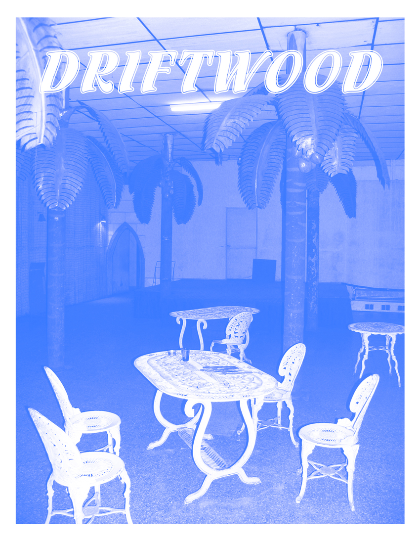
02 02
02 02
Read the Journal: site95_Journal_02_02.e
Editor in Chief MEAGHAN KENT, Contributing Editor JANET KIM, Copy Editor BETH MAYCUMBER, Copy Editor JENNIFER SOOSAAR
Contributors: Loriel Beltran, Tyler Emerson-Dorsch, Domingo Castillo, Aramis Gutierrez, Sam Trioli, Gean Moreno and Ernesto Oroza, Beth Maycumber, and Julie Dickover
Curated by Meaghan Kent
Journal designed by SITE, Logo designed by Fulano
Our second issue dedicated to contemporary practices in Florida
Pushing Against The Walls: Tyler Emerson-Dorsch speaks with Jenny Brillhart and Carolyn Salas about their exhibition Cut-Outs at Dimensions Variable.
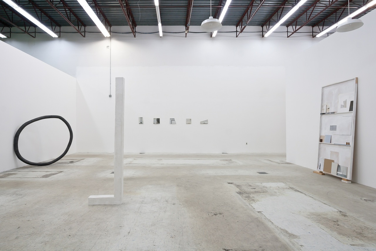
Exhibition view, Cut Outs – Jenny Brillhart and Carolyn Salas, January 26 – March 21, 2013, Courtesy of Emerson Dorsch
Jenny Brillhart’s two paintings bring a bit of her studio into the publicness of the exhibition space. Carolyn Salas’s two sculptures stand isolated from one another, and all the works almost float in a tall, fluorescent-lit white gallery. Despite this, the Dimensions Variable space feels cozy somehow. When I entered, I felt privileged to be inside an inner sanctum of delicate, subtle work. Brillhart’s “Vagabond” is made of five architectural detail paintings on drywall fragments, evenly spaced and propped on nails tacked onto a horizontal line drawn in pencil. Her other work houses small objects and paintings in neutral shades inside a door-shaped display box. The impression of intimacy was helped by Salas’ sculptures, which structured the space, from her mottled white “L” to her steely gray slightly misshapen circle, “O”, leaning against a wall. During the opening reception many viewers held their breath, yet children ran laps around the “L” and through the circle, before parents distracted them with other delights. In their exuberance the kids intuited that Jenny and Carolyn’s works were in harmony with the space and carried with them the amity of their making, a state of being protected and comforted, safe.
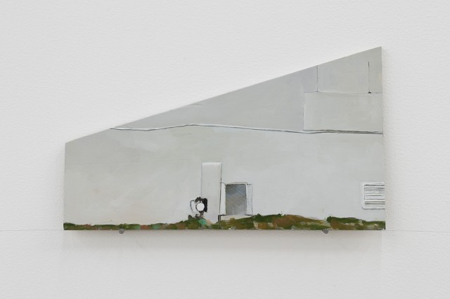
Tyler Emerson-Dorsch: Jenny, where did the title “Vagabond” come from? Why did you choose to display these particular architectural details in this format, on these supports?
Detail of Vagabond, oil on drywall and wood, 2012-13, Courtesy of Emerson Dorsch
Jenny Brillhart: It is named after the hotel where I found the details I painted about. The format can be thought of, as fragments which could separate, and become somewhat nomadic, like a vagabond, though this connection wasn’t made until I titled the piece. The hotel has a long history. At the time of making the piece it sat abandoned with plywood boarding up the windows and a large fence around it, so I had to stick my camera nose between the chain links. Then it was painted white with all its boarded-up-ness already on there so many of the walls had this geometric layering, which I like. I thought to paint the scenes on random pieces of wood and drywall in my studio and garage, as a way to further instill the specific material with narrative and bring a function to under-used substance. Painting on leftover drywall and wood seems a bit parallel to painting about the building. I used odd shapes to refer to the abstraction and fragmentation of it. Finally, resting the pieces on a pencil and nail shelf underscores the relationship of the material to the wall, as well as the subject.
TED: You trained at the New York Academy for painting. This is a very academic background. One might expect someone with this training to studiously depict the figure, a whole building, or a whole landscape. Why the seeming fragmentation?
JB: Yes, my graduate training was very academic in a material sense and fairly void of today’s post-modern (is that where we are?) thinking. I chose this path because I wanted to understand paint and its technical specifics and to understand how to see. Basically I was, and still am, into form. At that time the process of making something out of the stuff that best suited the idea was too large to take on. My concern was medium, the materiality of paint and what it could do and still function as itself.
So, to answer “why the fragmentation of the piece”, my intuitive process has always let me see croppings or fragments of things and that probably originally led me to architecture. For this particular series it wouldn’t make sense to paint the entire hotel in its landscape. I view and record the hotel in little bits over time and I want that process to be present, and also show what I find interesting and relatable in the subject.
All of the pieces in the show revere the space’s support systems. My two pieces, with the wall, nails and line and secondarily the wall and floor. Carolyn’s also unite with the wall and floor as well as within the space itself – the air, maybe? The structure and presentation are embedded within the environment and the contents within each individual piece contains a larger, outgoing dialog. This helps to elevate these objects beyond their categories of “painting”, “sculpture” etc.
Carolyn’s circle [“O”] contains the content it frames as well as the graphite that closes her armature. It is almost a sculpted drawing. My works more timidly step outward in hopes that there can be a balance between beauty and concept. Does one negate the other? Maybe it does. Beauty is really the poetic, usually intuited, it is more process-based, and it is what one can’t control.
TED: Carolyn, your sculptures seem to fit so organically with bodies in space. They are relatively large – the “L” sculpture was about 7 feet tall, and the circle about 5 feet in diameter. They also seem like just the right intervention into DV’s space and with more economy and less flourish than previous pieces. Can you talk a bit about how you modeled the pieces in space and to what circumstances were you responding?
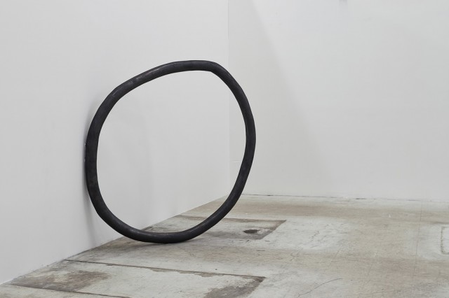
O, 2013, fiberglass and plaster, 5ft in diameter x 4in, Courtesy of the artist
Carolyn Salas: Working on-site over the course of two weeks allowed me to let the expanse of the space determine the configuration of the sculptures. When initially working on this project I had several ideas in mind but when I arrived at DV and saw the high ceilings and “openness” of the gallery I knew exactly how I wanted to approach making the pieces. Lately I have been working with a certain scale that corresponds to human height. In this way I imagine the relationship to the body, how we maneuver through space, and our relationship to objects in space. When making the “O” and “L” structures I was thinking about symbolic shapes relating to code. The forms then develop a conversation or particular language with one another and the architecture by referencing particular bits of structural framework, or in using the walls as support. This builds a connection between what’s familiar and seemingly unfamiliar. I just started incorporating graphite powder into the works. This emphasis on line or gesture becomes heightened by its materiality. In order to find a balance between the two, I kept the works black and white in color, allowing the forms’ minimalist structures to be accentuated. The graphite applied to the “O” shape gives the object weight, while the cast plaster of the “L” makes the white almost disappear into the background, and they become sculptural drawings in space.
TED: Explain why the pieces, even scaled up, bear evidence of your hand?
CS: No matter what scale the works are they would show my hand. That “quirkiness” is something I like to see, the evidence that it was touched and not slickly manufactured. My work is very physical; it demands use of my body, helping in a way, pushing and pulling, the material. I then develop this closeness with the material. It becomes about the struggle to figure out how it will work. With each project a new obstacle arises that has to be figured out. In a way I build up this system that then gets broken down. It seems to be an endless cycle; that closeness is what draws me in. The sketch or drawing of the objects is one aspect, while their physicality and size is another. I tend to focus more on the motion or direction, guiding me to a place of memory where touching and feeling is how I am seeing.
Tyler, when you brought up Geston Bachelard’s book Poetics of Space I thought it was such a perfect reference for the show. My copy has been on the bookshelf since my undergrad days, worn and rifled through. I picked it up again and skimmed over it. A phrase stands out to me that seems poignant at that time:
“But actually this grandeur does not come from the spectacle witnessed, but from the unfathomable depths of vast thoughts. Baudelaire writes, ‘In certain almost supernatural states, the depth of life is entirely revealed in the spectacle, however ordinary, that we have before our eyes, and which becomes the symbol of it.’”[1]
Exhibition view, Cut Outs – Jenny Brillhart and Carolyn Salas, January 26 – March 21, 2013, Courtesy of Emerson Dorsch
Looking back at Jenny’s work there is such an eerie quality to her paintings, which makes me think of places I have been whether in a dream or waking state. With her leaning wall piece [“Inner 10”] and the organized objects…this placement and order is also familiar but yet can’t quite be placed. How we work and move through our daily lives, observing and digesting to create a sense of them. It is something that I think is captured in this combination of works, even if just for a moment in time…. bringing the outside in or vice-versa.
TED: Bachelard writes about subconscious memories of the house – the cellar, the attic, or the nooks where one takes shelter (or perceives shelter) to be alone and read or daydream. These memories are shaped – bracketed if you will – by the imprint of the way a certain corner supported the body back then, the body of a daydreamer. In Bachelard, the attic houses the daydreams of rational thought, while the cellar, in its connection to the earth, is a mysterious space that tends to draw out animalistic nature and other parts of our nature we tend to fear. At DV, with the soaring ceilings and wash of cool white light, it seems that we are in an attic space. Bachelard focuses on the imprint of intimate space from childhood, or even mankind’s childhood. But the space of the studio has as much power to be an intimate space of memory and embodied observation.
Jenny, can you describe your studio and how its space and your place in it comes into your work?
JB: For me the studio is a place of filtering material and image, and allows for time and memory to come into the work. What might be intended as a straightforward composition will inevitably also contain the energy of it’s own life at the studio. Sometimes I think of the paintings as one might appreciate a found object, in that they might not mean anything at first, but simply by inviting them into the work space and letting them hang around, they acquire something, not quite tangible, much like the multiple fleeting and ordinary thoughts and visions Bachelard refers to in the above quote. The studio practice is one of repetition and making and it is through that cycle that I believe things happen.
TED: Carolyn, the graphite circle piece, “O”, leans against a wall for support, a gesture which recalls all the reasons a body might lean against a wall. Can you talk about how you think about weight and stability in your sculptures in DV, and in general?
CS: The leaning sculpture comes from thinking about support structures that are typically hidden from plain view. Whether you’re looking at the architecture of a building, the structure of a boat or a stretcher bar, the internal support is essential. I like how the sculpture needs the wall, activating this otherwise white field with its round mass. I’m interested in the idea that the “O” sculpture gives an impression of resting, taking a break, and using the wall for support. There is something humorous in that the circle is less a like a circle and more like a wonky shape, and slightly battered. I can imagine seeing it having difficulty rolling. I think the circle might be humbled by its inaccuracy, hence needing a little help. Some of my more recent sculptures play off balancing weight, teetering on that moment where gravity must hold everything in place. Finding that tension within that space is something that interests me, like something on the verge of collapse.
TED: Jenny, your paintings all lean against the wall as well. Where Carolyn’s circle sags a little against the wall in a gesture that suggests rest, you support your small paintings on top of nails, which are tacked into a horizontally level graphite line, and lean them against the wall. Propped on scrap wood, “Inner 10” also leans against the wall. Why did you choose this system of support?
JB: Like Carolyn, I am also interested in support structures and what is often overlooked. I think the components of “Vagabond”, the nails and pencil line, are a comment on the wall’s “potential.” The wall not only covers the armature of the building, gives shelter, and privacy, it also holds up artwork that is about it’s own self! What a handy thing that wall is. This leads into the function and purpose of a painting or wall work. Is the purpose of the painting simply to comment on the wall? Well, not exactly, but perhaps it shouldn’t ignore its support. I am acknowledging the idea of painting as object. And possibly bringing forward the tension between the painted object and the more common perception of painting as decor, aesthetic, or telling narrative. There, I believe, is something related to function, architecture and that space in between.
TED: After a month of not being in the exhibition space and looking at the installation shots again, I am struck by the way Carolyn’s circle and Jenny’s shelf push against the space in opposite directions. Jenny’s five paintings on the back wall seem to float, while Carolyn’s “L” acts like an extender in text, making it more legible, and connecting to the heights from the ground. Jenny and Carolyn, do you have some final impressions of the installation views?
CS: I’m particularly liking how minimal the works are, allowing plenty of breathing room in between. I am currently working on several projects in the studio now that came from this specific grouping of sculptural works.
JB: I like how you describe the pieces as pushing the walls in the opposite direction. I think our use of the walls does have a specific visceral effect on the space, enlarging it or allowing it to open. The paintings in the back sit even further back, with the large sculptures in front heightening the perspective distance. This visual suits me.
Jenny Brillhart graduated with a BA from Smith College and received an MFA in from the New York Academy of Art. She lives and works in Miami, Florida. Brillhart currently has a solo show up at Kuckei + Kuckei in Berlin. She recently showed at ARCO Spain and Pulse Miami. In 2012, she participated in exhibitions with Dorsch Gallery, Dimensions Variable in Miami, the Sammlung SØR Rusche Museum in Germany and ArtCenter South Florida. In 2010 she showed new work with Kuckei + Kuckei Gallery and she was chosen for New Work Miami at the Miami Art Museum, curated by Rene Morales. Brillhart has participated in group shows including The Naples Museum of Art (Naples, FL), David Castillo Gallery (Miami, FL), the Anhaltinischen Gemäldegalerie Museum in Dessau, Roemerapotheke Gallery in Zurich, Morgan Lehman Gallery in NY, and ArtCenter/South Florida in Miami Beach. Her work has been published in Ocean Drive, The McKinsey Quarterly, New American Paintings and Miami Contemporary Artists.
Carolyn Salas was born in Hollywood, California. She received her MFA from CUNY Hunter College, NY in 2005. In 2011/2012 she was a Grant Nominee for the Rema Hort Mann Foundation Award. Salas has exhibited at museums including The Torrance Art Museum, Torrance, CA; Hudson Valley Center for Contemporary Art, Peekskill, NY and The Berkshire Museum, Pittsfield, MA. Recent gallery exhibitions include Santa Barbara Contemporary Arts Forum, Santa Barbara CA; Kate Werble Gallery, NY; BRIC Rotunda Gallery, Brooklyn, NY; Abrons Art Center, NY and Casey Kaplan, NY. Salas has recently completed the artist in residence program at the Fountainhead Residency, New York Art Residency & Studios (NARS) Foundation, NY: Abrons Art Center Studio Program, New York, NY; and the Elizabeth Foundation For the Arts Studio Program. Salas had her first solo show at Dodge Gallery in January of 2013. Salas lives and works in Brooklyn, NY.
4.2.13 Beneath a Thread of Stars: A Conversation with Anna Von Mertens by Beth Maycumber and Julie Dickover
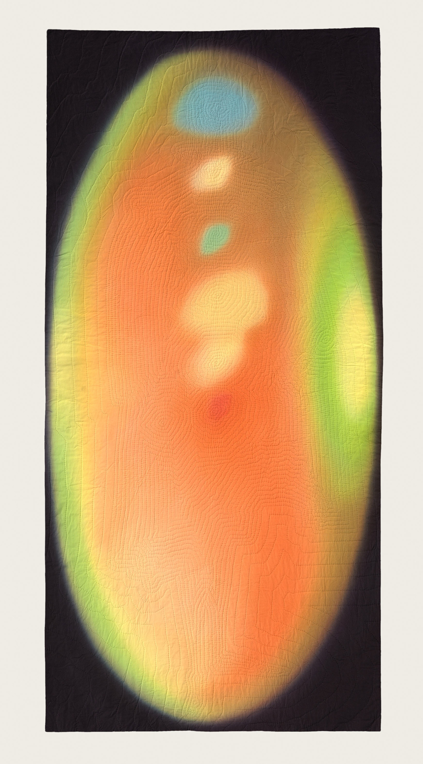
Anna Von Mertens creates intricately hand-dyed, hand-stitched fabric works that reveal seemingly allusive moments of existence and time. She explores themes such as the aura surrounding figures in famous paintings, the circulation patterns of currents between magnetic poles, and the actual stars as seen above violent moments in American history. Von Mertens has recently exhibited at the Smithsonian American Art Museum’s Renwick Gallery, Berkeley Art Museum, and Ballroom Marfa, and the Museum of Fine Arts, Boston, has just acquired a piece of her work, which now hangs in the Linde Family Wing for Contemporary Arts. She is currently exhibiting in galleries in Florida and Maryland, and will show in Boston and the Netherlands later this year. We caught up with Von Mertens on February 28 in Saint Augustine, Florida, the day before the opening of her solo exhibit “What Could Be”.
Portrait series, Installation image, Crisp-Ellert Art Museum, March 2013
Beth Maycumber: Could you start by describing your process for creating the aura portraits?
Anna Von Mertens: Typically, I start a series by creating a system, fleshed out with research, and then build the work visually from there. This series came at me sideways: while working on a previous series, observing how the dye was running together, I thought, these really remind me of aura photographs, the way the colors come and go, and the boundaries between them. I got stuck on the idea of auras—I couldn’t shake it. I wanted to shake it. I was like, “Auras? Come on!” But they stuck with me.
The premise is to create auras of famous paintings. I would select a famous painting, the sort referred to in Art History 101, paintings that live larger than the actual object itself. I chose paintings with an intense relationship between painter and sitter, as well as portraits of strong personalities, and used that context to build my story of the painting’s aura.
When you get your aura photographed, you place your hands on an electromagnetic sensor and the computer translates those electrical frequencies into the color spectrum. A Polaroid photo of you is then placed over it, so it’s actually two superimposed layers.
Julie Dickover: The image that is translated to the computer then is the electromagnetic current?
AVM: Right, that’s your aura reading, and they superimpose a Polaroid on top to make it seem like it’s around you, but they are actually separate. So with my series, the two layers of dyeing and stitching make sense. You have the aura itself, and then I’m superimposing art history on top of that by using the original image. It mirrors the process of getting your aura photographed.
There is a “science” to aura interpretation. Each color has significant meanings, and the location of the various colors—whether manifesting above your head, or coming in on your left side, or exhibiting outward on your right—is important. So I would reverse engineer these auras by creating narratives about who was Philip IV or Mona Lisa, and try to represent that with these rules of color.
For the dyeing process, I stretched white cotton onto a frame and painted the dye on with a brush, building the color slowly because the dye is like a loose watercolor, but it immediately starts chemically bonding with the fabric. The colors bleed into one another, and while you want those edges to leak, you also want to be in control of them. You’re right on the edge, falling in and out of control with the color.
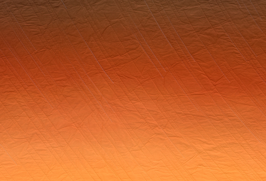
“Gold! Gold! Gold from the American River!” (Sunset, January 24, 1848, Sutter’s Mill, Coloma, California) during the dyeing process, courtesy of the artist.
Each piece has seven to ten layers of dye, and I would build up the layers until it had the intensity I wanted. I was working much more intuitively than normal, just responding to the color in front of me. But because I had this system of analyzing auras to follow, I tricked myself into working intuitively.
JD: Did you have failures? Pieces that just didn’t work?
AVM: I did—I had almost forgotten this. I started with the Mona Lisa—a logical starting point: the most famous painting. It took maybe four attempts, four failures. I didn’t know if technically I could pull off the effect I wanted to achieve. It’s challenging to keep the dye behaving the way you want while allowing it to do its own thing, but that was the fun part. So after those four passes, I almost gave up. Once I learned that you can never go backwards with the dye, as long as I built the color up slowly enough, I felt like, okay, this is going to work.
Mona Lisa, hand-dyed, hand-stitched cotton, 2009, courtesy of the artist and Elizabeth Leach Gallery, Portland, OR
BM: So you dye first, and then begin stitching?
AVM: Yes, you have to do the dyeing first because the fabric needs to be tight to get those even transitions. It’s funny to even say that because over the years, I’ve felt in competition with painting, and have tried to embrace textiles on its own terms. Here I’m taking painting head on, stretching out this canvas with a brush in hand—and the subject matter is obviously all about painting. It was interesting to inhabit the world I had been avoiding.
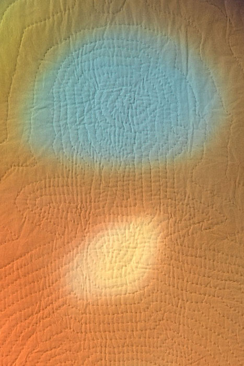
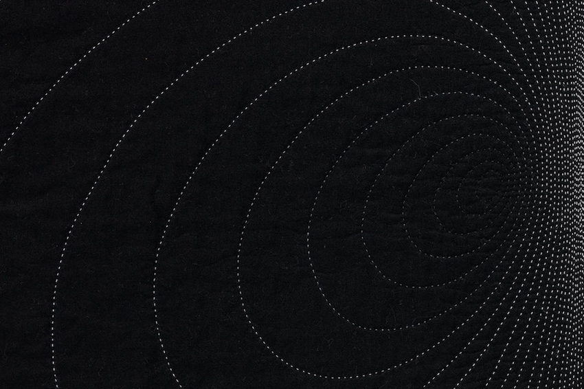
Back to your question, the dyeing comes first, and once I’m happy with the color, I project the original painting onto the fabric and chalk out the figure’s silhouette. My auras are the same proportions as the original painting, so the two fit to scale. Here you can kind of see Philip IV’s body, his front foot pointed out, and he’s got this high, strange collar on, that gives him this very unique silhouette. After chalking the silhouette onto the fabric, I then mark the figure’s chakra points, and from that create my own aura-like emanation. The original painting is recognizable while a suggestion of something else.
Philip IV’s aura, after Velázquez, hand-dyed, hand-stitched cotton, 2009, courtesy of the artist and Elizabeth Leach Gallery, Portland, OR
JD: How do you dye the stitching?
AVM: I wanted the stitching to be an invisible layer, so I matched the color of the thread to the background aura. There’s enough range that I’m able to buy commercially available dyed thread. I’m glad you think the thread is hand-dyed because I wanted that to appear seamless. Sometimes I would have to change thread color every couple of stitches to pull it off.
To clarify, I am not a craft martyr; I don’t take the stance that it has to be done by hand. If you can only achieve an effect by hand, it needs to be done that way. The dyeing can obviously only be done by hand, and the quality of texture that you get from hand quilting is only achievable through the hand. Because of the two interlocking threads, machine quilting would just flatten it, versus the dotted line of the hand stitching. I hand stitch simply because it is the only means to reach the end that I want. If there is commercially dyed thread that is the color I want, I have no problem going out and buying that.
Detail of Philip IV’s aura, after Velázquez
JD: Your work makes me think about how a quilt is a domesticated, functional craft object, and yet, you’re treating it as an art object, a painting. There has been a lot of work over the past ten or so years that has brought craft to the forefront of contemporary art making. Have you always made work like this? Did you use to be a painter and then transitioned to textile work? How do you negotiate the line between craft and fine art?
AVM: I studied fine art; since first grade I knew I wanted to be an artist. Originally, I followed a more traditional path of drawing and printmaking. I made my first patchwork quilt on a whim senior year in college, and fell in love with the materials and the process. It took a while, but slowly the two roads of craft and fine arts converged. I wanted to use the subtext, the meaning inherent in the quilt, and have that be my foundation for building my ideas. The two worlds came together.
Frida Kahlo’s aura, with Thorn Necklace and Hummingbird, hand-dyed, hand-stitched cotton, 2009, collection of Ann Hatch, San Francisco, CA
I have thought these dyed auras are so beautiful on their own, could I just stretch them like canvases? Ultimately, there is some transformation that happens when they become objects; they have more of a presence in the form of the quilt. I see hand quilting as my own way of “framing.” There’s also an accessibility that’s different if they didn’t have that layer of hand stitching to them. Even though these pieces are very far removed from the bed and the original context of the quilt, they still carry those meanings that then transform the work.
BM: It’s interesting that you say that, because I know with at least some of your earlier work, you displayed pieces on flat platforms that resembled beds. I am curious about what made you change to showing the works on the wall.
AVM: In grad school, I practically signed my own personal manifesto: my quilts needed to be displayed in the form of the bed. I wanted my work to address the site of the bed as a way to stay true to the origins and meaning of quilts. For a long time, I only displayed them in that format. I loved using that constraint as a conceptual jumping off point. But after a while I didn’t want such a strong association with the bed. I kept looking at the wall, wanting to put my works there, but because I had sort of signed this manifesto, I couldn’t do it. Finally, I realized the wall is not the enemy. The wall is about the act of looking, so if I make the works about the act of looking, they belong on the wall.
The Duke and Duchess of Urbino’s auras, after Piero della Francesca, hand-dyed, hand-stitched cotton, 2009, courtesy of the artist and Elizabeth Leach Gallery, Portland, OR
That’s how I landed on the idea of stargazing as the ultimate form of looking, this existential looking as a way of locating ourselves in this world. Thinking how the act of looking allows you to be more conscious of where you stand, I launched into the whole star series. The work in this gallery [the Portraits series] obviously belongs on the wall because it specifically refers to the history of painting, but it’s not like I’ve ruled out the sculptural; maybe a new series will come up where it becomes again about the space of the every day, the space where we live and walk, and then I’ll return to sculpture.
JD: One thing that is interesting about your work is how you tow the line between craft and formal aspects, but also the conceptual ideas and the research that goes into each series. Do you regard those issues as being equally important, or do you place a greater importance on one or the other? Is it important for the people viewing your work to know everything that goes into it?
AVM: Not that one trumps the other, but I definitely start the work from a conceptual framework and the idea carries me through the process. Beauty and formal decisions are important to me, but I spend so much time and work with the piece itself, if I didn’t have an idea or narrative to carry me through, I wouldn’t get to the other side; I wouldn’t finish the piece. It’s not that one is more important than the other, but that I couldn’t have one without the other.
Aesthetically, I am a minimalist at heart, but it sometimes can leave you cold. Minimalism’s original goal was to be much more accessible—by distilling the essence it would gain that much more. But it turned out it can be quite the opposite. In some ways, I’m trying to bridge to that original goal, distilling my idea down to its purest aesthetic form, while still maintaining its accessibility.
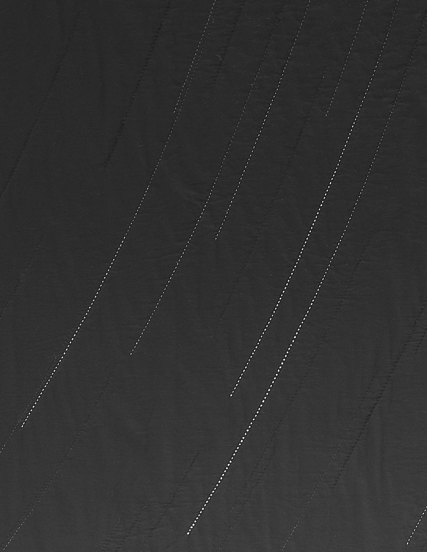
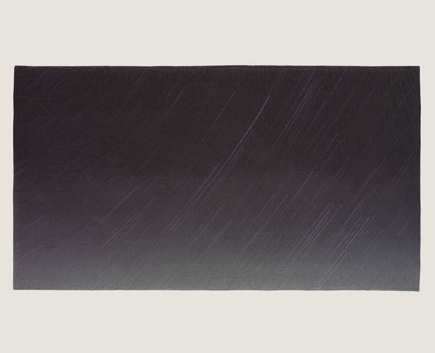
Black Gold (Sunrise, January 10th, 1901, Spindletop, Texas), 2011, detail, from the series Endings, courtesy of the artist and Elizabeth Leach Gallery, Portland, OR
In terms of what the audience knows and what’s revealed to them, I try to have the titles be an entry point, to launch the viewer with that piece of information. I also often have additional materials that accompany the work. I used to think of that as a weakness, that the work itself should contain everything. Then I thought of conceptual work from the ‘60s and ‘70s, and realized that stories were attached to these works, almost a mythos was created around them, that ended up augmenting the work. That became part of my process.
A tipping point for me was when I first showed the series “As the Stars Go By” at Jack Hanley Gallery. That work is so historically based—it shows violent moments in American history and the stars above them. I wrote up what occurred during those historical moments, and why they were such pivotal events. At the opening, word got out that this text was available, and the gallery said they had never printed so many handouts for any show before. I realized there is a hunger for that.
JD: Yet, not unlike wall text in huge museums, there is sometimes a backlash against it.
AVM: I think the backlash often for wall text is that it’s trying to describe what your experience should be of the piece—
JD: —Interpreting the piece for you.
AVM: Exactly. With my work, I provide information, either facts or circumstances, to accompany the work. Quilts have always had stories told about them; the story gets tied to the object. But quilts and stories are not sexy terms. Conceptual art, however, has its construct, or it has a long-winded title. These, too, are stories. Just because one is craft and the other art, there shouldn’t be a hierarchy. So I am trying to reclaim the idea of story.
BM: Can we talk about these pieces [“You and Me” series] here?
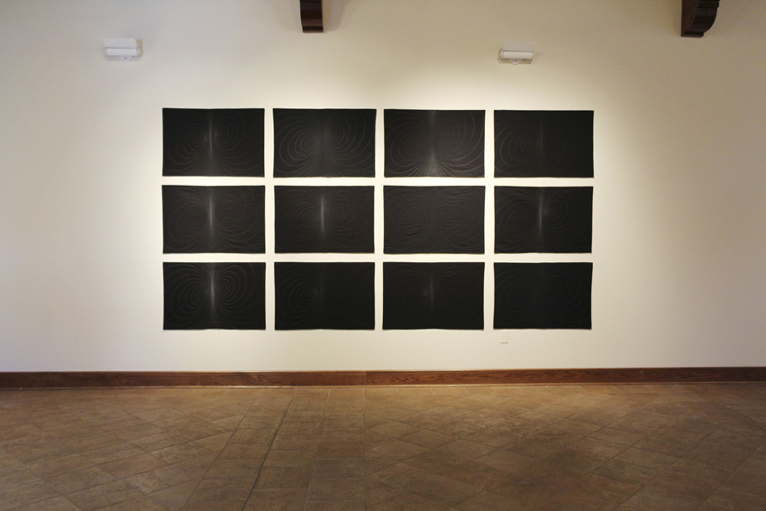
You and Me series, Installation image, Crisp-Ellert Art Museum, March 2013
AVM: Right after my second child was born—I mean literally two days after—I needed to get back into the studio to restore my sanity. I had typical postpartum spikes of joy, and complete love for this child, along with a real sense of feeling overwhelmed. I had this image, on maybe day five of my son’s life, of how current circulates around two magnetic poles, how that was a metaphor for the push and pull of this intense relationship.
Using the same source image for each piece, I treat the poles differently: using the gray scale, I shift the color of the thread to highlight different areas of the piece. I named each piece after a rock song because I liked playing off the idea of romantic love, that melodramatic, intense love—like this piece named for a song by The Smiths [“Heaven Knows I’m Miserable Now”]. But hidden underneath the melodrama of young love was for me this relationship between mother and child.
At the outset of this series I also knew, with the realities of having two young kids, I wouldn’t be able to get in to the dye lab for a while. I wanted to work on a small, intimate scale, work in black and white, and work really simply, to mirror my year of becoming a mother of two. The irony was, despite this simple concept, this series was insanely technically challenging to pull off. The transitions between thread had to be precise. In certain works, I had fifteen shades of thread within two inches. This simple, beautiful idea at times drove me crazy, but I came out the other side, just like I came out the other side of those newborn sleepless nights.
You and Me (Heaven Knows I’m Miserable Now), detail, hand-stitched cotton, 2011, courtesy of the artist and Elizabeth Leach Gallery, Portland, OR
The intensity of those threads so close together is like the point in a relationship where you lose your sense of self. With the hand quilting, at times I love it, and at times I hate it. I only make one piece at a time, which creates a nice cycle: the research phase, the dyeing process, the hand stitching. Taking it one step at a time makes it continually feel fresh.
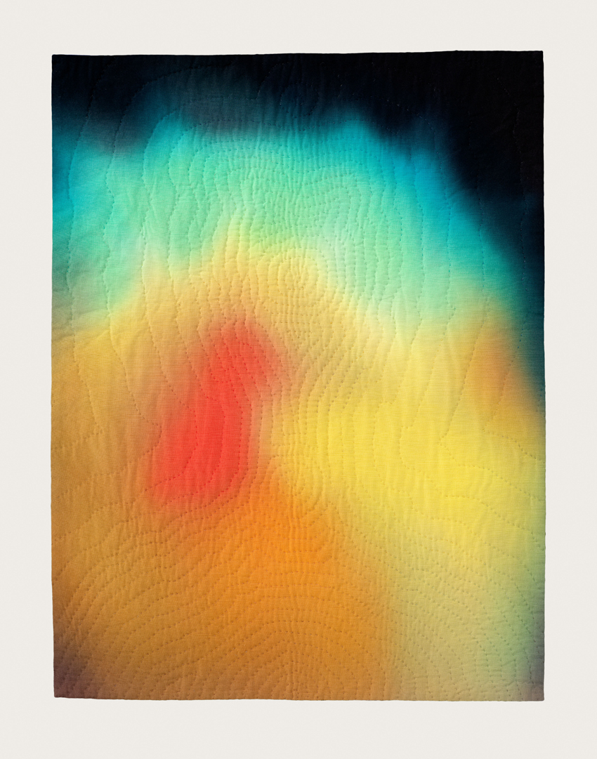
The remaining three works in the show [“Jupiter Rising”, “Black Gold”, and “Gold Rush”] are from two different series, but share the same premise. They use star calculation software to map stars above historic events.
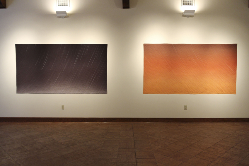
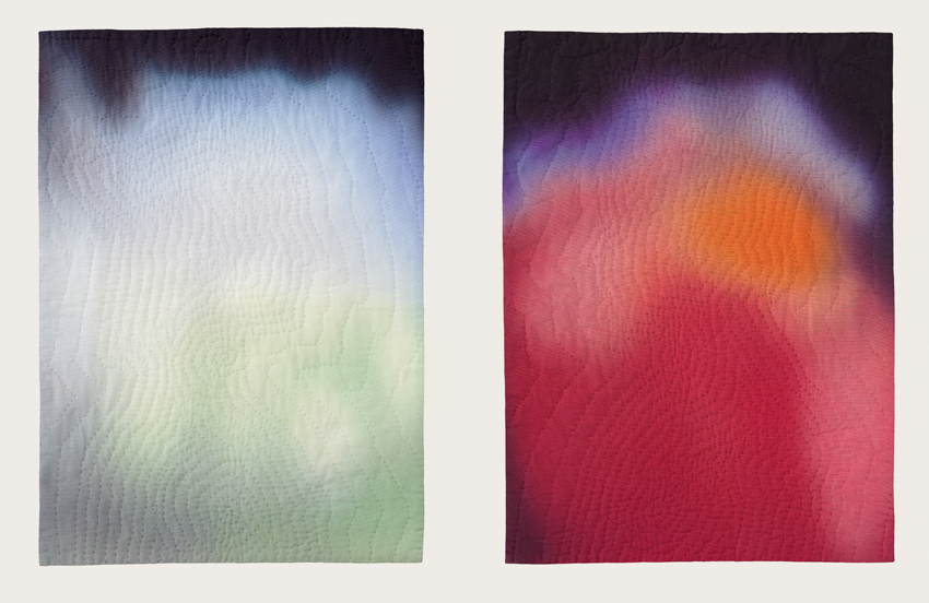
Endings series, Installation image from Crisp-Ellert Art Museum, March 2013. Left: Black Gold (Sunrise, January 10th, 1901, Spindletop, Texas), 2011, hand-dyed, hand-stitched cotton, courtesy of the artist and Elizabeth Leach Gallery, Portland, OR. Right: “Gold! Gold! Gold from the American River!” (Sunset, January 24, 1848, Sutter’s Mill, Coloma, California), 2008, hand-dyed, hand-stitched cotton, Private Collection
This diptych [“Black Gold” and “Gold Rush”] is about dawn and dusk, an obvious transition point between one thing ending and another beginning. I wanted to use that moment as a broader metaphor for those times when we close one chapter of our lives and look forward to the future. The piece on the right [“Gold Rush”] shows stars coming into view on the evening gold was first discovered in California, leading to the California Gold Rush. The piece on the left [“Black Gold”] shows the stars on the morning the Spindletop geyser blew in 1901, and the modern oil industry began. They represent the allure and pull of the future, as well as the events these discoveries set in motion. Reading like Hollywood film stills, one is a black-and-white Western, while the other conjures the idea of riding off into the sunset.
BM: Am I correct that you were commissioned to do a piece for Ballroom Marfa? Can you speak about that experience?
Yes, this diptych [“Black Gold” and “Gold Rush”] was that commission. I had never done a commission before, but was up for the challenge. Thinking about topics relevant to Texas, I started looking into the drought Texas is currently experiencing. That launched me into research about the history of drought cycles and I came across recent international studies linking climate change with the fall of empires. Thinking of the United States and the eventual fall of its oil empire, I was excited to make this connection. But I was dependent on scientists who were generously collaborating with me, so realized I wouldn’t make my Marfa deadline, but it was still an amazing process because it launched an entire series I am working on now, linking drought cycles to catastrophic events.
So with oil on my mind, and thinking of Marfa’s rich film history, I returned to the stars and made the Spindletop piece. The reference to film stills really clicked when the diptych was shown at Ballroom Marfa— the film Giant is shown continuously at a hotel in downtown Marfa and there is a film poster with an orange background that reads just like the “Gold Rush” piece.
It was also a thrill to get to travel to Marfa after hearing about it for so many years. It is one of those places where the legend looms large, and when you get there, it still lives up to all of your expectations.
Jupiter Rising, January 7, 1610, Padua, Italy, 2008, from the series, Look to the Heavens, hand dyed, hand-stitched cotton, courtesy of the artist and Elizabeth Leach Gallery, Portland, OR
This piece [“Jupiter Rising”] is from a different series, “Look to the Heavens.” I had been depicting the stars, but not with any particular relation to astronomy. So for “Look to the Heavens,” I turned to actual astronomical events where what is seen above is clouded by our belief systems below. This piece is the evening Galileo first spotted Jupiter’s moons, which validated Copernicus’ theory that the earth was not the center of the universe. In his diary, Galileo wrote the exact time and date of his sighting so the software program is a way to time travel and see the stars Galileo saw. Galileo was put on house arrest for the rest of his life because of this discovery, so this series highlights how even observable facts can be controversial.
BM: In your historically based pieces, how do you choose which moments to focus on?
AVM: With the “As the Stars Go By” series, showing the stars above violent moments in American history, I chose these pivot points where what came before changed what followed. The Vietnam War changed our idea of war, but within that, I chose the Tet Offensive because, while strategically it was not a successful mission for the Viet Cong, it was a mental tipping point for the American public. Another example is the Wounded Knee Massacre, the last “battle” in the American Indian Wars.
Detail of “Gold! Gold! Gold from the American River!” (Sunset, January 24, 1848, Sutter’s Mill, Coloma, California)
But sometimes the image comes first. Like with the “Gold Rush” piece I wanted to do the most over-the-top Hollywood sunset, and watched some old Westerns trying to find that quintessential moment of riding off into the sunset. Only later did I figure out the piece should be about the California Gold Rush. So the historic references come in different ways, but they’re all about the idea of one thing ending and another beginning.
BM: Do you feel like your work is going in a certain direction at the moment?
AVM: The series I’m working on now uses historic tree ring cross-sections pulled from studies that link climate change with periods of human instability: the Fall of the Roman Empire, the Aztec Conquest, the Black Plague. My work is increasingly political, perhaps just a sign of our times. But we’ll see. I never know where a new series will take me, which is scary and delightful at the same time.
“What Could Be” is on view at the Crisp-Ellert Art Museum through April 12. Von Mertens’ work can also be seen at the Museum of Fine Arts, Boston, Linde Family Wing for Contemporary Arts; Salisbury University Art Galleries, Salisbury, Maryland, from March 4-April 6; Mills Gallery, Boston Center for the Arts, from April 19-June 30; and at the 2013 Rijswijk Textile Biennial at Museum Rijswijk, in the Netherlands, from June-November.
Beth Maycumber is currently working on a Master’s degree in Library and Information Studies at Florida State University; she also holds an M.A. in U.S. History from the University of North Florida, and a B.A. in History and Art History from Flagler College. Her recent projects include curating two special exhibits about Jean Ribault’s 1562 voyage to Florida at Fort Caroline National Monument, and participating in artist Harrell Fletcher’s “Before and After 1565” project at the Crisp Ellert Art Museum. She lives in St. Augustine, Florida, with her husband and son.
Julie Dickover is the director of the Crisp-Ellert Art Museum at Flagler College in Saint Augustine, Florida, where she has organized exhibitions by artists such as Montreal based video artist Julie Lequin and photographer Mark Ruwedel, as well as a collaborative interdisciplinary project and exhibition with Portland, Oregon based artist Harrell Fletcher. Dickover is also an advisory editor for At Length. Prior to living in northeast Florida, she lived in Los Angeles where she worked as a registrar at UCLA’s Hammer Museum.
3.23.13 Gean Moreno and Ernesto Oroza


GEAN MORENO is an artist based in Miami. His work has been exhibited at the North Miami MoCA, Kunsthaus Palais Thum and Taxis, Bregenz, Institute of Visual Arts in Milwaukee, Haifa Museum, Israel, Arndt & Partner, Zurich, and Invisible-Exports, New York. He has contributed texts to various catalogues and anthologies, including Uncertain States of America! (Astrup Fearnley Museum, Oslo), Round-Leather Worlds (Martin Gropius-Bau, Berlin), Catastrophy? What Catastrophe!? (Quebec Biennial), 2009 e-flux Reader (Sternberg Press, New York), Eat the Frame! (DFI Publishers, Amsterdam), and Peter Friedl (Extra City, Antwerp). In 2008, he founded [NAME]Publications, a platform for book-based projects.
ERNESTO OROZA lives and works in Aventura. He earned a degree at the Havana Superior Institute of Design. Oroza is author of the book Objets Réinventés. La création populaire à Cuba (Paris, 2002). He was a visiting professor at Les Ateliers, École Nationale Supérieure de Création Industrielle (ENSCI) in Paris (1998), and professor at the Polytechnic Institute of Design of Havana from 1995 to 2000. His work has been exhibited in museums, galleries, and cultural spaces such as Haute Definition Gallery, Paris, The Montreal Museum of Fine Arts, Montreal, The Museum of Modern Art (MoMA), New York, and Laboral Centro de Arte, in Spain.
2.12.13 Walking through “The Umpire” with Daniel Milewski by Meaghan Kent
Daniel Milewski’s current exhibition at Gallery Diet in Miami is a hybrid of objects that, at first glance, seem somewhat disparate in its minimal arrangement. A loose weaving of photographs, notes, t-shirts, a baseball, and other found objects are combined to investigate the banal, to tease out the overlooked. Daniel Milewski walked Carolyn Salas and me through the exhibition beginning with an appropriated image of the historical Florida developer Henry Morrison Flagler.
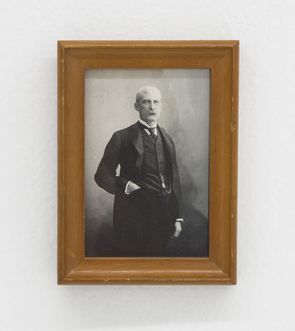
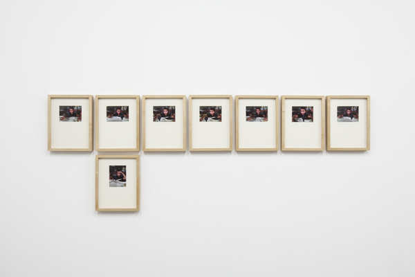
Daniel Milewski, Flagler, 2012, Digital c-print, found frame, 4.75 x 5.75in
Daniel Milewski: It’s a fairly well known image that I intended for people to overlook and possibly miss. It mimics the same way you draw a moustache on. The scale of it allows you to not see it in such a grand manner, and you can walk right past it.
Carolyn Salas: What I like about it is that his lips are kind of off.
DM: It’s about memory and how you can forget or remember different parts of history. How you might notice something is either normal or perverse. He is such a notable local figure. It might have been easier to choose someone more known like Teddy Roosevelt, but he is just knowable enough for people that come here.
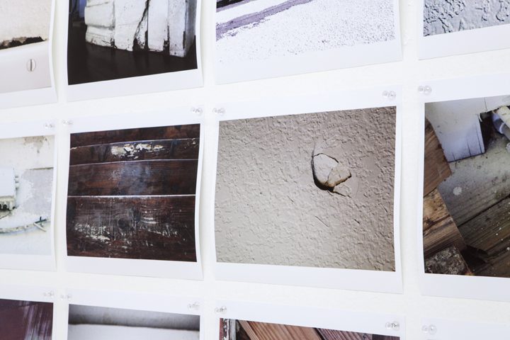
Daniel Milewski, Everything Wrong with the House, 2012, 45 digital c-prints, acrylic push pins, 52.5 x 78in
Meaghan Kent: There is a sense of locality with some of the pieces in the show, for instance your home documentation in “Everything Wrong with the House.” Are you from here?
DM: I’m originally from Massachusetts and lived here for 7 years. A lot of the show deals with memory or perception. Both series, “Everything Wrong with the House” and “Flagler,” are talking about cartography in a similar way.
They had photographed our house for the Style section of The New York Times. But we live in a funny neighborhood that is somewhat ghettoized. We renovated for several years so it does look nice but I thought it was interesting and kind of funny that The Times had photographed it in a wonderful, perfect kind of way when there are imperfections and things that needed to be fixed. So this series was put together or mapped together, initially for myself, for my own neurosis. And these images can be endless; you could remove a piece of plywood and find something else. No matter how much you think you are representing something there is always an unknown factor. Even in something as mundane as fractures in a wall.
MK: And this is what you discussed in the press release the everyday objects, everyday living. The banal.
DM: Yes. Things become grand in banal objects. I was talking with someone the other day about Olafur Eliasson’s photographic vignettes of landscapes and riverbeds and how his work is trying to capture something that is difficult to visualize, something grandiose in a smaller space. It is a similar idea in my work. This is what I built up, collect, and even obsess over.
Also, perceptions are different: to me, they are imperfections in my house; to someone else, there is abstract formalism. I am certainly making a formal decision with the camera, framing something that I can’t readily frame with my eye.
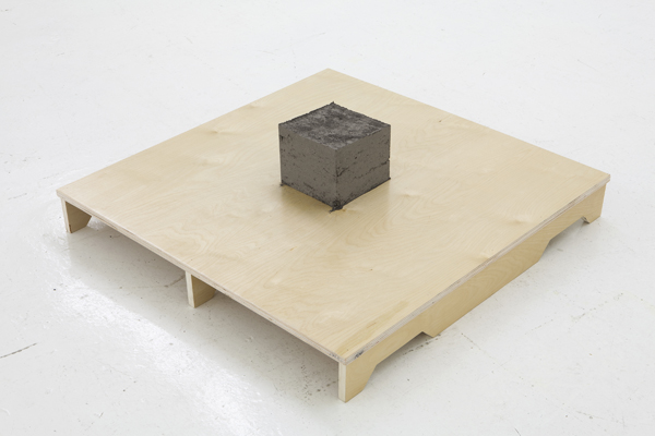
Daniel Milewski, Gram, 2012, Ash, birch plywood, 36 x 36 x 10.5in
CS: Does “Gram” also relate to the home and labor?
DM: It didn’t necessarily come from the apartment but mostly from the studio. I have an old barbecue and I would light small fires and burn materials over the course of several months.
It is reminiscent of Japanese gardens and how there are different stages of meditation. There is meditation during the process of forming it, maintaining it, and once it is perfected. If a strong wind came in the structure would be compromised, it would need to need to be taken apart and reformed. There are imperfections too that could get better over time.
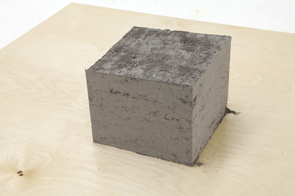 The palette represents some sort of portability and defines parameters. I am also interested in the idea of storytelling (around campfires). “Gram” alludes to many different things. “Gram” can be a unit of measurement, a grandmother, Gram Parsons. Do you know Gram Parsons? He is a country/rock singer who died near Joshua Tree National Park and when he died, they stole his body and burned it at Joshua Tree. Of course it didn’t work because they were all messed up on drugs.
CS: He wanted his ashes to be left there.
DM: I was interested in linking it with this heavy rock and roll myth. We were there recently (with Nina Johnson) and there was a makeshift shrine. I like the idea of this object moving from place to place. I also like that there are direct stories or links that you can go to or not, your brain can fire into different directions.
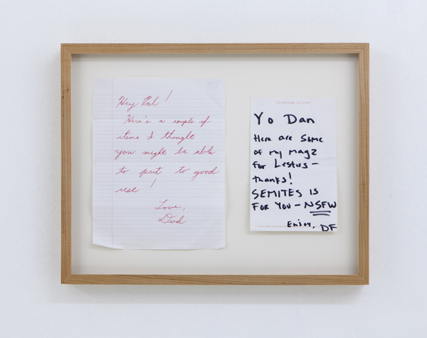
Daniel Milewski, Untitled (notes), 2012, Found notes, 20 x 16in
MK: The piece includes a note from your father?
DM: Yes, we’ve been talking about how I thought about the show and how I sometimes use personal objects. I’ve almost thrown away these two notes a few times and for some reason I kept them and they are now included in this show. Both notes are almost identical in what they are trying to get across. One is from my dad, the other from a friend with the abbreviated “Not Safe For Work.”
CS: I was trying to figure out NSFW.
DM: Yes, it is a fairly common abbreviation and often used as a warning of sexual content. So there is a kind of interesting interaction between the two including the choice of paper itself: the notebook paper from my dad and the Barbara Gladstone stationary with Sharpie from a friend.
MK: Also, they are notes to accompany specific objects that we can’t see. Unknown objects.
DM: They are about communication and are not necessarily a thing on their own until now.
CS: It makes me think of the feature on 60 minutes of this man who was caught stealing official documents from the White House, how he had a trench coat designed to hold files. Would we have noticed them missing and when? It makes you consider how history is created over time.
DM: And that’s part of a bigger idea, like the myth of the rock star.
MK: I remember our studio visit last year and looking at your work and interpreting some of your exhibitions as a kind of group show. Where the pieces seem so different. At a first glance the connections aren’t readily clear, which is interesting to think about in context to finding these different meanings. And I think it could be connected even to the title of this exhibition, “The Umpire”, where you can make the decisions on how these works can and cannot relate.
DM: Yes, I like making works that look very different, yet in the context of a show are allowed to relate to each other.
Daniel Milewski, Rodrigo, 2012, 8 individually framed digital c-prints, 76 x 27.5in
DM: We were traveling and went to dinner with this little boy (a family member) and bought this top along the way. I like using my camera phone and the digital shot rather than an over produced image so that, like the notes, they are something that I can arrange and re-arrange.
He’s playing with this at dinner. He’s at that age, 7 or 8, before becoming an ornery teenager while at the same time having complex thoughts. So he is looking at this top: a children’s toy that has all of these properties of the universe. Laws of Physics are happening. And in these moments of me taking the photos he is at times enthralled but also completely distracted. I like the enormity of those moments. I think we all do that.
“The Umpire” is currently on view at Gallery Diet through Saturday, February 16.
1.24.13 Under Diamond Lights by Sam Trioli
1.9.13 The Possibility of Colloquial Aesthetics in Miami: A Three-Way Discussion with Aramis Gutierrez, Loriel Beltran and Domingo Castillo
Aramis Gutierrez: I want to start this discussion by asking if you think that a colloquial aesthetic can develop here in Miami? The biggest Post-Cuban thing that happened here is what happened in the late ‘90s and early 2000s. Artists like Hernan Bas, Naomi Fisher, Luis Gispert and a lot of other people here really found a voice, but as of lately it is difficult to say if that work has pollinated [into] something unified, or even if it is gestating into something else recognizable. When I think of the work from that moment, I remember there was a predominant sense tropicality going on.
Domingo Castillo: It’s funny you bring up tropicality. There was certainly a ‘savage’ aesthetic, but there were also architectural themes that were coming up in a lot of people’s works, probably from all the construction cranes that popped up in the mid-2000s. Diego Singh seems to have capitalized on something very Miami in his denim paintings. Denim has its own vernacular in Miami that is especially prominent in South Beach and with the various South American groups pouring in.
AG: Because Miami is such a transient international city, I always wonder if that works against the possibility of forming a colloquial aesthetic or myth. Besides the locals, we have these three major economies that feed into our city. We have Europeans, who come here to vacation; the seasonal northeasterners, who come to escape the winter and taxes; and the South Americans, who come here for a stable environment for their investments. Each has its own school of thought and culture. I always find that most of the Miami-based culture I am interested in is from the local culture, from the people who were born here or have just ended up living here year-round.
Loriel Beltran, Young Sexy and Clumsy, 2012
Loriel Beltran: Art may be high culture but it is always informed by low culture. If you are in contact with all these people, their culture affects you. I don’t think it is so much a choice as much as what you encounter on a daily basis. Either it becomes part of your work naturally or you try to make work that is conscious of it.
AG: I know from painting in Miami, that part of me has tried to find this moment that allows me to convey the light, the color and the transient nature of this place. I felt that coming from New York and being educated there meant I was at odds with it. So I came up with tricks to outthink or derail my limitations, like setting up my palette. I am no longer a tourist, but I will always be somewhat of an outsider looking in.
LB: Everybody is.
DC: Everyone is. All the information you are getting is coming from outside anyway. So if you are accessing that information, you are automatically becoming “outside.” You are removing yourself from site and place. It makes us different from New York or L.A. because a lot of that information is right there. It’s being made there. If you are watching a movie in L.A., Hollywood is right there.
AG: That’s a funny point. Whenever you see Miami depicted on film, it is never really accurate.
DC: Miami Vice in the ‘80s was crazy. It looked like there was a party here, and there was tons of crime, but there was a lot more going on.
AG: If one is looking for an aesthetic in Miami, they might turn to our galleries. Lately when you look at the majority of galleries in America, it is easy to get a feel for whose roster is N.Y. or L.A. -centric, but there doesn’t seem to be a gallery that sums up what is going on in Miami. Maybe it is too much to ask at this point.
DC: That’s because there aren’t enough artists here, or not enough that are that critical or that have some kind of position. We need enough artists to be in multiple galleries, moving in different engaged circles, so you could get a better understanding of what’s going on here.
AG: But let’s back up. N.Y. and L.A. also have these graduate programs in place. They homogenize and streamline the paradigms these artists are thinking about. In comparison, work coming from artists in Miami is all over the place.
DC: What I love about Miami is that there is no reason to historicize anything. People here just don’t give a shit. So things don’t permutate in an academic environment, where events are organized, and they say this is what happened here over the last ten years. A lot of these schools are in place to look at the recent afterthought more than anything else. Here you don’t have that. A lot of places and projects don’t become institutionalized. In this way, it is a lot richer artistically because there are no institutions to conform to, and at the same time, it doesn’t allow people to know what came before, so there is this constant feeling of the new and that things are about to go crazy.
AG: It’s funny, when I first moved to Miami, and sadly this has gotten less and less exciting the longer I’ve lived here, I was very pleased that the artists here were doing their own thing. Nobody was really looking over each other’s shoulders to inform their work, and people were just operating on their own and finding something they wanted to do, and going for it. Coming from New York, this was really refreshing to see. I remember I got into a debate about it with a friend, that this kind of richness would be lost if grad programs were put in place. At the same time, six years on, my friend is now winning the argument. A lot of artists are moving away from Miami and I am seeing less and less new young faces. What is worse is that Miami has always had a reputation for superficiality and that is what’s sticking. It has always gotten more attention than our cultural output. Do you feel that superficiality has a negative connotation here in Miami? Does it always have to?
Loriel Beltran, Primitive Girls, 2012
LB: Yes, but I am trying to embrace it. I wanted to go back to painting but I didn’t know where to start. That’s why I went back to advertising, because they are the only images being generated here and solidly reinforcing an aesthetic.
AG: When I am starting a new body of paintings, I always go back to the last thing I trust, which are different things at different times. Why did you choose advertising?
LB: In bus stop advertisements, you have these crystalline islands of aesthetics presented for you in the concrete jungle. Fashion is one of the only industries really generating any kind of cohesive imagery in Miami that is coherent enough to have a dialogue with.
DC: Thinking about superficiality and fashion can be really nice; they have the tendency to shamelessly generate aesthetic in an instant.
AG: I think painting has a temporal duality in how you experience it. Initially, you have that first instant to dismiss it. In most cases, rejection is exactly what happens. However, sometimes there is an instant attraction, when something grabs your attention and can’t be ignored. It’s similar to window-shopping, which makes me think about how you are pushing this exchange by using advertising in your paintings.
DC: Also, half the work is done for you.
LB: Yes, but once you paint on advertisements, it’s promoting the aesthetic and it’s the thing itself. Instead of being relevant for a season, maybe it will become universal.
DC: It works because you abstract the sale. When they were selling swampland in the ‘20s, everything depended on advertisement to conceptualize the potential.
AG: Now some of these new condos are just so sexy that during the sale you overlook that they lack any closets. Similarly, your paintings remove the subconscious product. Suddenly that expensive watch isn’t there and what you’re left with is the pure abstract gratification of being set up for the sale.
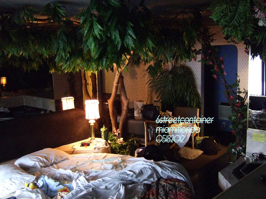
Domingo Castillo, Invite for 05182012 at 6th Street Container, 2012
DC: One of the reasons I came back to Miami to live and work is that New York forces abstraction. This is because you are completely removed from your situation and that becomes the situation. The things you are left with are the aesthetic situations that happen in abstraction. Coming back here I wanted to become more in tune with the reality of Miami. So I started painting, but I only want to make paintings that could be shown in furniture stores. Painting is the only medium that can never remove itself from the art conversation. Sometimes sculpture, video and photography can be broken down into their source materials. Painting, on the other hand, can never just be material. It will always be considered art. Because of this, generic painting becomes the equivalent of open source. It is a visual cue that represents…something. That self-awareness is something I pay attention to. Once you are self aware, it gives you the freedom to speak. Then you can start speaking about all these systems and how things function within them. It also opens these in-betweens, like subjectivity and objectivity, in doing these actions.
AG: Because there are so many different cultures converging here, and we as artists are looking in from the outside, many of the visual cues, for all their subtlety, appear obvious. If you are sensitive to it, these cues appear humorous because they are so simple and direct. Here is the cue and here is the sale. For some reason, El Dorado furniture store just came to mind. Maybe it is a good example of this.
LB: They have the boulevard.
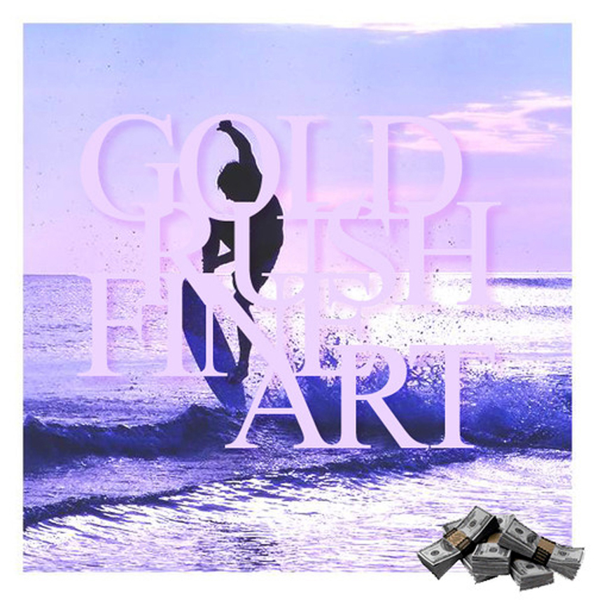
Domingo Castillo, Goldrush Fine Art Promotional Image, 2012
DC: They have the boulevard! The whole thing is a set-up. It’s better than IKEA because they have everything. It’s not just for the Bauhaus-oriented. It personalized and it’s not removed.
AG: It’s more exclusive. Whatever you are looking for, they have it and it’s affordable. Maybe we are comfortable with their hodgepodge because we all come from a Latin American background. It might be too pluralist for European or Caucasian sensibilities, whereas we are kind of used to the mess and assimilating everything. I remember in Venezuela, my family purchased a white minimalist painting and hung it in their predominantly Caraqueño-styled living room. They were very proud of it and loved to show it off as being expensive and eccentric, but once the stigma wore off it became like all their other paintings of pueblos and cows in pastures. It became just another visual cue.
DC: Kind of, though, because abstraction developed its own language in South America for such a long time. It isn’t another cow painting. It’s an abstract painting, that’s the “painting” you need in your house.
AG: I often think about how Modernism never left the conversation in South American art. In Venezuela, Op art is alive and well. Modernist formalism has recently re-entered the conversation in Western Contemporary art, but it is not taken in complete earnest. In South America, it is sacrosanct. They’re still doing it because they never stopped doing it. When you see this art in Miami, it becomes part of our colloquial perspective. It’s in this grey area. You don’t have to embrace it, but you consider it.
DC: Yeah, because you are seeing everything. You are walking into different houses and malls and you are seeing all these situations and possibilities. You are navigating all these weird contrasted spaces.
LB: When you are in people’s houses, they all bring as much of their culture as they can. It dilutes into this in-between, which is eclectic. Nothing is unified. It is a mess, but it is a nice mess. It keeps things interesting.
DC: No one is fully assimilating towards one thing, but you assimilate to what you gravitate towards. Everyone is gravitating towards three different things at once and all of these different cues are coming together to create a unique identity.
AG: I know this is cliché, but I am obsessed with the light in Miami. I am always trying to organize my work so this light makes sense within the context of the image.
LB: Coming from Caracas, we have El Avila. Nature is present and it is a beautiful feature of that city. Miami has light, but it is elusive and everything seems to slip through the cracks.
Aramis Gutierrez, Let Justice Be Done, Even If the World Perishes, 2012
AG: I have this German friend who gets depressed in the summertime because the light in Miami becomes so oppressive. It’s different somehow. It’s right above you and it’s on you all day, but the rest of the year, after summer, you get into this hedonistic relationship with the sky and the light. I have gone to great lengths to make sure my living quarters has a view of the sky. After some consideration I have even arranged my palette to consider this. I can paint whatever, but I am using these colors and thinking this way. I had Nick Lobo over at the studio recently and he mentioned that I am making very colloquial paintings, which is pleasing because the only cue that would communicate this would be the light. It isn’t conceptually engrained in the image but symptomatic of how I am making the work.
LB: It’s really funny that they look like Florida paintings.
DC: It’s the subversive atmosphere that is created by those colors and the light that you can’t be fully aware of, but you can feel it.
AG: The handling also outsets the light so that it becomes subversive. Tom McGrath once told me that my handling is scatological. When you compound that with light, it creates the possibility for contradiction, where something is grotesque and beautiful at the same time. I remember hearing that a lot of people in the early twentieth century thought the Everglades were ugly. This has long been the argument for paving over the swamps and developing them. If you remove something’s value, then annihilation is the proper thing to do. At some point there was a conservationist backlash. The argument arose that this habitat is in fact beautiful and people just weren’t considering their unique aesthetic. This predicament is anthemic to Florida; there is value here and people just don’t get it. How then do we imbue our culture with value so people will appreciate and respect it? This is why I am always thinking about the colloquial value of work I see here, because this is the key to what makes us special.
LB: The most important part of being colloquial is that it is real, it’s happening, and something is backing it up.
AG: Loro, you once said something I really agree with but I never really considered. You said you were more interested in seeing what artists in Miami are doing, rather than going on blogs or seeing artwork from the outside. Even going to someone’s studio here is a lot more interesting than being in New York, where everyone is breathing the same air.
LB: What you do every day is what you really are. That’s the way that the best art can happen and why I am interested in seeing what is going on here in Miami, because it’s part of my reality. It is in tune with who I really am, not who I want to be. Whether I like it or not, it is closer to who I am. I know the situation here isn’t easy for art to develop because we lack institutions and structure. I appreciate having the time, and I see people stepping up and learning on their own. This is why I think there is the opportunity for something good to happen here.
Gutierrez, Travel Wear, 2012
AG: It is a contiguous tabula rasa here. There are so many new cultures constantly pouring in from other places. In addition, you have new naturalized culture- participants whose descendants were displaced and are no longer in touch with their traditional cultural heritage. They were told about their culture, but they never experienced it first hand and have since moved on. This is a real opportunity and why I believe it is important for us to focus on new aesthetics instead of trying to seek validation through mimicry. Perhaps we don’t need another curator to come here from some out-of-state grad program, trying to find commonalities to compare with the art world at-large. Is it acceptable for someone trained in New York and L.A. to interpret our culture?
DC: They are also tourists. Even if they approach the excess of this place, they never fully appreciate what is going on here. They leave and say this place was unintelligible.
AG: I’m not trying to be dismissive about the academia already here, but as artists, is it our responsibility to form these people? Should we demand it?
LB: They have to spend enough time. We have good people who recently moved here who seem like they are interested in this place for what it is and want to make it work. I’m thinking of Diana Nawi and Amanda Sanfilippo, for example. And then we have people like Gean Moreno and Rene Morales that have always been about it. Maybe the validation of going to a respected grad program isn’t what is needed, but the time and the quality of what you do while you’re here.
DC: There is no syringe that pumps you or this city with information. You have to be here long enough to figure everything out for yourself.
AG: Someone has to really look at this and come to terms with how artists working here fit within our dynamic culture. The artwork here can have a common thread, but we are all coming from such different places. Maybe we need a sociologist.
Aramis Gutierrez was born in 1975 in Pittsburgh, PA of Venezuelan, Slavic and Scottish decent. He received a BFA in painting from Cooper Union in 1998 and studied an additional 5 years in post-baccalaureate studies. The artist has shown in New York, Philadelphia, Palm Beach, Miami, Istanbul, and was part of the Studio Residency Program at the Deering Estate at Cutler. Most recently he has exhibited at the Miami Museum of Art. Gutierrez currently lives and works in Little Haiti, Miami. spinelloprojects.com
Loriel Beltran was born in Caracas, Venezuela in 1985. At age fifteen, he moved to Miami where he obtained a BFA from New World School of the Arts in Electronic Intermedia. Beltran has exhibited at the Wolfsonian Museum’s Bridge Tenders House in Miami Beach, and has been part of group exhibitions at The Miami Art Museum, The Museo de Arte Acarigua Araure in Acarigua, Venezuela, The Fabric Workshop and Museum in Philadelphia. Solo exhibitions include Fredric Snitzer Gallery and Locust Projects, both in Miami.lorielbeltran.com
Mr. Castillo has unrivaled experience and expertise. He has been practicing fine art for over 50 years, advising some the most noteworthy companies in the Dominican Republic and nearly all the major corporations in Latin America. He is currently a member of the board of the main bank in the Dominican Republic. Mr. Castillo leverages his thorough understanding of the commercial and financial landscape on behalf of all the firm’s clients, advising collectors and artists on long-term strategies and crisis management.
His practice includes advising on corporate and commercial issues, mergers and acquisitions, finance and Foreign Investment across a range of industries and sectors. His extensive experience includes both non-contentious and contentious matters, advising on litigation, arbitration and mediation. In addition to advising clients, Mr. Castillo is also a prominent and active member of several boards of directors and administrative councils and holds senior positions on a number of committees.
He is also highly committed to pro bono work, as a member of the board of the Sur Futuro Foundation and the Perelló Foundation, private non-profit organizations that promote the well-being of communities in the southern region of the Dominican Republic. Mr.Castillo is also a board member and Treasurer of the Instituto Nacional de la Diabetes. In recognition of Mr. Castillo’s contribution to the Dominican Republic, he has been honored by the President with the Duarte, Sánchez and Mella Order of Merit, Gran Cruz Silver Plaque. This is the highest distinction that can be awarded by the Government of the Dominican Republic.
Beltran, Castillo, and Gutierrez will open “Guccivuitton” in Little Haiti, Miami in 2013.