4.2.13 Beneath a Thread of Stars: A Conversation with Anna Von Mertens by Beth Maycumber and Julie Dickover
Anna Von Mertens creates intricately hand-dyed, hand-stitched fabric works that reveal seemingly allusive moments of existence and time. She explores themes such as the aura surrounding figures in famous paintings, the circulation patterns of currents between magnetic poles, and the actual stars as seen above violent moments in American history. Von Mertens has recently exhibited at the Smithsonian American Art Museum’s Renwick Gallery, Berkeley Art Museum, and Ballroom Marfa, and the Museum of Fine Arts, Boston, has just acquired a piece of her work, which now hangs in the Linde Family Wing for Contemporary Arts. She is currently exhibiting in galleries in Florida and Maryland, and will show in Boston and the Netherlands later this year. We caught up with Von Mertens on February 28 in Saint Augustine, Florida, the day before the opening of her solo exhibit “What Could Be”.
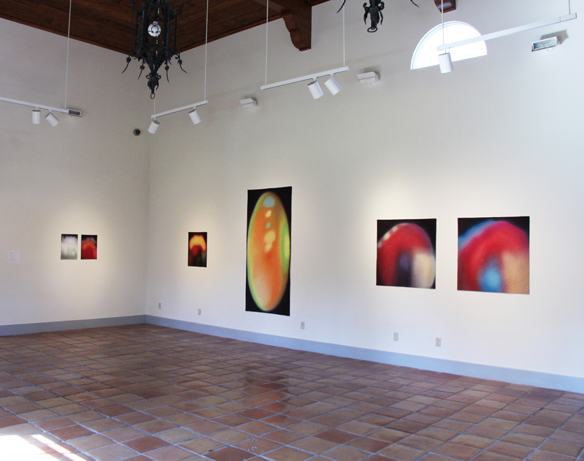
Portrait series, Installation image, Crisp-Ellert Art Museum, March 2013
Beth Maycumber: Could you start by describing your process for creating the aura portraits?
Anna Von Mertens: Typically, I start a series by creating a system, fleshed out with research, and then build the work visually from there. This series came at me sideways: while working on a previous series, observing how the dye was running together, I thought, these really remind me of aura photographs, the way the colors come and go, and the boundaries between them. I got stuck on the idea of auras—I couldn’t shake it. I wanted to shake it. I was like, “Auras? Come on!” But they stuck with me.
The premise is to create auras of famous paintings. I would select a famous painting, the sort referred to in Art History 101, paintings that live larger than the actual object itself. I chose paintings with an intense relationship between painter and sitter, as well as portraits of strong personalities, and used that context to build my story of the painting’s aura.
When you get your aura photographed, you place your hands on an electromagnetic sensor and the computer translates those electrical frequencies into the color spectrum. A Polaroid photo of you is then placed over it, so it’s actually two superimposed layers.
Julie Dickover: The image that is translated to the computer then is the electromagnetic current?
AVM: Right, that’s your aura reading, and they superimpose a Polaroid on top to make it seem like it’s around you, but they are actually separate. So with my series, the two layers of dyeing and stitching make sense. You have the aura itself, and then I’m superimposing art history on top of that by using the original image. It mirrors the process of getting your aura photographed.
There is a “science” to aura interpretation. Each color has significant meanings, and the location of the various colors—whether manifesting above your head, or coming in on your left side, or exhibiting outward on your right—is important. So I would reverse engineer these auras by creating narratives about who was Philip IV or Mona Lisa, and try to represent that with these rules of color.
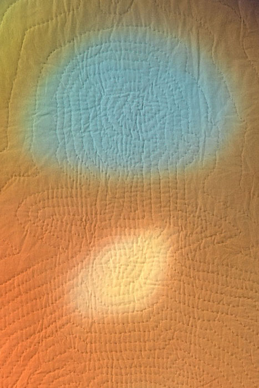
For the dyeing process, I stretched white cotton onto a frame and painted the dye on with a brush, building the color slowly because the dye is like a loose watercolor, but it immediately starts chemically bonding with the fabric. The colors bleed into one another, and while you want those edges to leak, you also want to be in control of them. You’re right on the edge, falling in and out of control with the color.
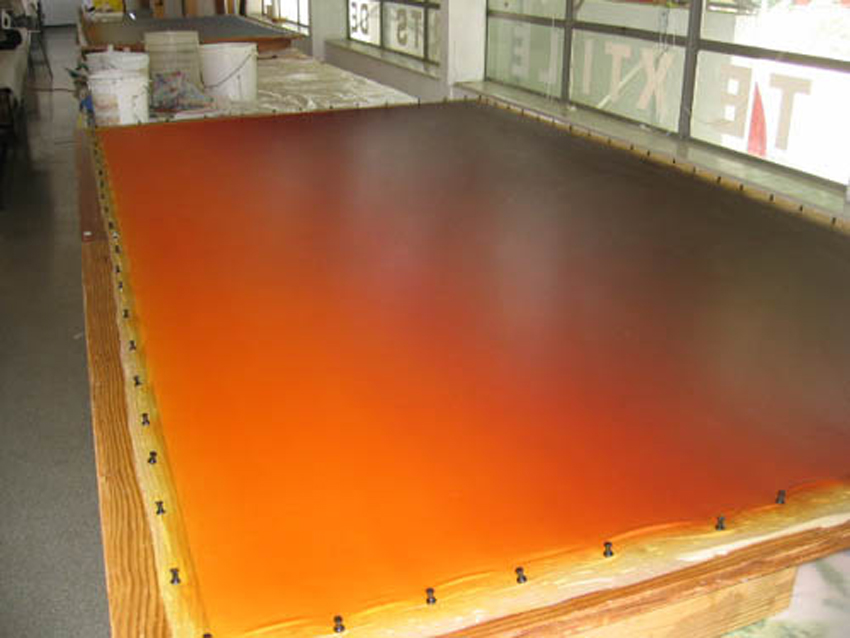
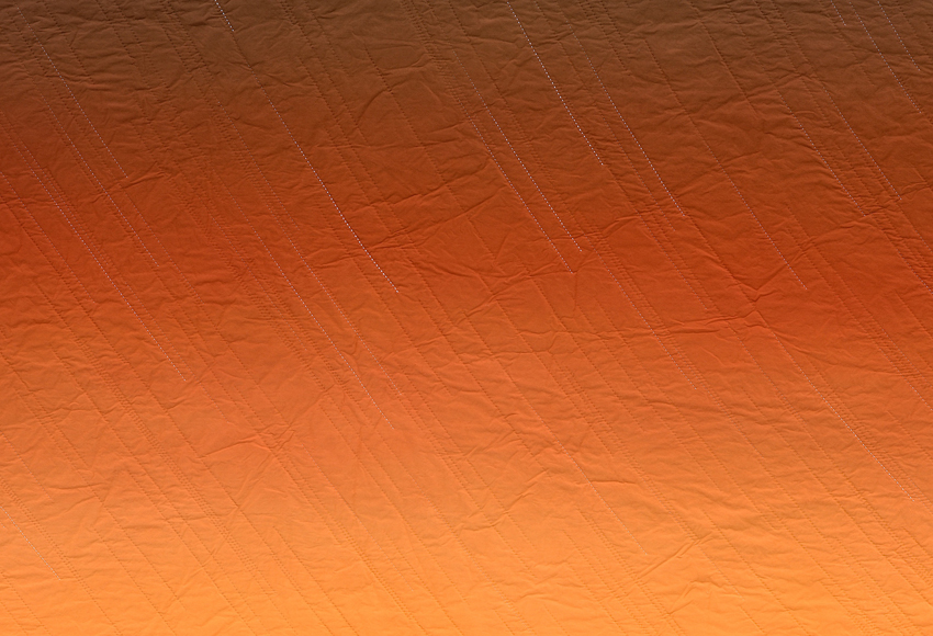
“Gold! Gold! Gold from the American River!” (Sunset, January 24, 1848, Sutter’s Mill, Coloma, California) during the dyeing process, courtesy of the artist.
Each piece has seven to ten layers of dye, and I would build up the layers until it had the intensity I wanted. I was working much more intuitively than normal, just responding to the color in front of me. But because I had this system of analyzing auras to follow, I tricked myself into working intuitively.
JD: Did you have failures? Pieces that just didn’t work?
AVM: I did—I had almost forgotten this. I started with the Mona Lisa—a logical starting point: the most famous painting. It took maybe four attempts, four failures. I didn’t know if technically I could pull off the effect I wanted to achieve. It’s challenging to keep the dye behaving the way you want while allowing it to do its own thing, but that was the fun part. So after those four passes, I almost gave up. Once I learned that you can never go backwards with the dye, as long as I built the color up slowly enough, I felt like, okay, this is going to work.
Mona Lisa, hand-dyed, hand-stitched cotton, 2009, courtesy of the artist and Elizabeth Leach Gallery, Portland, OR
BM: So you dye first, and then begin stitching?
AVM: Yes, you have to do the dyeing first because the fabric needs to be tight to get those even transitions. It’s funny to even say that because over the years, I’ve felt in competition with painting, and have tried to embrace textiles on its own terms. Here I’m taking painting head on, stretching out this canvas with a brush in hand—and the subject matter is obviously all about painting. It was interesting to inhabit the world I had been avoiding.
Back to your question, the dyeing comes first, and once I’m happy with the color, I project the original painting onto the fabric and chalk out the figure’s silhouette. My auras are the same proportions as the original painting, so the two fit to scale. Here you can kind of see Philip IV’s body, his front foot pointed out, and he’s got this high, strange collar on, that gives him this very unique silhouette. After chalking the silhouette onto the fabric, I then mark the figure’s chakra points, and from that create my own aura-like emanation. The original painting is recognizable while a suggestion of something else.
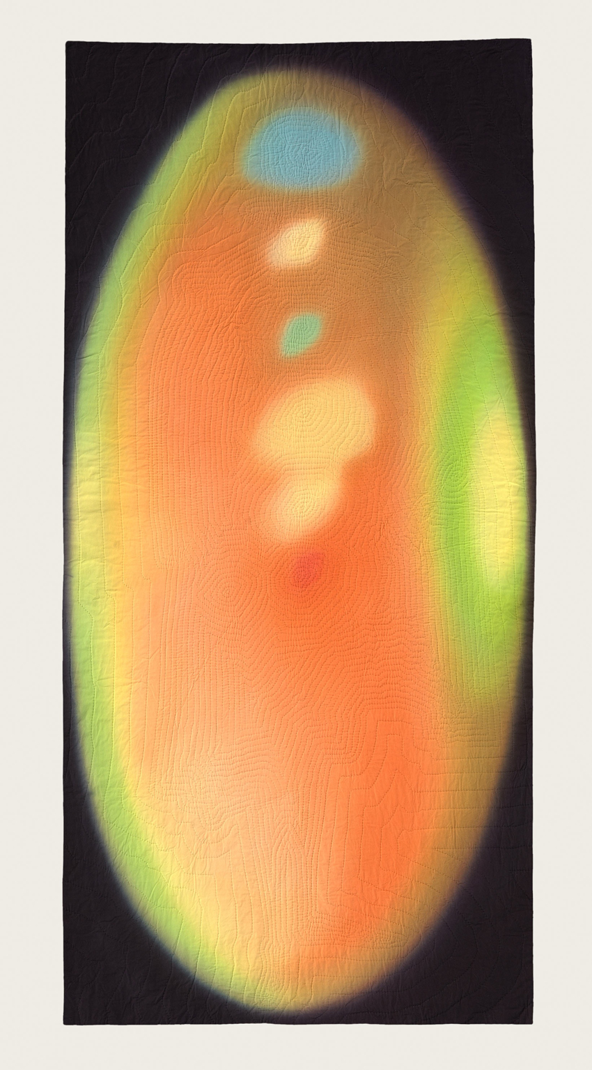
Philip IV’s aura, after Velázquez, hand-dyed, hand-stitched cotton, 2009, courtesy of the artist and Elizabeth Leach Gallery, Portland, OR
JD: How do you dye the stitching?
AVM: I wanted the stitching to be an invisible layer, so I matched the color of the thread to the background aura. There’s enough range that I’m able to buy commercially available dyed thread. I’m glad you think the thread is hand-dyed because I wanted that to appear seamless. Sometimes I would have to change thread color every couple of stitches to pull it off.
To clarify, I am not a craft martyr; I don’t take the stance that it has to be done by hand. If you can only achieve an effect by hand, it needs to be done that way. The dyeing can obviously only be done by hand, and the quality of texture that you get from hand quilting is only achievable through the hand. Because of the two interlocking threads, machine quilting would just flatten it, versus the dotted line of the hand stitching. I hand stitch simply because it is the only means to reach the end that I want. If there is commercially dyed thread that is the color I want, I have no problem going out and buying that.
Detail of Philip IV’s aura, after Velázquez
JD: Your work makes me think about how a quilt is a domesticated, functional craft object, and yet, you’re treating it as an art object, a painting. There has been a lot of work over the past ten or so years that has brought craft to the forefront of contemporary art making. Have you always made work like this? Did you use to be a painter and then transitioned to textile work? How do you negotiate the line between craft and fine art?
AVM: I studied fine art; since first grade I knew I wanted to be an artist. Originally, I followed a more traditional path of drawing and printmaking. I made my first patchwork quilt on a whim senior year in college, and fell in love with the materials and the process. It took a while, but slowly the two roads of craft and fine arts converged. I wanted to use the subtext, the meaning inherent in the quilt, and have that be my foundation for building my ideas. The two worlds came together.
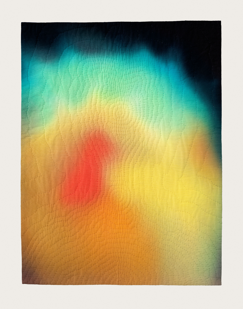
Frida Kahlo’s aura, with Thorn Necklace and Hummingbird, hand-dyed, hand-stitched cotton, 2009, collection of Ann Hatch, San Francisco, CA
I have thought these dyed auras are so beautiful on their own, could I just stretch them like canvases? Ultimately, there is some transformation that happens when they become objects; they have more of a presence in the form of the quilt. I see hand quilting as my own way of “framing.” There’s also an accessibility that’s different if they didn’t have that layer of hand stitching to them. Even though these pieces are very far removed from the bed and the original context of the quilt, they still carry those meanings that then transform the work.
BM: It’s interesting that you say that, because I know with at least some of your earlier work, you displayed pieces on flat platforms that resembled beds. I am curious about what made you change to showing the works on the wall.
AVM: In grad school, I practically signed my own personal manifesto: my quilts needed to be displayed in the form of the bed. I wanted my work to address the site of the bed as a way to stay true to the origins and meaning of quilts. For a long time, I only displayed them in that format. I loved using that constraint as a conceptual jumping off point. But after a while I didn’t want such a strong association with the bed. I kept looking at the wall, wanting to put my works there, but because I had sort of signed this manifesto, I couldn’t do it. Finally, I realized the wall is not the enemy. The wall is about the act of looking, so if I make the works about the act of looking, they belong on the wall.
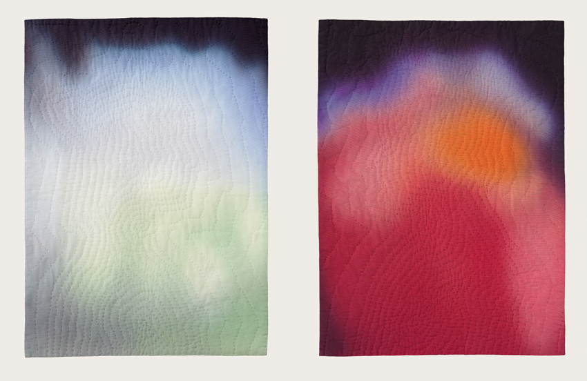
The Duke and Duchess of Urbino’s auras, after Piero della Francesca, hand-dyed, hand-stitched cotton, 2009, courtesy of the artist and Elizabeth Leach Gallery, Portland, OR
That’s how I landed on the idea of stargazing as the ultimate form of looking, this existential looking as a way of locating ourselves in this world. Thinking how the act of looking allows you to be more conscious of where you stand, I launched into the whole star series. The work in this gallery [the Portraits series] obviously belongs on the wall because it specifically refers to the history of painting, but it’s not like I’ve ruled out the sculptural; maybe a new series will come up where it becomes again about the space of the every day, the space where we live and walk, and then I’ll return to sculpture.
JD: One thing that is interesting about your work is how you tow the line between craft and formal aspects, but also the conceptual ideas and the research that goes into each series. Do you regard those issues as being equally important, or do you place a greater importance on one or the other? Is it important for the people viewing your work to know everything that goes into it?
AVM: Not that one trumps the other, but I definitely start the work from a conceptual framework and the idea carries me through the process. Beauty and formal decisions are important to me, but I spend so much time and work with the piece itself, if I didn’t have an idea or narrative to carry me through, I wouldn’t get to the other side; I wouldn’t finish the piece. It’s not that one is more important than the other, but that I couldn’t have one without the other.
Aesthetically, I am a minimalist at heart, but it sometimes can leave you cold. Minimalism’s original goal was to be much more accessible—by distilling the essence it would gain that much more. But it turned out it can be quite the opposite. In some ways, I’m trying to bridge to that original goal, distilling my idea down to its purest aesthetic form, while still maintaining its accessibility.
Black Gold (Sunrise, January 10th, 1901, Spindletop, Texas), 2011, detail, from the series Endings, courtesy of the artist and Elizabeth Leach Gallery, Portland, OR
In terms of what the audience knows and what’s revealed to them, I try to have the titles be an entry point, to launch the viewer with that piece of information. I also often have additional materials that accompany the work. I used to think of that as a weakness, that the work itself should contain everything. Then I thought of conceptual work from the ‘60s and ‘70s, and realized that stories were attached to these works, almost a mythos was created around them, that ended up augmenting the work. That became part of my process.
A tipping point for me was when I first showed the series “As the Stars Go By” at Jack Hanley Gallery. That work is so historically based—it shows violent moments in American history and the stars above them. I wrote up what occurred during those historical moments, and why they were such pivotal events. At the opening, word got out that this text was available, and the gallery said they had never printed so many handouts for any show before. I realized there is a hunger for that.
JD: Yet, not unlike wall text in huge museums, there is sometimes a backlash against it.
AVM: I think the backlash often for wall text is that it’s trying to describe what your experience should be of the piece—
JD: —Interpreting the piece for you.
AVM: Exactly. With my work, I provide information, either facts or circumstances, to accompany the work. Quilts have always had stories told about them; the story gets tied to the object. But quilts and stories are not sexy terms. Conceptual art, however, has its construct, or it has a long-winded title. These, too, are stories. Just because one is craft and the other art, there shouldn’t be a hierarchy. So I am trying to reclaim the idea of story.
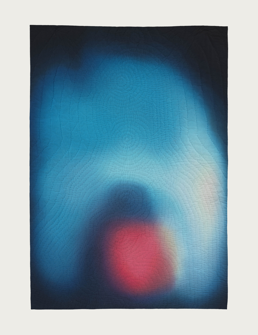
BM: Can we talk about these pieces [“You and Me” series] here?
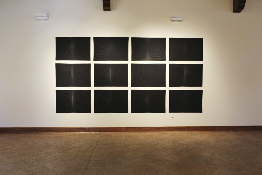
You and Me series, Installation image, Crisp-Ellert Art Museum, March 2013
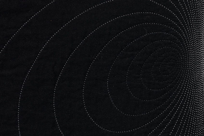
AVM: Right after my second child was born—I mean literally two days after—I needed to get back into the studio to restore my sanity. I had typical postpartum spikes of joy, and complete love for this child, along with a real sense of feeling overwhelmed. I had this image, on maybe day five of my son’s life, of how current circulates around two magnetic poles, how that was a metaphor for the push and pull of this intense relationship.
Using the same source image for each piece, I treat the poles differently: using the gray scale, I shift the color of the thread to highlight different areas of the piece. I named each piece after a rock song because I liked playing off the idea of romantic love, that melodramatic, intense love—like this piece named for a song by The Smiths [“Heaven Knows I’m Miserable Now”]. But hidden underneath the melodrama of young love was for me this relationship between mother and child.
At the outset of this series I also knew, with the realities of having two young kids, I wouldn’t be able to get in to the dye lab for a while. I wanted to work on a small, intimate scale, work in black and white, and work really simply, to mirror my year of becoming a mother of two. The irony was, despite this simple concept, this series was insanely technically challenging to pull off. The transitions between thread had to be precise. In certain works, I had fifteen shades of thread within two inches. This simple, beautiful idea at times drove me crazy, but I came out the other side, just like I came out the other side of those newborn sleepless nights.
You and Me (Heaven Knows I’m Miserable Now), detail, hand-stitched cotton, 2011, courtesy of the artist and Elizabeth Leach Gallery, Portland, OR
The intensity of those threads so close together is like the point in a relationship where you lose your sense of self. With the hand quilting, at times I love it, and at times I hate it. I only make one piece at a time, which creates a nice cycle: the research phase, the dyeing process, the hand stitching. Taking it one step at a time makes it continually feel fresh.
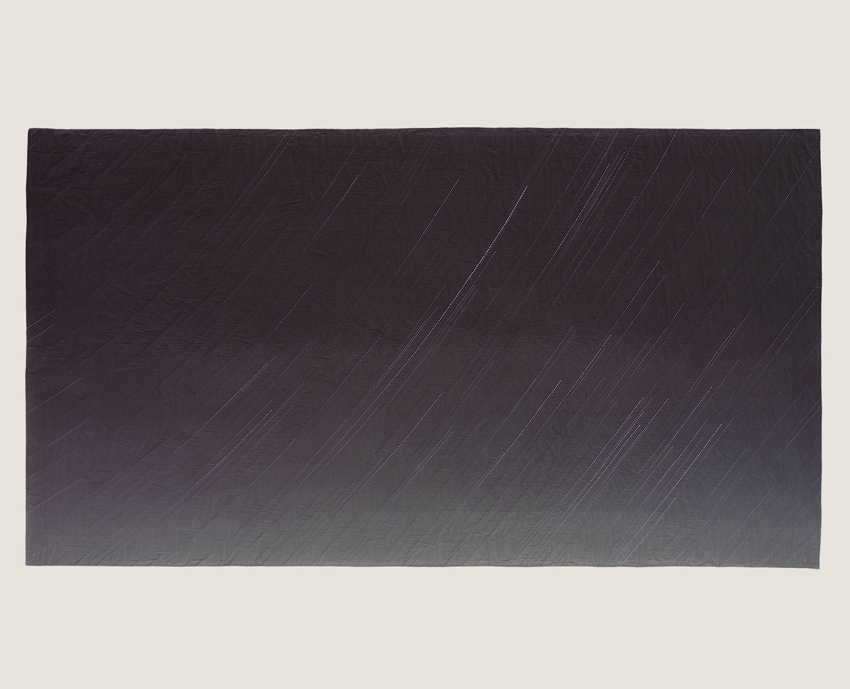
The remaining three works in the show [“Jupiter Rising”, “Black Gold”, and “Gold Rush”] are from two different series, but share the same premise. They use star calculation software to map stars above historic events.
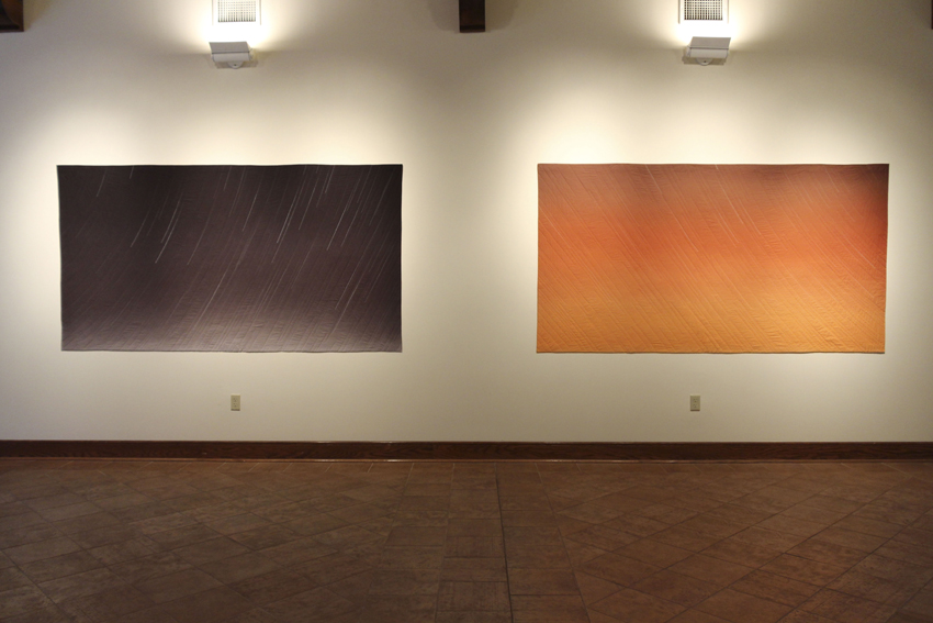
Endings series, Installation image from Crisp-Ellert Art Museum, March 2013. Left: Black Gold (Sunrise, January 10th, 1901, Spindletop, Texas), 2011, hand-dyed, hand-stitched cotton, courtesy of the artist and Elizabeth Leach Gallery, Portland, OR. Right: “Gold! Gold! Gold from the American River!” (Sunset, January 24, 1848, Sutter’s Mill, Coloma, California), 2008, hand-dyed, hand-stitched cotton, Private Collection
This diptych [“Black Gold” and “Gold Rush”] is about dawn and dusk, an obvious transition point between one thing ending and another beginning. I wanted to use that moment as a broader metaphor for those times when we close one chapter of our lives and look forward to the future. The piece on the right [“Gold Rush”] shows stars coming into view on the evening gold was first discovered in California, leading to the California Gold Rush. The piece on the left [“Black Gold”] shows the stars on the morning the Spindletop geyser blew in 1901, and the modern oil industry began. They represent the allure and pull of the future, as well as the events these discoveries set in motion. Reading like Hollywood film stills, one is a black-and-white Western, while the other conjures the idea of riding off into the sunset.
BM: Am I correct that you were commissioned to do a piece for Ballroom Marfa? Can you speak about that experience?
Yes, this diptych [“Black Gold” and “Gold Rush”] was that commission. I had never done a commission before, but was up for the challenge. Thinking about topics relevant to Texas, I started looking into the drought Texas is currently experiencing. That launched me into research about the history of drought cycles and I came across recent international studies linking climate change with the fall of empires. Thinking of the United States and the eventual fall of its oil empire, I was excited to make this connection. But I was dependent on scientists who were generously collaborating with me, so realized I wouldn’t make my Marfa deadline, but it was still an amazing process because it launched an entire series I am working on now, linking drought cycles to catastrophic events.
So with oil on my mind, and thinking of Marfa’s rich film history, I returned to the stars and made the Spindletop piece. The reference to film stills really clicked when the diptych was shown at Ballroom Marfa— the film Giant is shown continuously at a hotel in downtown Marfa and there is a film poster with an orange background that reads just like the “Gold Rush” piece.
It was also a thrill to get to travel to Marfa after hearing about it for so many years. It is one of those places where the legend looms large, and when you get there, it still lives up to all of your expectations.
Jupiter Rising, January 7, 1610, Padua, Italy, 2008, from the series, Look to the Heavens, hand dyed, hand-stitched cotton, courtesy of the artist and Elizabeth Leach Gallery, Portland, OR
This piece [“Jupiter Rising”] is from a different series, “Look to the Heavens.” I had been depicting the stars, but not with any particular relation to astronomy. So for “Look to the Heavens,” I turned to actual astronomical events where what is seen above is clouded by our belief systems below. This piece is the evening Galileo first spotted Jupiter’s moons, which validated Copernicus’ theory that the earth was not the center of the universe. In his diary, Galileo wrote the exact time and date of his sighting so the software program is a way to time travel and see the stars Galileo saw. Galileo was put on house arrest for the rest of his life because of this discovery, so this series highlights how even observable facts can be controversial.
BM: In your historically based pieces, how do you choose which moments to focus on?
AVM: With the “As the Stars Go By” series, showing the stars above violent moments in American history, I chose these pivot points where what came before changed what followed. The Vietnam War changed our idea of war, but within that, I chose the Tet Offensive because, while strategically it was not a successful mission for the Viet Cong, it was a mental tipping point for the American public. Another example is the Wounded Knee Massacre, the last “battle” in the American Indian Wars.
Detail of “Gold! Gold! Gold from the American River!” (Sunset, January 24, 1848, Sutter’s Mill, Coloma, California)
But sometimes the image comes first. Like with the “Gold Rush” piece I wanted to do the most over-the-top Hollywood sunset, and watched some old Westerns trying to find that quintessential moment of riding off into the sunset. Only later did I figure out the piece should be about the California Gold Rush. So the historic references come in different ways, but they’re all about the idea of one thing ending and another beginning.
BM: Do you feel like your work is going in a certain direction at the moment?
AVM: The series I’m working on now uses historic tree ring cross-sections pulled from studies that link climate change with periods of human instability: the Fall of the Roman Empire, the Aztec Conquest, the Black Plague. My work is increasingly political, perhaps just a sign of our times. But we’ll see. I never know where a new series will take me, which is scary and delightful at the same time.
“What Could Be” is on view at the Crisp-Ellert Art Museum through April 12. Von Mertens’ work can also be seen at the Museum of Fine Arts, Boston, Linde Family Wing for Contemporary Arts; Salisbury University Art Galleries, Salisbury, Maryland, from March 4-April 6; Mills Gallery, Boston Center for the Arts, from April 19-June 30; and at the 2013 Rijswijk Textile Biennial at Museum Rijswijk, in the Netherlands, from June-November.
Beth Maycumber is currently working on a Master’s degree in Library and Information Studies at Florida State University; she also holds an M.A. in U.S. History from the University of North Florida, and a B.A. in History and Art History from Flagler College. Her recent projects include curating two special exhibits about Jean Ribault’s 1562 voyage to Florida at Fort Caroline National Monument, and participating in artist Harrell Fletcher’s “Before and After 1565” project at the Crisp Ellert Art Museum. She lives in St. Augustine, Florida, with her husband and son.
Julie Dickover is the director of the Crisp-Ellert Art Museum at Flagler College in Saint Augustine, Florida, where she has organized exhibitions by artists such as Montreal based video artist Julie Lequin and photographer Mark Ruwedel, as well as a collaborative interdisciplinary project and exhibition with Portland, Oregon based artist Harrell Fletcher. Dickover is also an advisory editor for At Length. Prior to living in northeast Florida, she lived in Los Angeles where she worked as a registrar at UCLA’s Hammer Museum.
Tags: Journal
1 Comment
Pingback: “What Could Be” at Crisp-Ellert Art Museum through 4-12-2013 | artthatdoesntsuck