01 12
Vol. 01 Issue No. 12
Read the Journal: site95_Journal 01_12e
Elizabeth Huey, Paul Judelson, Susan McLean, Niv Rozenberg, Charlie Rubin, Cary Whittier, and Stephen Yang
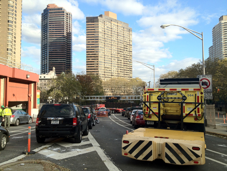
Regardless of how aware and prepared people might have been, Hurricane Sandy took everyone off their guard. Wind gusts over 90mph slammed into the coast of New Jersey, Manhattan, Brooklyn and on, demolishing the shorelines and affecting peoples home and work environments. This issue is dedicated to the NYFA Emergency Relief Fund in their endeavor to provide aid for artists and organizations devastated by the hurricane. Our goal is not only to raise funds for the cause (all site95 proceeds will be donated to NYFA) but also awareness to the community at large that there are ways to find help and continue to make work. Meaghan Kent
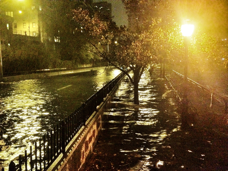
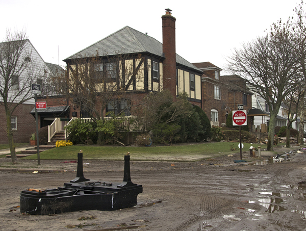 Elizabeth Huey, Piano, Belle Harbor
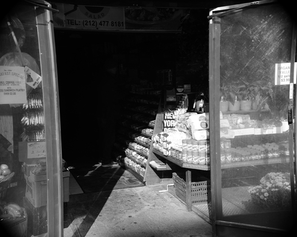
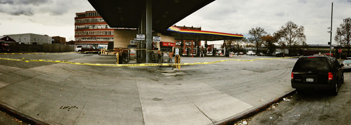 Cary Whittier, Untitled
 Elizabeth Huey, Morning Before Sandy
 Elizabeth Huey, Home Rockaway
 Elizabeth Huey, Fire, Rockaway
 Elizabeth Huey, Brighton Beach
 Charlie Rubin, After the Storm (In to the Dark)
 Charlie Rubin, After the Storm (Monolith)
 Charlie Rubin, After the Storm (Daytime)
 Niv Rozenberg, DUMBO, Oct 2012
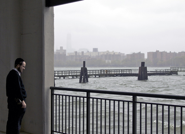
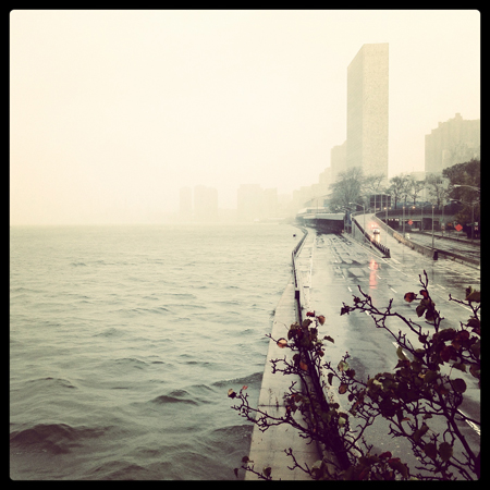 Paul Judelson, View of the river, FDR Drive and UN Building from the East 51st Street skyway.
 Paul Judelson, The East River starts to rise hours before the storm hits.
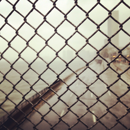
 Paul Judelson, FDR Drive at 51st Street facing north.
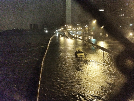 Paul Judelson, The FDR Drive flooded. A taxi that didn’t make it. UN Building in background.
 Paul Judelson, 2 AM. West 29th Street and Fifth Avenue
 Paul Judelson, 1 AM.
 Paul Judelson, Midtown Tunnel closed days after the storm.
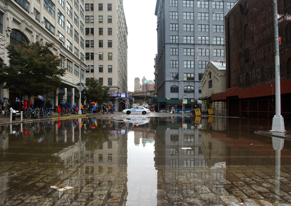
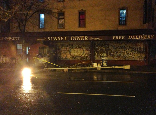
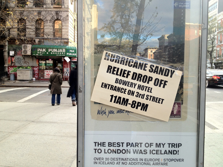 Paul Judelson, East Village after the storm.
 Paul Judelson, Bortolami Gallery reopens in Chelsea.
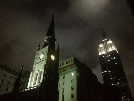
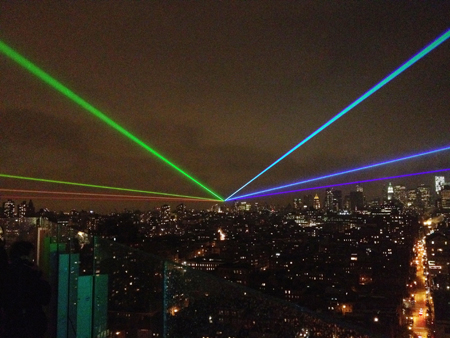 Paul Judelson, Yvette Mattern, Global Rainbow After the Storm
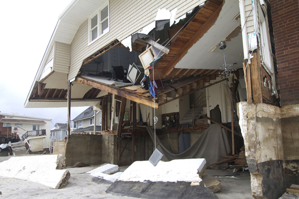
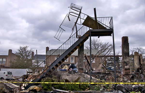
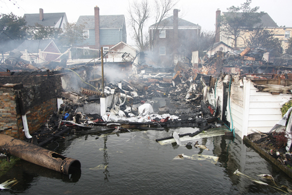 Stephen Yang, October 30th, 2012 – Queens, NY: The scene at 130th St. and Newport Ave. in Rockaway where many houses were burned down after Hurricane Sandy hit the area. Locals milled about looking for reminders of their houses in a daze
 Stephen Yang, October 30th, 2012 – Queens, NY: The scene at 130th St. and Newport Ave. in Rockaway where many houses were burned down after Hurricane Sandy hit the area. Locals milled about looking for reminders of their houses in a daze.
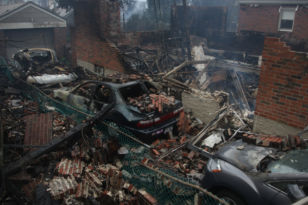 Stephen Yang, October 30th, 2012 – Queens, NY: Burned cars lay in rubble from houses at the scene at 130th St. and Newport Ave. where many houses were burned and destroyed after Hurricane Sandy hit the area.
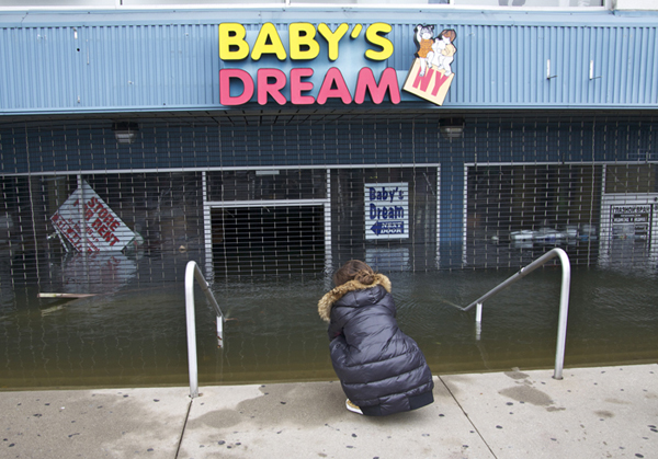
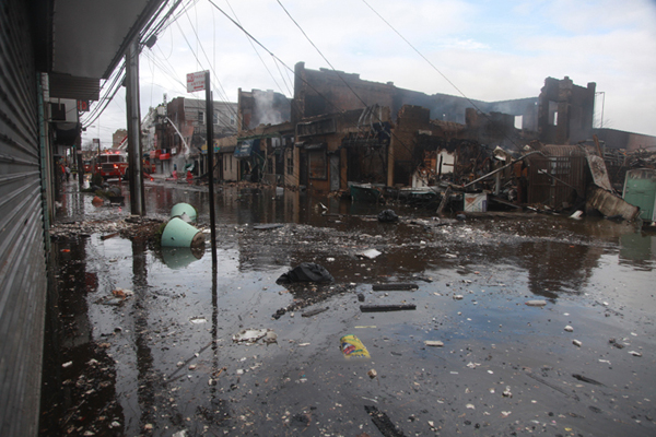 Stephen Yang, October 30th, 2012 – Queens, NY: A flooded Rockaway Blvd. near Beach 114th St. after floods and heavy wind from Hurricane Sandy hit the Rockaways.
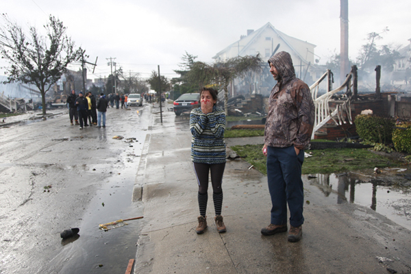
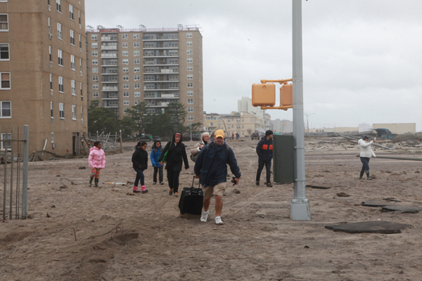 Stephen Yang, October 30th, 2012 – Queens, NY: A family evacuates, walking with their possessions down the Rockaway boardwalk near Beach 105th St. after floods and heavy wind from Hurricane Sandy hit the Rockaways.
 Cary Whittier, Untitled
 Cary Whittier, Untitled
 Cary Whittier, Untitled
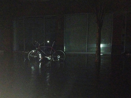
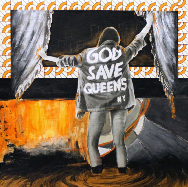 Susan McLean, Queens
12.24.12: Mark George
Mark George’s paintings of love, anguish and anxiety spare no emotion, and bare no subliminal message. George’s work demonstrates his commercial art background, graphic design, and the idea of painting. With no visible brushstrokes, the pieces have a flat color quality seen primarily in printed work. The paintings on the torn panels are an attempt to embody an era of mid-century Americana in advertising and urban street art. The material gives the work an abandoned quality that suggests the piece is not a painting per se, but a relic or illustrative portion of an old billboard or advertisement. The look created is genre crossing: a Dada approach, a Pop sensibility.
Mark George is a self-taught artist that grew up enjoying Speed Racer and Johnny Quest re-runs. His work has been exhibited throughout the United States. Some recent exhibitions include: “Jet Set Glamour”, Harold Golden Gallery, Miami, FL (2012), “The Panelists”, Living Gallery, San Clemente, CA (2012), “A Pre Existing Condition”, Hogue Hospital, Newport Beach, CA (2011), and “Art Basel”, Harold Golen Gallery, Miami, FL (2011).
Artists Website: markge.org/e/
12.17.12: Gina Beavers
Palate, Clifton Benevento, New York, November 10 – December 22, 2012
Clifton Benevento is pleased to present “Palate” a solo exhibition by Brooklyn based artist Gina Beavers.
In Beavers’ latest body of paintings the artist appropriates photographs of food from social media and images taken by friends or acquaintances to create works querying notions of taste.
Using these images as source materials, Beavers re-creates the primary image, initially by layering and building areas in thick swathes of acrylic medium and finally finishing with a specific rendering of the object on the dried form’s surface. By layering her materials the artist creates paintings with an almost sculptural quality, these works can also be read as reliefs. Here, the physicality of Beaver’s paintings counteracts the finish-fetish often associated with contemporary painting. These works suggest an aesthetic influenced by both impressionism and craft-art more than a practice structured around the gloss of advertising.
While Beavers earlier work often veiled the original source materials, the artist’s current paintings leave intact the essence of their origins. By appropriating imagery, including photographs and in some cases paintings composed by others, the artist is able to forego much of fraught decision-making of creating an original painting, thus producing images that can both reflect, distance and underscore their relation to “the real”.
Evidencing a twin conversation about culture and formalism, Beavers’ “food paintings” magnify and distort elements of her source materials, her representations of food may appear plastic instead of organic. Here, tomatoes and potatoes take on a near translucence and suggest, via the title of the exhibition, parallels between literal and artistic taste.
Gina Beavers (b. Athens, Greece, 1974) is an artist based in Brooklyn, NY. She holds a BA in Studio Art and Anthropology from the University of Virginia (1996), an MFA in Painting and Drawing from the School of the Art Institute of Chicago (2000) and an MS in Education from Brooklyn College (2005). Recent solo exhibition include PACS (Brooklyn, 2011), Nudashank (Baltimore, 2012) and James Fuentes (New York, 2012). Recently projects include “Leave it to Beavers,” Gallery Diet (Miami). Beavers is a founding member of Art Book Club In June, 2013 Beavers will be featured in a two person show with Devin Troy Strother at Cooper Cole (Toronto, Canada).
Gallery Website: cliftonbenevento.com
Artists Website: ginabeavers.com
12.10.12: Peter Gordon
I layer tens of thousands of marks in these large-scale drawings, which test my limitations, progress, and ability to adapt. While drawing, I encounter choices similar to those I face as a living thing, including aspects of timing, pressure, abundance, growth, and decay. I see references to my experiences and survival in the play of lines. For inspiration, I go outside to connect with my surroundings in different weather and lighting conditions, and especially enjoy the active visuals in forests and streams. I want my compositions to feel curious, stable, and unpredictable.
Peter Gordon is a painter, teacher, and graphic designer in the Washington D.C. area. He earned his MFA at the University of Maryland in 2007, and BFA at the University of Massachusetts in 2002. He has participated with the artist collectives, Sparkplug, in Washington D.C., and The Storefront Artist Project, in his hometown, Pittsfield, Massachusetts. Peter’s artwork has been widely exhibited, including shows in Washington D.C., Maryland, Virginia, Massachusetts, New York City, and abroad. He continues to develop his artwork, exhibit, and work with other artists.
Artists Website: petergordonart.com
12.2.12: L For Leisure by Special Affects Films
For the last three years we have been working on our first feature film L FOR LEISURE. We’ve already filmed over 70% of the film in seven separate locations. The end of production is finally in sight and we need your support to get us there.
L FOR LEISURE is an impressionistic, episodic comedy about laziness, wandering and wasting time. Hanging out with teenagers when you’re thirty, smoking nutmeg to get high and eating pie until you fall asleep. Training a dog how to boogie board. Set to the rhythm of the school-year calendar, L FOR LEISURE tracks the changes to the collected spirit of a group of graduate students through 1992-93 as they go on various vacations. Out of their elements and hyper-aware, the students are gradually drawn into a highly casual metaphysical struggle. In its focus on highly thoughtful but somehow clueless characters, L FOR LEISURE is an homage to the 90s films of directors like Hal Hartley, Whit Stillman and Eric Rohmer. But L FOR LEISURE takes a more panoramic approach, treating its characters and scenarios as deeply contextualized moving parts and using them to explore ideas about adulthood, lifestyle, alternate universes and friendship.
Production has taken us to Coastal New Jersey, Newport Beach, the California mountains, Connecticut, Côte d’Azur France, and in November 2012, twighlighty offseason Iceland! The locations are exotic but each shoot has been accomplished as cheaply as possible. Every aspect has been DIY and not just by ourselves. Our wonderful actors have regularly pulled double and triple duties as drivers, cooks, lighting assistants, you name it. Locations, cars, props and countless meals have been generously donated. Our funds have come from a number of sources: our families (thanks guys!!), foreign extreme sports enthusiasts (thanks bro!), and our own pockets: nearly $40,000 in contributions. But we need you to help raise the $14,000 necessary to complete production.
There are just three shoots left: the opening scene set in Los Angeles, the closing scene set in Mexico and featuring a surfing dog(!), and “Laser Wars” set in the apocalyptic future. These final three shoots are slated for January 2013, so to be able to buy plane tickets, hold locations, and secure actors we need these funds soon! Our deadline is December 10, 2012. THANK YOU FOR YOUR CONTRIBUTIONS!
Making films as a two-person operation has always been a challenging process. L FOR LEISURE has involved scheduling shoots with nearly thirty actors, arranging locations and lodging far from everyone´s homes, and running production without a professional crew. On top of this, working in 16mm leaves a very small margin for mistakes or on-set corrections. Every time we shoot, the film could be damaged or exposed and all our work would be lost. Working together on nearly a dozen projects these last ten years has taught us to build on what works for us and accept our limitations as a two-person team. And most of all, be patient when the inevitable setbacks come. We´re confident with your support that these last shoots will be completed and will look great. Nearly all the actors and locations are scheduled and confirmed – a much better position than we´re usually in at this point. However, finishing the shoot will not be the end of the process. Post-producing a film: mixing and mastering the sound, color correction and promotion present demands that are not within the scope of this Kickstarter campaign. After the film is shot, we will be able to either prepare the film for festival tours ourselves (as we did for BLONDES IN THE JUNGLE), or to partner with organizations that can bring this innovative and fun project to the larger scale we think it deserves.
Special Affects Films is Whitney Horn and Lev Kalman.
Film blog: leisureiswar.tumblr.com
Artists Website: specialaffectsfilms.com
11.26.12 Featured Artist: Greg Lindquist
My work examines the fictive distinctions of nature and culture through painting and installation. Some of my paintings depict enigmatic objects in the landscape, while others compose the landscape through framing that recalls digital technologies that mediate how we experience the world. In the end, my painting is site-specific and can only be truly viewed in the context and the real space in which it is displayed.
Greg Lindquist is a New York-based artist who earned a dual MFA in painting and art history from Pratt Institute in 2007. Recently, Lindquist has participated in the group shows “Planet of Slums,” co‐curated by La Toya Ruby Frazier and Omar Lopez Chahoud at Rutgers University, NJ and Third Streaming, NY and “No One is an Island” also curated by Omar Lopez Chahoud at LMCC’s exhibition space on Governor’s Island. He is the 2009-10 Pollock Krasner Foundation Grantee and the Sally & Milton Avery Arts Foundation Grantee for the 2009 Art Omi International Artist Residency. His work has been featured in various publications, including Art in America, ARTNews, Frieze, Harper’s Magazine, The New York Sun, The New York Observer, and The New York Press and Sculpture. His work is currently on view in the 2012 Art on Paper Biennial at the Weatherspoon Art Museum in Greensboro, NC and The University of Arizona Museum of Art.
Artist website: greglindquist.com
11.19.12 Featured Artist: Christine Carr
With this series I am transforming ordinary contemporary buildings into sites of power and mystery. Often, the most suitable structures include empty office buildings, parking garages, shopping malls and civic centers. Despite their everyday nature and common architecture, for me these buildings elicit visions of ancient monuments such as mastabas and the Egyptian pyramids, which were created to memorialize kings. I location scout during the day, searching for buildings based on surface, shape and size. Light, non-descript and relatively uniform surfaces are ideal, as they will easily reflect different types of illumination. I am also drawn to basic geometric shapes and exaggerated scale. At twilight I work as quickly as possible, photographing from different approaches and angles while analyzing the color and strength of available light sources.
It is important that these structures lack a distinctive identity because this process is not about each building’s character or purpose, but how it can be altered with light and composition. The transformed structures and resulting imagery are fascinating yet unsettling to me. I am enthralled when the mix of natural and artificial light creates fleeting scenarios; however, the lack of access and physical immensity of these buildings contribute to an aura of secrecy. The structures seem impenetrable, compelling me to consider the nature of power and what happens behind closed doors.
Hailing from Portsmouth, Virginia, Christine Carr received her MFA from the Tyler School of Art, her BFA from the Corcoran College of Art and Design and her AAS from the Tidewater Community College Visual Arts Center. She is a two-time recipient of the Virginia Museum of Fine Arts Fellowship. Her work is included in the 5th edition of Exploring Color Photography, the 3rd edition of Photographic Possibilities and the 2nd edition of Light and Lens, all by Robert Hirsch. She has exhibited in solo and group shows in the eastern United States and in Germany. Much of her work explores the mood derived from spatial, light, and color relationships in the industrial and urban landscape. Carr has participated in residencies at the Kimmel Harding Nelson Center for the Arts and at the Prairie Center of the Arts. She is currently teaching photography at Hollins University in Roanoke, Virginia.
Artist website: christinecarr.com
11.12.12 Featured Artist: Artemis Herber
Through my sculptures and installations, I explore ideas of how human beings live in spheres whether contained or imagined. Single segments of painted cardboard create safe, warm realms and remind us of our nature – pliable, easily formed, and changeable, thus simultaneously inclusive, exclusive and interactive. When those segments are grouped together, various dynamic relationships form. Each individual segment interacts and communicates with the others, showing the balance between stability and movement, equality and individuality, embracing and defending moments. The relationship between installation and site is energizing; the pieces can be configured endlessly, transforming the same space over and over again. An active relationship also develops between the installation and the viewer who walks through the surprise openings, obtaining new perspectives of the sculptural settings.
The material used is both visibly, imperfectly vulnerable and incredibly unpretentious, a medium that some may even consider “artless” and simple. Cardboard is a common material with uncommon versatility – mundane, industrial and cheap, yet interactive, global and irreplaceable. Cardboard protects and hides. It is warm, sturdy, dense and thick. Conversely, when I apply my technique of serial and constant scoring/carving, the vulnerability and impermanence of cardboard is unveiled. The cardboard segments are painted in vibrant, metallic or rusty colors. I transform the surface of the material into something that appears different (like metal, leather, or fabric), but the material maintains its reality through its corrugations, its inherent warm quality and its vulnerability and unpretentiousness. Because of their scale, color and surface reflection, they create a strong presence in their environment. With use of a “natural” handmade process, I reduce the product to a minimalist expression in color, form and material, thereby forming my own language. By repetition and grouping of individual objects, I achieve ever-changing “statement” creating poetry with the result.
My “Stems” series is based on the idea of recreating trees destroyed by environmental disasters (storms, bug pests, etc.) by copying the shape of stumps and reviving the trees. The shape of “Stems” is inspired by nature, with each individual segment of recyclable, sustainable corrugated cardboard creating a haven where visitors can take shelter. The original material of the trees is integrated and transformed at the same time, arousing memories of what was lost in real nature. The bright, fresh green colors inspire a dreamlike stroll through a vivid, optimistic environment, artificial but without denying our nature – a walk between illusion and reality.
“Shelters” reflects the idea of being visually and emotionally harbored, wrapped in basic tent-like cardboard formation associated with mantles or capes, providing a warm protective haven. Its elementary shape reminds us of a simple, natural and pristine way of life (like that of the Native Americans). In this sense it embodies the basic concepts of protection, retreat and introspection. The series also relates to a contemporary lifestyle of commuter travel, mobility and nomadism that brings us back to our basic need for a place to live, a place of safety, protection and orientation. Even further, it delves into the societal issues of poverty and homelessness and the actual use of cardboard as a warm protective shelter when other resources are not at hand. A single segment or a group of “Shelters” allows visitors to walk around in indirect ways exploring the space and the nature of the correlation to life: in the midst of an unstable economy and an environment plagued by manmade disasters, we cannot take a safe place to exist for granted.
My sculptural series “Barricades” explores how specifically shaped formations create an index of social conflict and how societies do (or do not) find solutions to those conflicts. “Barricades” embodies the concept of current unresolved global confrontations (Syria, Egypt, Greece) and centuries of historical construction representing a language of fear, defense and exclusion (Great Wall of China, Western Wall, Berlin Wall, Mexican/US border). I purposely juxtapose a common visual interpretation of “barricades” with the material I use, corrugated cardboard, which is sturdy but not lastingly durable, stable or resistant. Creating a visual barricade (which we suppose is a solid defense system between forces in conflict) out of cardboard ridicules the inherent meaning and converts the construction itself into an absurdity. The work conceptually questions systems of frontiers and barriers in social and political systems. As pre-fabricated pieces, “Barricades,” can be installed in varying formations, transforming any space as the barriers provoke visitors to stop, walk around and take detours. Those purposeful stops motivate to reflect on the specific site of the work. The pieces can be arranged in rows, circles, or even along permanent walls, each installation engendering different responses and creating different meanings. Minimal in color, material and formation, various groupings give rise to connotations of political topics, images of riots or reflections on totalitarian ideals implied in military parades. “Barricades” are the visual meeting point of two opposing sides, of unsolved conflicts between those longing for protection in unstable situations of social disparity. Even if built as protective boarders, barricades always imply aggression and thus serve as a provocation as well as a defense. In any installed formation,”Barricades” represent an index of society’s fragility, thin layers of civilization, the fine line between attack and defense of consciousness.
With their big, womb-like, rounded walls, “Vessels” evoke the idea of being harbored in a safe realm, separating exterior and environment with openings where viewers can walk in, through and around discovering different views and formations. In various groupings, they create interactions, floating dynamically, with boundaries constantly redefined. My inspiration came from how impressed I was by the giant vessels anchoring in Baltimore harbor, by the beautiful shape of the bows, sterns and keels. Many of those vessels sit at docks, shipyards or wharfs for repair. Others reside permanently, old rusty dinosaur, artifacts of global shipping and trade that define the city’s manufactured landscape and its economy. Paradoxically, my works are created from sustainable material, made of corrugated cardboard, a material which represents the market of global trade itself, now transformed and appearing rust-covered and decaying, denoting the temporal, fleeting character of our self-contained lives. I use paint to create a chemical process of rust or copper oxidation, which covers the cardboard, giving a natural look to artificial forms. It is this natural quality conveyed by the rusty surface that eliminates the perceptible distinction between found and newly created objects. In this sense, the existing boundary between nature (something naturally aged) and art is blurred. The process of covering an existing form replicates and changes that form, and it becomes an artifact and the icon of an artifact simultaneously. The outcome is a new sculpture (artifact of an artifact) that resembles the old one, but the new and old are not the same. “Vessels” become metaphors of an artistic artifact with connotations of a manufactured landscapes and urban life, referring to memories of our everyday life, creating a past that is already an ancient artifact of today.
Across culture and history, civilizations have built walls as defense systems, creating a global atmosphere of separation, isolation and, in consequence, alienation, all of which hinders us from being communicative, curious and social. “Walls of Love” represents a juxtaposed concept of simultaneously overcoming those inner and outer barriers, hurdles, and “walls”. In their message they are a peaceful and playful while at the same time obstructing and intrusive, reflecting the way humanity creates spaces and boundaries between cultures and nations. Thus with my work, just as in life, barriers or walls that seem to define our lives – appearing solid and sturdy – are transformed into a statement of impermanence. Seemingly rigid and immovable cardboard is revealed as fragile and flexible, even inviting and embracing when viewed from changing perspectives. The variation on groupings allows for surprise openings that make it possible to experience the installation on a personal level. In general, we associate “walls” with borders, and defense mechanisms, both on a personal and on a societal level. In contrast, my installation suggests a different approach: with their openings, the “Walls of Love” reference their osmotic character, showing a positive, living, warm climate where we remember our humanity.
“Coats” function as protective mantles covering our bodies, defending against elements, separating interior and environment. The “Coats” series reflects the correlative relationship between inner and outer worlds, place and space. Individual segments are sheltering womb-like spheres, where a human being can be contained. By using a mundane, industrial, sturdy cardboard instead of fabric, my “Coats” appear like walls or hardened curtains, defending and sheltering. At the same time their ultramarine/cobalt blue color attracts us and pulls us in, cocooning and conserving, bringing us quiet, tranquility and calm. Even though I choose to use darker shades of blue, both the ultramarine and cobalt blue evoke another look with their pureness and clarity, as they carry light and create a mystic sphere of reflection inside the sculptural shape. Within these juxtapositions “Coats” offers the playful option of life: they reflect the relationship between the inner and outer world, between the physical world and the world of mind and spirit, between being here and there, place and space. In various groupings, they create a warm climate of interaction, floating dynamically, with boundaries constantly redefined.
With my sculptural series “Wings,” I explore the question of how to merge artistic expression through painting with sculpture. Individual segments of “Wings” are minimalist constructions of concave and convex cardboard walls, extended on both sides with a higher density of front cuts, creating spatial sculptures, which extend their inhabited space With minimal use of color, tone and its gradations, the sculptural arrangement can appear scenic and picturesque and at the same time architectural, with the bold, womb-like segments emphasizing a sculptural construction. By combining perspectives, I create moments of illusion when elements of painting and sculpture reinforce each other and contradict each other by being unified in a simple sheet of corrugated cardboard.
Artemis Herber was born and educated in Germany. She completed her studies in Fine Arts and Arts Education at the University of Paderborn achieving scholarships and prizes. Herber has exhibited widely throughout the United States and on an international scale (Germany, Italy, Spain). Some recent exhibitions have included “Options 2011”, American University Museum at Katzen Art Center, Washington DC (2011), “Duets”, Delaware Center for the Contemporary Arts, Wilmington DE (2011), “Artefacts”, James Pierce Gallery, Baltimore MD (2010), and “Paderborner Kunstpreis 2010”, Kunstverein Paderborn, NRW, Germany (2010). The artist lives and works in Maryland.
Artist website: artemisherber.com
11.5.12 Featured Artist: Mark Lawrence Stafford
“TABLE OF CONTENTS,” SLAG Gallery, October 19 to November 12, 2012
Please destroy before reading.
Before you ask: Is this is a group show? A collaborative? No. Is this a retrospective? No, but relative to that, it is a prospective – one that is a self-aware creation myth within its own evolutionary process. This collection of work embodies a “table of contents” in which the chapters and their sequence are most accurately represented as undefined variables suspended in context. Each of the works presented is a documentation of a semi-private performance of a process I call “the context:conundrum.”
If further pressed to give my impressions of the contents I present to you, I would have to do so with some uncertainty. My feelings lead me to thoughts related to The Architecture of Knowledge, The Consistency of Time, and the Ruins of Sensation.
I do not consider this work to be a series, nor a cycle. If necessary to confine it, my best attempt would be a synchronization (although I am also drawn to a constellation). So for the purpose of this string of words, I say that the work in this exhibition is a synchronization of Data Visualizations of my thoughts and feelings constructed in dialog with the Muse, through the context:conundrum process. This process is similar to my understanding of Jung’s “collective unconscious” notion, but with a fundamentally different focus: I do not characterize the muse to decode archetypes, entities where one can find answers or questions, but instead, I resist any recognizable structures to conjure the unknown, which I assimilate into the forms generated.
These forms, I believe are the pure data of this process. I possess no ownership of them from the recognizable self until I reach the moment of incision in which I try to communicate it utilizing linguistic symbols. This act brings them to a new but not final level of the context:conundrum, where one has to ask if the context enriches the native or raw data of the process, or whether it confines not only your ability to decode the work—which would be a splintering of the form as seen through the lens of your personal contextual architecture, but also my ability to encode the work, which quite likely would lead you in the wrong direction to begin with.
To me, the significance of this research relies on the ability to suspend the context – from my point of view this suspension occurs during my creative process, and from yours only if you choose not to read this text. Our regular mode of operating dictates that we first contextualize temporal relationships, and subsequently the subject and object of its focus in order to communicate our ideas. This mode relies heavily and continuously on contextualization, and in doing so, it is not our ideas that are shared, but our words. These words are the abstractions that construct the scale and dimensionality of humanity’s reality. In the present that we exist, Knowledge, Sensation and Time are unsynchronized. I propose using our mind’s relentless ability to abstract as a means to create, instead of confine, our experience of reality.
Tragedy can produce the illusions of beauty and meaning, but that very fact is the biggest tragedy of all.
Mark Lawrence Stafford was born in Anchorage, Alaska in 1978. He received a BFA from the School of Art, University of Arizona in 2002 and a MFA from the Pennsylvania Academy of Fine Arts in 2005 in New Media, Installation and Performance Arts. In 2008, he became a fellow of the AIM program at the Bronx Museum of the Arts. Recent fellowships, grants and residencies include: Franconia Sculpture Park (2011), The Puffin Foundation (2010), Socrates Sculpture Park, NY (2010), Volunteer Lawyers for the Arts (2010), and chashama Visual Arts studio residency (2009). International exhibitions include Songzhuang Art Museum, Beijing, China, the 7thVerkliets Biennal in Germany, Bienal Internacional de Arte Contemporaneo- Centro De Investigaciones Esteticas, Merida, Venezuela, VIVID, Birmingham, United Kingdom, Zentral Bibliothek, Zurich, Switzerland, Biblioteca Nacional de Buenos Aires, Argentina, and the 10th OPENART International Performance Art Festival, Beijing, China.
Artist website: marklawrencestafford.com