01 09
Vol. 01 Issue No. 09
 Journal Volume 01 Issue 09
DOWNLOAD PDF: site95_Journal 01_09e
Featuring: Lisa A. Banner, Jongil Ma, Elizabeth Winton, Emilia Galatis, Margaret Boko, Sally M. Mulda, Amy French and Lily Long, Christina Mesiti, Enrique Santos, Gina Occhiogrosso, Ryan Peter Miller, Justin H. Long, Susan Homer, Allison Wade, Leon Reid IV, Champneys Taylor, Thomas Michael Corcoran
On the heels of “Dead in August” we have jumped into the fall season to bring together an amazing and diverse group of artists and writers for the September issue.
Lisa Banner’s in depth interview with Jongil Ma and his collaborator Elizabeth Winton is an enlightening reminder of the interactive and engaging power of large-scale sculpture as she focuses on Jongil Ma’s unique practice in making his installations.
Emilia Galatis, based in Australia, shares her passion and insight on the under-recognized work of Aborginal art. Culled from her personal experiences and research through meeting individuals, Galatis describes the illumanitive messages and meanings imbedded in contemporary Aboriginal art and the current challenges Aboriginal artists face.
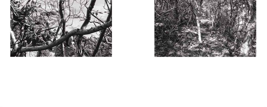
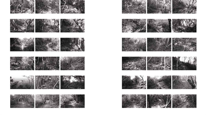
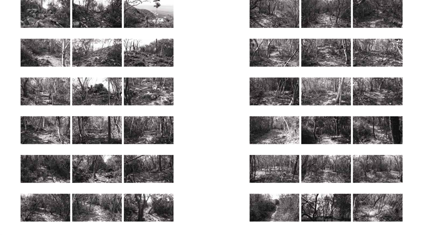
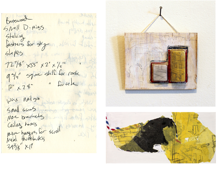
Christina Mesiti and Enrique Santos have contributed incredible artist projects. Mesiti coincides her daily “to do” lists with images of her multi media body of work. Santos submits a selection from his recent monograph, “The Mexican Suitcase.” This issue focuses on the series of beach photographs that mark the travelers steps as he goes.
Lastly, DC based artist Champneys Taylor writes a curatorial feature on the photojournalism of Thomas Michael Corcoran who currently lives and works in Seoul, Korea.
My great thanks to everyone involved in this issue. Next month delves into the exhibition series “City Limits.”
More to come,
Meaghan
8.17.2012 Interview with Jongil Ma by Lisa A. Banner

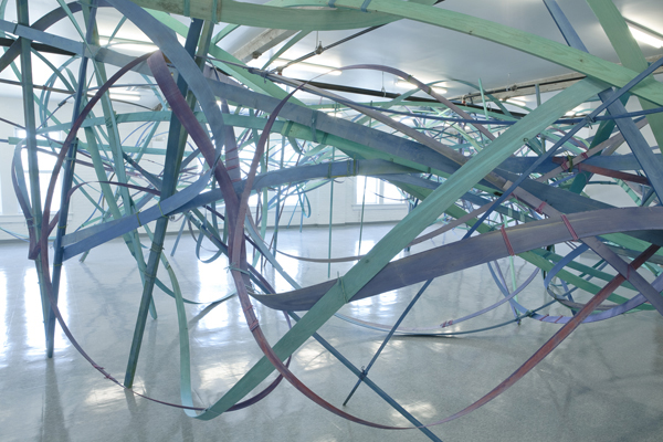
To You, Little Bigger Than A Sweet Summer Pink Peach, Socrates Sculpture Park, NY, 2008, wood, rope, paint, 30 x 150 x 30ft
Lisa A Banner: We are meeting at Grand Central Station for this interview on August 17, 2012, at 4:00 in the afternoon, with sculptor Jongil Ma, and his collaborator, painter Elizabeth Winton.
Jongil, tell us about how you came to work with wood, and what inspires you to create such large-scale works, especially those outside, in full view of everyone. Is there something in your personal background that informs the decision to be a sculptor on a grand scale? Your process intrigues me. When you first started working with wood, what prompted you to do that?
Jongil Ma: When I started in art school, it was late in my life, I was 35 when I started the first year in SVA. In my third year of art school, something hit me: that I would be finished in one more year, so I had to be realistic to survive as an artist. From that line of thinking, I was focused on what do I do better than anybody? Because NYC is full of highly skilled, professional people, you have to do something outstanding, whether you are a designer, or artist, or professional. The result of that consideration was to look at wood. I believed at that time that if I worked with wood, I could do anything I wanted, and do it better than anybody. Michelangelo was great with stone, and I felt that I could do something like that with wood. So I began to work with soft wood, and began to make some simple shapes in wood, and this impressed one of my professors, who hired me to make sculptures. After that I began to develop the skill with wood.
LAB: When did you come to the U.S. and was it for art school, or some other reason?
JM: When I came to the U.S. in 1996 it was for studying art. I had worked over 15 years since I graduated high school. I was looking for creative profession. I thought it was to become an artist. Since I was really young, I realized that I played with wood a lot. Since I was seven years old I was using hammers and chisels, and nailing things, like everyday toys, and those activities are in my body.
LAB: Like a muscle memory.
JM: Yes, it’s like when you want to be a good pianist, you have to grow up with those circumstances. A close family member plays music, or something like that, and it shapes your interests.
Tracing the Letter You Wrote, Saying ‘I Love You’, Bronx Museum, NY, 2011, wood, rope, paint, 30 x 50 x 16ft
LAB: When I first saw your work in a small shadow box, and in photographs of the monumental bent wood structures, you told me that you were creating bridges. Can you remark on that? JM: I was not literally creating bridges. I was trying to bring the feeling of these gigantic human made structures, with thousands of parts delicately balancing to hold the structure up. Those structures connect two different lands, or stand in the certain place. It is also a metaphor of human society connected through each individual to construct some group, then it becomes a physical community. I was projecting the similarity between the life and the monumental structures.
Those of bridges, in the wide-open land of the States, are not only meant of practicality but also symbolizing the human’s desire to control, or invading or challenging, struggling to the new place. It is my gesture to reproduce my own way of combining social consciousness while I am building abstraction of monuments.
LAB: Please tell us about your process, how is the wood prepared for your sculptures, what kind of wood do you use, and how is it bound together? Is the material that binds the wood important in creating the tension that seems to create balance and resistance in your work?
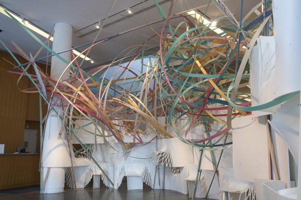
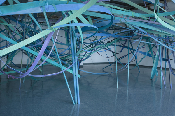
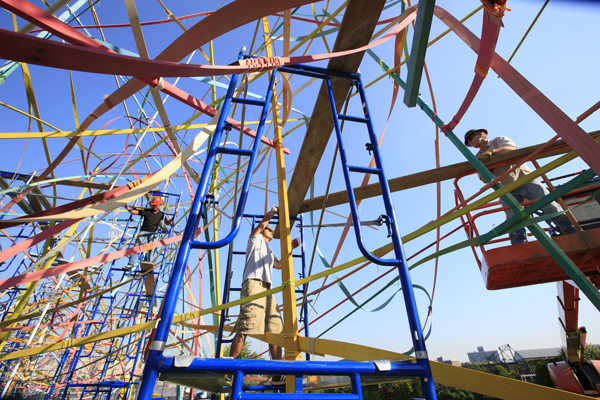
JM: For indoor works I use mostly fine wood, such as maple, oak. I use bamboo, poplar and pine for outdoor projects. I separate wood or bamboo for structural or detail use. Those of structural wood or bamboo will be mostly straight or slightly curved so usually thicker. I cut wood or split bamboo into various thin strips to use for details. The thickness will have different ranges; depends on the size of piece. For small scale indoor projects some strips can be from paper-thin to ½” thick or thicker. The right thickness will be showing the right amount of curve line with the right amount of tension. After I prepare all the different amounts of material I separate them into some groups for coloring along with some adequate amount of ropes too. When all the material is ready, of course I move it to the space. Usually I feel overwhelmed in the space.
Although I have some plan before starting, the large empty space is challenging to begin with. Dividing the space to have the right balance and filling the space with delicate tension are always the basis of the installation along with each physical structures’ own balance and tension. From the beginning, for every step I am aware that I am a performer in the open space stage. Each moment when I step forward I am using my whole life experience through the performance.
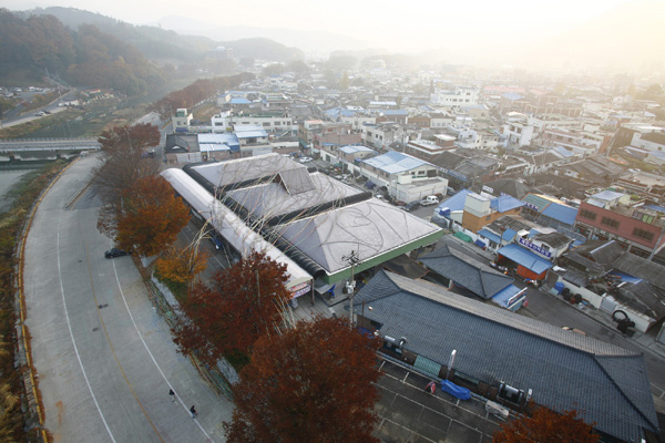
No One Could See Me, But I Could Hear Everything, Damyang, Korea, 2007, bamboo, rope, paint, 300 x 300 x 27ft
LAB: The first work I saw of yours, in person, was in a Korean art gallery in Queens. There was a giant tree installation that scraped the ceiling and the floor, but had no roots. The branches were cut, truncated, and the bark was painted in stripes of beautiful color, running vertically down the trunk.
JM: In many cases, I feel that we are living with artificial things around us in this time and this place. People are interacting with artificial things a lot. In making the sculpture, I was influenced by that thought, and it is a simple way of echoing this time in my life. Also, that particular gallery, and the culture of that place, offered a way to reach another level of meaning. I had already created a serious installation there, two years ago. This time, I thought the work should have some inner meaning, or a kind of attraction that would make people curious. In that neighborhood, the people are not really close to that culture. So I wanted to invest in the work an essential quality to make them attracted to the work. From that thought I put lots of colors and many different thicknesses to make people attracted to the work. In a simple way I can say, although it may not be appropriate to say, it was like bait for a fish, or like a flower attracting bees and butterflies. It is really difficult when I think about the audience. I feel connected to the audience’s response. I am a social being, and without somehow exchanging or communicating with people it feels meaningless.
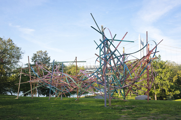
LAB: That’s quite profound, simply said, and very moving. What you imply is that there is a reaction that becomes part of the work, and that you as an artist are responding to something, anticipating something as you make that work to appeal to the viewer. Let’s talk about an outdoor installation that you made for the Socrates Sculpture Park. Some of the installation shots for the Socrates Sculpture Park were really amazing, would you talk about the outdoor installation there?
JM: That installation was influenced by modern monumental architectural projects, like bridges, airports, and sports complexes. These structures have all these instances of human relationship. The way they associate with humans is in the structure and the composition. There are big columns and sub-columns. It is about tension between the structures, which I have emotionally felt in situations in urban life. There is a lot of tension in this city life. And I observe that other people feel the same thing.
Borrowing the form of the architectural structure, mixed with my feelings and the experience that I have in this city, I created a sculpture installation that reflected all those components. My piece is composed of very thin lines, weaving in the air. It isn’t a really strong structure, it is just very fragile, but it doesn’t collapse easily. It is like our delicate feeling of human interaction. Specifically I focused on people here in New York City. People in different regions have different tensions, and different aspects to their social life. All the sculptures I’m doing are about contemporary people interacting. So I tried to grab that when I was building the piece in Socrates Sculpture Park, and infuse the piece with that feeling.
LAB: You’ve installed sculptures in several boroughs of NYC. Do you perceive differences in the tensions you describe in different areas of NYC?
JM: Yes, people in Brooklyn, Staten Island, Islip, all have a different quality of life. And of course I’m doing this work at different times. So I move around from different aspects, from previous traditions to a new situation. It really influenced my way of making the art piece.
Yes, Honey, You Can Bounce Back And Forth, And You Are A Bit Closer To It,
Governors Island, New York, 2010, wood, rope, paint, 45 x 45 x 12ft
LAB: So the work is interactive, reflective and responsive to the situation. At the core, it is human. JM: Yes. My work responds to the geography of the situation, and my psychology is responding to the time in which I’m making the work. Maybe everybody does, but an artist is looking for something and developing an idea, changing his or her mind, and responding to the environment. This is why, most artists toward the end of their life complete their work in a stable or more perfect way, processing their psychology with insight.
LAB: Is that true for everyone?
JM: Really. Every day I feel something different and change my perspective. Every day I am thinking and re-thinking, trying to find something different, to make progress, to find more perfection. I think it is true for every artist that I see, like Eli, or others. Essentially they try to find a new idea, a more perfect world. And to improve the quality of life for everyone.
LAB: Sculpture does improve our quality of life, because it invites both a visual exploration and an exploration of space in relation to ourselves. How does your work respond to that particular exploration?
JM: That is a good question. A collector I know, who is a big supporter of artists, wants to support only three-dimensional sculptors because sculpture has a lot more tangible qualities. It allows one to observe multiple points more than two-dimensional work and that’s why all these young kids love three-dimensional figures more than two-dimensional images. He believes eventually that three-dimensional art will be pervasive in every society. So to me, it is very interesting, because when I started drawing… in Korea they do a lot of practicing of drawing, like copying sculptures with a pencil drawing, so you have to see the three-dimensional aspect of the object to bring it into space. I was really bad at that. So the teacher told me that after I started making sculpture pieces, I started to be fascinated with three-dimensional sculpture pieces. Because basically what I am doing is dividing this three-dimensional space as I want it. And before I started to do that, the space is nothing. But for example, in the Socrates Sculpture Park, I made huge columns, and between them I put single lines flowing from one to the other. It made the space different. It is a stunning pleasure to do it. From there I started dividing it all different ways. Certain parts are dense and some are loose, tightness and looseness. That part is basically like painting or drawing in space. Which is a lot bigger action. A serious component of the space. People see the result, but I often think about the whole process in the space. The process is the form of the work. Cutting all the pieces and putting it together. Sometimes it is really dangerous, because I’m working 30 feet high, or using heavy materials, in a high space, so all this activity is part of the work, which makes me very excited. Excited to do it.
LAB: You received a Pollack/Krasner award, was that for a specific project, or did a specific project emerge from that?
JM: It was a general support award, so I will make something for an upcoming group show, and maintain my studio space, and buy tools to make the art pieces.
LAB: A work you did for the Bronx Museum has a beautiful and evocative title, as do all of your works, sort of tongue-in-cheek, and provocative. They bring up multiple associations. But can you say something about “Tracing the Letter You Wrote Saying, ‘I Love You.’”?
Yes, Honey, You Can Bounce Back And Forth, And You Are A Bit Closer To It,
Governors Island, New York, 2010, wood, rope, paint, 45 x 45 x 12ft
JM: I think you are right. It obviously has multiple associations. I am trying constantly to understand people’s behavior in this city. I get the information from all different resources, such as newspaper, Internet, friends, my own observation and so on. Then I process it my own way for the project. Of course I intend multiple perspectives. However the idea processed while I am planning a project will be the main theme. I choose colors, I design the form of installation with the theme. On the other hand, I personally have been very interested in certain lyrics appearing in rock and roll music. Some of the lyrics have incredible authenticity and reality about our individual life relationship. It is such beauty and I work with it. Finally the title contains a feeling of loss. It tries to retreat the feeling.
LAB: One installation you did in Korea intruded into the physical space of a building, and was formed of orange, red, yellow and green bent wood. Was that, “You Have To Run, Don’t Look Back.”? Could you comment on the title and its relation to the experience of creating that piece?
JM: The title was very much related with my own situation. I had been working for some artists and I had a serious issue with them. It was a moment whether I continue my type of installation or not. And also I made this title because it does connect to everybody’s life in general. Our life can be said to make a decisions. Many times you cannot proceed easily because of all the different types of obstacles. Especially in Korea now, with the extra amount of speed of development, people quickly lose their integrity. So, this title not only says what you are supposed to do but it is also being cynical.
LAB: A second installation in Korea, in 2007, was poignantly entitled: “No One Could See Me, But I Could Hear Everything.” Was this about an experience in Korea, or in New York, or did the concept evolve from another experience?
JM: This feeling was absolutely mixed both in Korea and New York. In general, people, including myself, constantly try to grab something they need. This is more likely associated with domination. Life before I started to create artworks and after, it is feeling about the individual, me and other.
LAB: On Governor’s Island you made an indoor installation that is poetically held within a room, and is composed of wood painted in a cooler palette, of blues, purples and greens. Was there a connection between the harmony of the colors you chose, and the type of expression you were after within the bent wood?
JM: The color was chosen by the water around the gallery location and the audience I was expecting during the particular season. This was a kind of public project although it was an indoor space. I also meant to emphasize the whole piece by using monotones. It was also some kind of mind road map.
LAB: I’m also interested in the project you did for the LAB Gallery in the 30s, here in NYC.
JM: This was the fourth indoor piece that I did, combining two-dimensional drawings and sculpture. So the installation itself was abstract, and I wanted to give it a more solid idea by combining that with drawings. The drawings I enlarged.. like an illustrated book, like wolves, one endless snowy field in Canada, or somewhere, full of snow. And they condemned one of the wolves in the pack. One got hurt, and died in the plain snowy land. The rest of the family, the pack of wolves, were sitting and watching in a circle around the one who died. You can see the footsteps connected to the victim. I blew up this one image, and made my own drawings. I blew them up to 10 feet by 37 with a green background, and I added green, with a circle of a target mark, near the victim’s area. So in this installation I tried to connect ideas of this image and the installation.
LAB: Where did you put the drawings?
JM: On the back wall of the exhibition, near the target mark, one wolf face stares at the viewer. It was the background for the entire installation.
LAB: Do you often use drawings in your work, or is that something unusual?
JM: This was the third case, and I will do a lot more in the future. The first time it was of a simple line drawing of an abandoned house drawing in Korea. A simple rainbow color striped drawing, connecting room to room and space to space.
Hello There, Walking Away From It Ain’t No Fun, Randall’s Island, NY, 2011,
wood, rope, paint, 30x 60 x 20ft
LAB: What do the rainbow colors signify?
JM: At that time I was thinking about the sense of essence of life, being. An empty abandoned house. I tried to recreate the space with a sense of life.
LAB: Reanimate?
JM: Yes. The people are obviously not there. It was like a housing project in the area. The government was waiting for the space. And obviously government was trying to help the poor people, but I wasn’t sure whether it was a good idea. So I was thinking about all this. Something pure, placing a likeness of the human life there. It was a public project. I couldn’t think about only the artist inside. I had to respond to the public project.
LAB: Describe some other projects that you’ve completed in the last two years.
JM: Bronx Museum, Randall’s Island, Islip, a project in Korea. I also did a collaboration with Elizabeth Winton. [He smiles and gestures to Eli, sitting with us.]
Elizabeth Winton: [She laughs] Originally it was his project and then we wanted to collaborate. We had to work off of Jong’s original proposal ideas. We were working in a way that was much less abstract for us both. Once we asked the gallery about my participation and they said yes, we dove in together. I think we had only about 10 days to work?
JM: It involved figurative sculpture pieces like beetles, and two-dimensional drawing.
LAB: Beetles?
EW: We were interested in a sort of storybook illustration quality with oversized beetles wandering down a path. We had had a conversation about a year before just walking down the street. He and I are always working. We were walking in the shade and passed this bar. He asked what was the word in English for shade and this conversation became this piece.
LAB: Where was this?
EW: The LAB Gallery. It was a storefront gallery in midtown. Kind of a fishbowl. You have to catch people’s eye quickly. So the first challenge was how to build the beetles. We bought all this crazy spandex and sequined fabric. We hired a Japanese clothing designer to sew the spandex to cover three of the beetles. Two of them I painted. They were loosely based on real beetles. I called up my cousin who is an entomologist to learn more about beetle behavior and biology. In our piece they were having a dinner party.
JM: It is a satire of city people.
EW: Yeah beetles can be beautiful, brilliant colors changing in the light. Functionally their shiny exoskeleton provides both armor and flexibility. Some are predators but then also are prey. Really the most direct and rewarding part was that little kids would climb out of their strollers to get a better view while their parents tried to hurry past not noticing our corner until after.
LAB: This was one of only 2 indoor installations so far?
To You, Little Bigger Than A Sweet Summer Pink Peach, Socrates Sculpture Park, NY, 2008,
wood, rope, paint, 30 x 150 x 30ft
JM: I have done many indoor installations, nearly as many as outdoor.
LAB: Do you prefer to be outside?
JM: Bronx Museum and Islip were both inside. It is important to me to do both.
LAB: What is the next project you imagine?
JM: My next project will likely be indoors. It will have a pictorial aspect rather than just linear abstractions. I’m moving toward more figurative work, and also trying to grab irony. Also in the past I looked at social or political relationships. But in the future I want to create what I can actually express. Social and political aspects of life.
LAB: To make figurative work seems like a radical departure from what you’ve been doing with bent and twisted wood structures under tension, tied together with small thin ribbons, ropes and twine.
JM: After doing these installations I realize that I have to be sharper than what I have been. It is a really difficult thing, but I want to grab a more efficient quality of the work, more like condensed contemporary ideas. It will be a long-time process, but I believe that this is what artists are supposed to do in any society… to respond with an expression about the social political circumstances. Engage more directly with it.
LAB: Your work seems fully realized, and fully engaged, and evolving in response to the circumstances. It is such a great pleasure to speak with you today. Thank you, Jongil and Eli.
Jongil Ma is a Korean artist who lives and works in Brooklyn, New York. He received his BFA from the School of Visual Arts in 2002. He has had solo and collaborative exhibitions at The Lab Gallery at the Roger Smith Hotel in Manhattan, “Jamaica Flux: Workspaces & Windows” at Jamaica Center For Arts & Learning in Queens, and the LMCC Governors Island Project in 2010. His work has been featured in international exhibitions including the 2009 International Incheon Women Artist’s Biennale in Korea and the Lodz Biennale in Poland in 2010. In 2011 he participated in the AIM Bienial Exhibition in the Bronx Museum, a Group Exhibition in the Islip Art Museum, and created a piece at the Randall’s Island Park in conjunction with “FLOW.11: Art and Music at Randall’s Island.” His awards include the INC Visual Arts Award from the AHL Foundation, a Fellowship from Socrates Sculpture Park and Award, and a grant from Pollock Krasner in 2012.
Elizabeth Winton is Brooklyn-based visual artist, working primarily with paint and mixed media on paper, wood, and canvas. She received a BA from Connecticut College. She has exhibited her work throughout the United States and Asia, including shows at the Lower East Side Printshop, New York; Metro Gallery, Gwanju, Korea; Kolok Gallery, North Adams, MA; Margaret Bodell Gallery, New York; and a solo show at Ruby Green Contemporary Art Center in Nashville, TN. Her most recent solo exhibition, curated by Douglas Dunn, was at CUE Art Foundation in New York in 2011, followed by a collaborative installation project at the LAB Gallery at the Roger Smith Hotel in Manhattan, and a group exhibition at Brooklyn Fire Proof in 2012.
Feature: Dark Clouds and Bright Futures: Current Climates in Australian Aboriginal Art
After a busy two months of exhibition openings, art fairs, national awards and international recognition, something this year was missing from the usually dynamic Aboriginal art circuit. Some have blamed the bureaucracy, some have blamed the institutions, some have blamed the slumping market, and some have blamed the curators without knowing all the facts. However, is there any benefit in blaming anyone? Artists are constantly surprising us, experimental and courageous, more innovative than ever, more vocal then ever, this should be a time of celebration.
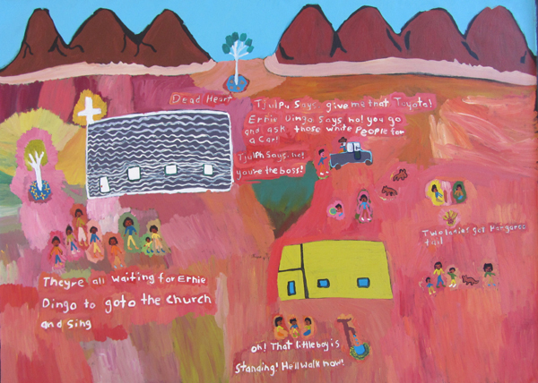
Margaret Boko, Dead Heart, 2012, courtesy of Tangentyere artists, copyright of the artist
The diversity of Aboriginal art across Australia can no longer be contained, there is no simple way to present or engage with Aboriginal exhibitions. Different multiplicities are operating across the vast and intricate expanse of Australia. There is more opportunity for collaboration and discussion. It is impossible to capture this diversity in one exhibition, in one retrospective, in one institution. The only way to talk about these pluralities is to create multiple structures that not only recognizes this plurality, “but provide a means through which plurality can be ordered, characterized and evaluated” and perhaps communicated in some meaningful way. (II) The future of Aboriginal art may be facilitating new ways of capturing plurality through the mobilization of fluid networks and information sharing. This will take a keen ear and an open mind, it has started happening all ready from those whom treat all artists as artists.
There is a degree of tension looming between those who are keen to write Aboriginal arts obituary and the artists themselves, whom are still creating, very much alive. The only thing that is becoming extinct is homogeneity, the view that all art looks and is about the same thing. Stories are now more personal, more individual, more contemporary and in some ways, more confronting. Exhibitions have previously come to celebrate the abstract mysteries of ‘other worlds,’ but where are these other worlds and who is in them? As Hetti Perkins remarks, are we doomed to continually rearrange the seats on a sinking Titanic? (XIII) For some people it is still unthinkable that Aboriginal art can be on the one hand traditional and on the other contemporary. (IV) However, as Rex Butler explains, Aboriginal art is the one thing in Australia that involves us as it is “truly alive, has wider implications, that tells us something about the times in which we live.” (V) Stephanie Radock, almost 10 years later is saying a similar thing, “Aboriginal history, Australian history, world history of great significance.” (XIV) Any deviations or attempts at shaking things up, cross cultural collaborations and solo careers are usually met with harsh criticism, seemingly like some people have missed the point. Ian McLean explains that modernity’s apocalyptic effects on all traditional societies are undeniable and that Aboriginal art in Australia is laying bare these effects for collaborative interaction, so why aren’t we interacting? (XI) The silence surrounding colonialism and aboriginal experiences of it continues to silence voices in Aboriginal art. (IX) As Tim Acker explains, “The market’s focus on the consumption of art and the profitability of its players has smothered serious and confronting issues of artist and community livelihoods.” (I) Some of the best contemporary art has been created from issues of displacement, migration, marginalization; “great art happens in spite of its circumstances, rather than because of them.” (VIII) It seems that Aboriginal art is often theorised from the point of view that it is all ready ‘dead,’ that is has remained unchanged for thousands of years, that this complex culture has not had to constantly reinvent itself to remain in tact in some way. An important part of this reinvention and rejuvenation has come from the making of art, an art making that is “process oriented and not outcome oriented,” (IV) so why is everybody so obsessed with the outcome?
I believe there is reason to believe that artists want things to be done differently, that stories need to be shared so that they can be acknowledged. As Djon Mundine states, it is not about forgiveness, it’s about recognition and remembering. (XII) When looking at a selection of different artists across Australia, with a list that is constantly expanding, it becomes clear that the work itself demands something else, at the very least, a willingness to listen. Sally Mulda, Margaret Boko and Dulcie Sharpe all work in Alice Springs under the banner of Tangentyere Artists and Yarrenyty-Arltere. Their work talks of intervention, reinvention and collisions, experimental art works that are innovative microcosms of the world they live in. Lance Chad and Billy Kenda paint at the human rights organization, Bindi Inc., also in Alice Springs. Lance’s paintings of cowboys have a haunting, surrealist quality where Billy’s bold and vibrant tourist scenes come from deeply personal observations.
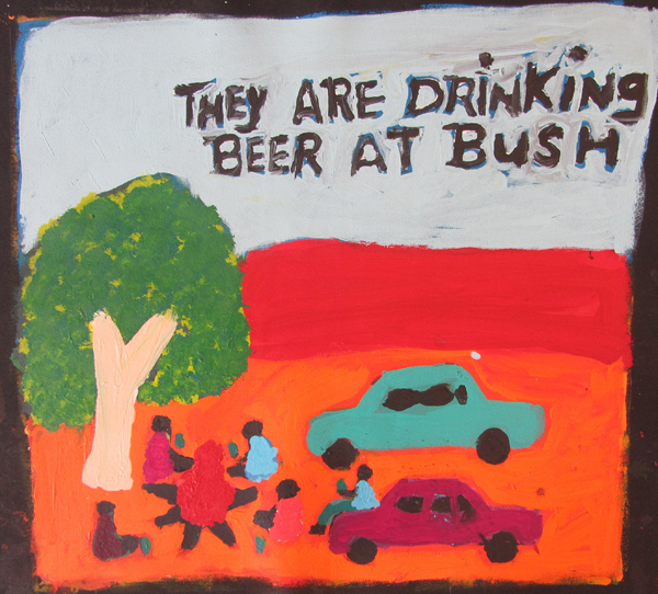
Sally M. Mulda, They are drinking beer at bush, 2012, courtesy of Tangentyere artists, copyright of the artist
I believe there is reason to believe that artists want things to be done differently, that stories need to be shared so that they can be acknowledged. As Djon Mundine states, it is not about forgiveness, it’s about recognition and remembering. (XII) When looking at a selection of different artists across Australia, with a list that is constantly expanding, it becomes clear that the work itself demands something else, at the very least, a willingness to listen. Sally Mulda, Margaret Boko and Dulcie Sharpe all work in Alice Springs under the banner of Tangentyere Artists and Yarrenyty-Arltere. Their work talks of intervention, reinvention and collisions, experimental art works that are innovative microcosms of the world they live in. Lance Chad and Billy Kenda paint at the human rights organization, Bindi Inc., also in Alice Springs. Lance’s paintings of cowboys have a haunting, surrealist quality where Billy’s bold and vibrant tourist scenes come from deeply personal observations.
Sophie Wallace, Art Centre manager at Yarrenyty Arltere explains that the degree to which people are often marginalized in Alice Springs cannot be overstated. The art produced comes directly from the heart, turning personal reflections political and social narratives. Often being written off as naive or worse, untraditional, there is always a persistence to categorize Aboriginal art, to name it one thing or another. Jorgensen explains that Aboriginal artists have always wanted to translate their paintings to a white audience so that we can understand the artist’s spiritual links to country. (IX) The spiritual power of country is still present in the grandiose of Margaret and Sally’s landscapes, but country has become more personal, a meditation on life in the town camps.
Dulcie Sharpe from Yarrenyty-Arltere is most recognized for making utterly unique soft sculpture from recycled woolen blankets. The fabric is dyed with local plants, tea and rusty bits of metal, creating rare organic patterns. Art Centre manager Sophie Wallace says the artists create work that is “humorous and beautiful, rough and sculptural, ridiculous, dramatic and inspiring… people find a voice that tells the wider community that they are worth listening to, that they are important, that they are healing themselves and their families.” (XVI)
Moving across to the Pilbara reside two sisters with a passion for innovation. Lily Long and Amy French are two Warnmun women whom paint at Martumili artists. A dynamic duo, these two began painting with the intention of modernizing their culture, sharing their ideas on canvas by always negotiating what should be included and what shouldn’t. Lily and Amy are strategists, intellectually deciphering their problems with what way best to paint. Their paintings are never one-dimensional, one thing is never one thing, having a collaborative approach and sharing the burden of the past by re-envisioning/ re-invigorating place.
Daniel Beeron and Leonard Andy from Girringun Arts in Far North Queensland universalize their personal stories. Creating small projects with big ideas, these two artists are challenging the way rainforest people have been visualized in the psyche of Aboriginal Australia and their own struggle for a unique identity. The artists only started working in 2009 and decided that the best way to create was to be radically different. Passionate and inventive, these two men from different areas are both initiating their own projects to educate both Aboriginal and non- Aboriginal audiences.
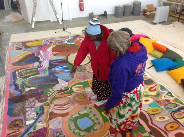
Amy French and Lily Long explaining the imagery and singing in their 5 x 3m canvas that will be featured in “We Don’t
Need a Map,”an exhibition in November, photo credit: Gabrielle Sullivan, courtesy of Martumili Artists.
Daniel Beeron has just completed the first phase of a research and visual art project about communication and connection. (VI) Daniel started with archival anthropological historical information about muwaga (message sticks) and mindil (woven) baskets from the region of tropical north Queensland. Written in early contact time, the historical information explains that without a written language, groups in that area of Australia use to communicate with message sticks. Some were carved or ornamented and were interpreted differently depending on spiritual knowledge and could also be used as a passport. Daniel explains that this project is revitalizing culture, reengaging with the past to re-articulate the future, reconnecting groups across the region and teaching younger generations. Each artist that participates creates two message sticks and two baskets, one for themselves and one for exhibition. Each is a very personal manifestation of the historical information and their own experiences. But grouped together, Daniel’s project speaks of universal truths, what can we learn from lost histories, about reconnection, about innovation and the power of personal stories in painting a much grander picture.
Leonard Andy is from Mission Beach and is one of the only few traditional elders of the land in that area. In the corner of the Cairns Regional Gallery last year, in an exhibition curated by Avril Quail, was a set of five eloquently executed and meticulously painted boomerangs. A dog with dollar signs painted on his body caught my attention, and as you delve deeper into the seemingly small, humble objects, a big story appears. Leonard explains that the story painted on the boomerangs is about cyclone money and the impact its had on the social structure of Mission Beach after the devastating cyclone Yasi tore through the region in 2010. Leonard also says that as a far north Queenslander, he is the minority of the minority, in a constant battle for a separate identity to desert Aboriginal art and culture. These artists are just at the beginning of their journey; their projects can only grow as people become more aware of the different contemporaneity’s within Australia.
Stan Brumby from Halls Creek Art Centre, Yarliyil and Mervyn Street from Mangkaja artists, Fitzroy Crossing paint about the pastoral industry and the seamless transitions made by many Aboriginal men from nomadic life to horsebacks and mustering. Described as Aboriginal cosmopolitans, young men became proficient cowboys, “fearless, full of initiative and very quick to adapt.” (X) These two artists combined a life of hard work, maintaining traditional ties and now, articulating their life on canvas in vibrant collisions. Elements of Catholicism haunt Stan’s work, his intricately executed “Noah’s Arc, 2011” is the perfect example of this consolidation. How elements of the colonizers culture was integrated, incorporated into the complex systems of Aboriginal spirituality.
Loreen Samson from Roebourne and Charmaine Green from Yamitji both are visually reacting to the reality of mining, the destruction it creates and working through their own grievances. Loreen’s figurative works envisage parts of Australia that are unseen in the cities, the industrial machinery that haunts the once pristine landscape. Charmaine’s work is full of emotion, as a way to experience the pain and facilitate a new form of activism.
After nearly 40 years the Aboriginal art movement continues to grow, artists are more committed and the art keeps evolving in unexpected ways. (X) The unreality of the ‘Australia’ presented through movies and documentaries on colonial times is very different to the Indigenous experience of Australia. If we are to be taken as seriously addressing the problems of the Aboriginal Australia divide, then we need to curate exhibitions that address this, and start a dialogue, not end one.
Aboriginal art continuously involves us because it is the site of unprecedented “cultural conflict and exchange.” (V) In the following years, it will be interesting to see how these artists develop, how disparate parts of Australia can be reconciled. This is not a uniquely Australian thing, Indigenous populations internationally are attempting to rewrite their own histories and receive acknowledgement. (XV) To use Djon Mundine’s words again, “in Aboriginal society all art is a social act,” you cannot remain neutral in the presence of these artists work. There are many artists whom are developing new ways of creating; this movement will continue to grow. This is just the beginning of the conversation that the artist’s have started, its time we all got involved.
I Acker, Tim, “Aboriginal art is a complicated thing’, Artlink 2:3, 2008, p. 64-69.
II Smith, Terry, “What is Contemporary art?” University Of Chicago Press, 2009.
III Biddle, Jennifer, “Art Under Intervention: The Radical Ordinary of June Walkutjukurr Richards,” Art Monthly, June 2010.
IV Biddle, Jennifer, via email correspondence, 2012.
V Butler, Rex, “An End of ‘Aboriginal’ art and the shock of the new” (2003) in How Aboriginies created the idea of contemporary art, ed. McLean, I., IMA Press: Australia, 2012.
VI Girrungen Arts Statement, 2012.
VII Jorgensen, Darren, “Aboriginality, hyper-visibility and wobbliness in paintings from Australia’s Western Desert,” World Art 1:2, 2011, p. 259-272.
VIII Jorgensen, Darren, “Bagging Aboriginal Art,” Arena 111, March-April, 2011, p. 38-42.
IX Jorgensen, Darren, “On Cross- Cultural Interpretations of Aboriginal Art’, Journal of Intercultural Studies 29:4, 2008, p. 413-426.
X McLean, Ian, “Aboriginal Cosmopolitans: A Prehistory of Western Desert Painting,” Globalization and Contemporary Art, ed. Harris, J. Wiley- Blackwell: UK, 2011.
XI McLean, Ian, “Aboriginal Modernisms in Central Australia,” Exiles, Diasporas and Strangers, ed. Mercer, K. MIT Press: USA, 2008.
XII Mundine, Djon, “The Ballard of Jimmy Governor,” Artlink 32:2, 2012.
XIII Perkins, Hetti, “A Place of our own: conversation with Daniel Browning,” Artlink 32:2, 2012.
XIV Radock, Stephanie, “Making Histories,” Artlink 32:2, 2012.
XV Thompsen, Christian, 2012.
XVI Wallace, Sophie, “Same But Different Speech,” unpublished manuscript, 2012.
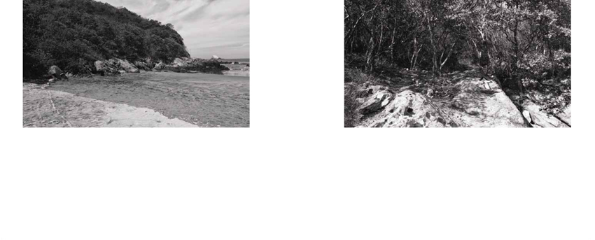
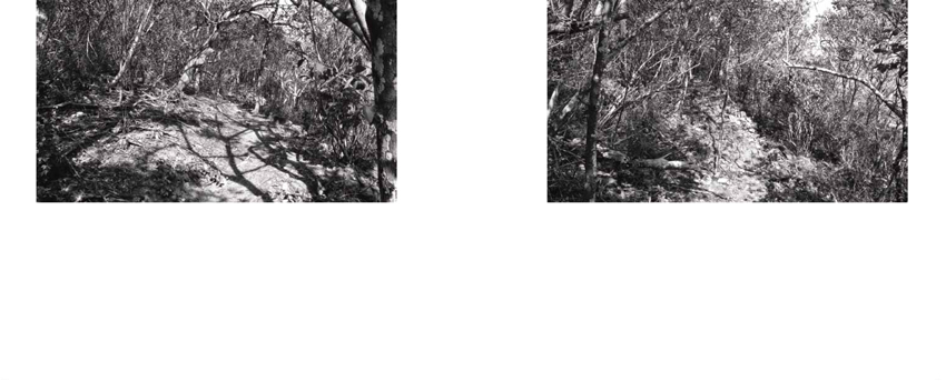
Artist Project: The Mexican Suitcase, Enrique Santos
To Catch a Thief / Para Atrapar a un Ladrón
The Mexican Suitcase is the result of more than three years of work by the Mexican-based Argentinian artist, Enrique Santos. This artist book could be, amongst other things, a ‘catalogue’ of an apocryphal exhibition that is not meant to be, one that from its very beginning proposes a reverse path to that already established —first the book, and then? Ever since this basic wink (not to mention that the title itself is an appropriation) Enrique Santos’ work addresses the idea of “robbery.” Using diverse languages and tools (photography, collage, video, sculpture, film, installations) the artist reflects upon the contemporary artistic works in a sociocultural and political environment of violence in which we find ourselves immersed. Robbery as a metaphor of appropriation and “postproduction”—in Bourriaud’s definition of the word—as an element specific of an artistic way of producing, that is loaded with intertextuality, reference, discourse and images that roam our daily lives.

Currently, we find ourselves going through a historical moment, defined by the larger number of cultural alternatives and proliferation of cultural objects: “trapped inside a chaotic mass of objects, the creator recycles, transforms, and takes hold of the signs that surround him,” says Bourriaud in an interview with Humberto Beck. In this regard, the idea of postproduction indicates a reference to a tendency by a large number of artists to interpret, reproduce, re-expose and use works made by others, or cultural products readily available within our environment. It’s not about quoting, referencing or paying tribute, but rather reusing in a new way that proposes an active and creative relation with the existent. It’s the artist’s idea of “appropriationism,” that makes use of the codes of culture, of the day-to-day formalizations, of the entire world’s heritage, and redesigns them and makes them work in a more specific way, according to specific senses.
Thus, Santos’ work turns towards culture, cinema, advertising, journalism, art, and everything around us, as a toolbox with which to “use” the world and create complex meanings. At the same time, appropriations are translated by Santos through a mixing of tools, genres and artistic disciplines that, through this transition, gain a new meaning: a film scene becomes a sculpture, a still image or a text; a picture becomes a painting; fixed images become a film; court records become works of art, and even the artist himself becomes a thief. This selection of cultural objects and their insertion into specific contexts is essential to the reading and interpretation of Enrique Santos’ work.
Santos’ work is a way of thinking about how contemporary art is produced, and at the same time it talks about the gaze, the interpretation of he/she who observes, the understanding and production that comes with every look. It reflects upon a single active spectator, who builds a discourse, appropriates all meanings and elaborates on them according to his life story, and his social, cultural and emotional capital. That gaze has a filter through which history is interpreted. It talks about and with the viewer without underestimating his capacity for understanding. From the very beginning, the book presents a relationship of shared complicity, discourse, codes and understandings, but demands a lucid and imaginative perspective.
Retaking film, journalistic, documentary and advertising language, Santos quotes and reinterprets the great thieves of the screen and some real criminals, in order to talk about lies, confusions, myths and misunderstandings, as well as an ever more violent and heartbreaking reality that crawls into our lives through trivialized and shallow images.
Florencia Magaril Alterman, 2012.
Florencia Magaril Alterman is an educational curator and cultural journalist who specializes in Communications and Cultural Management at the National University of Cordoba, Argentina. Magaril Alterman coordinated the educational project “Opened Study of the Art Museum Carrillo Gil,” México City (2010-2011). Since 2007 she has been an editor for Dictionary: Magazine of letters, an independent art and culture publication based in Argentina. She worked as a co-director for the annual “Third and Fourth Edition: Contemporary Editions Forum” at the Art Museum Carrillo Gil in México City. In 2010 and 2011 Magaril Alterman curated the MX Editions stand at the New York Art Books Fair, MoMA PS1. She was the chief editor of the publication Mental Movies México (2011) a multidisciplinary project that assembles cinema, art and music. Magaril Alterman directed workshops on art and education, edition and curatorships in Mexico (Gymnasium of Art and Culture) and Argentina (Spain Cultural Center in Cordoba, Muta, Multidisciplinary Space). Magaril Alterman’s current project is “Formative experiences in contemporary art museums” while she is completing her master’s thesis in Communication and Culture. She also writes for he Fanzine, City X, Deodoro, amongst other independent magazines.
Artist Project: Christina Mesiti
Let’s Walk Without Searching: Maps, Souvenirs, and All the Words in my Sketchbook, June 3 – July 16, 2012
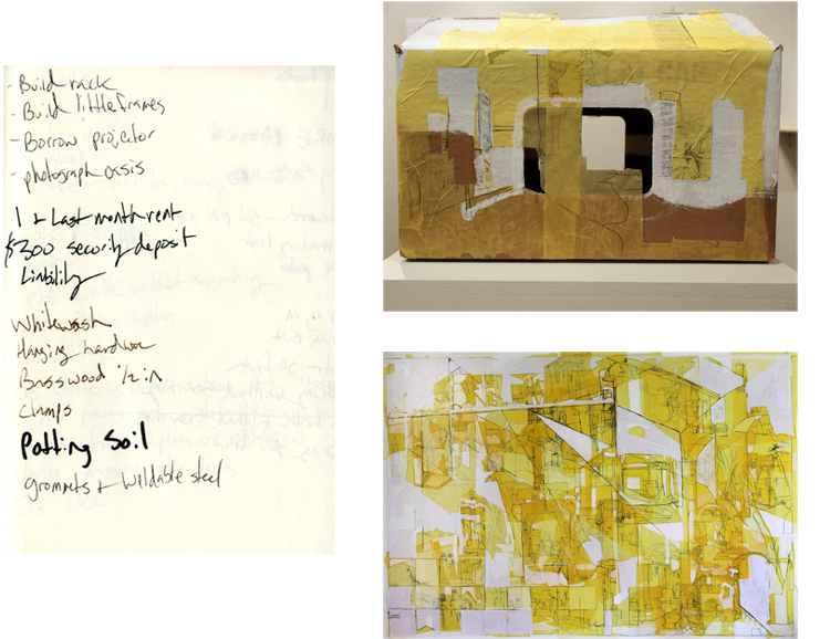
Top: Package, 2012, mixed media, dimensions variable
Bottom: Map Drawing 11, 2011, paper on canvas, 42 x 62in
Top: Reliquary (Street), 2012, 135 drawings, wood, plastic, 5.5 x 7in
Bottom: Wall (Hidalgo), 2012, Collage on panel, 5 x 8in
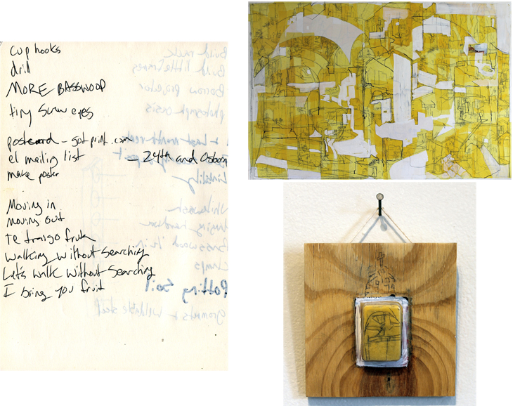
Top: Map Drawing 10, collage on canvas, 43 x 63in
Bottom: Reliquary (Church), 2012, 135 drawings, wood, plastic, 5 x 5in
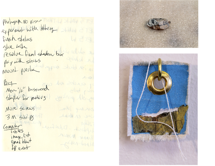
Top: Souvenir, 2012
Bottom: Souvenir (tag), 2012, mixed media, 2.5 x 2in
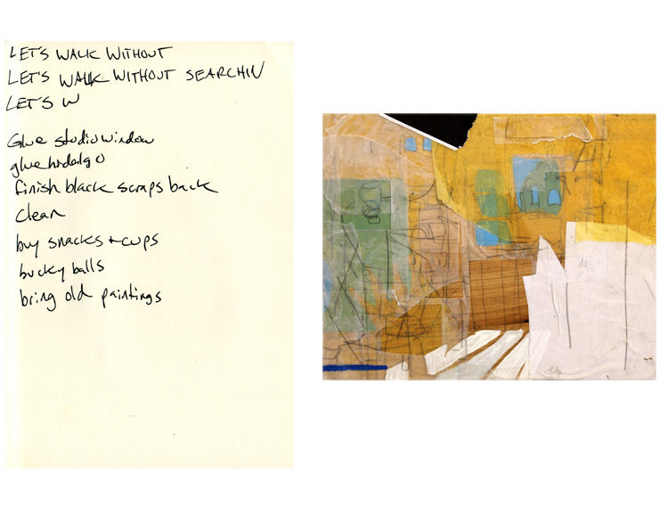
Kitchen Painting, 2012, collage on wood, 6.5 x 9in
8.27.12 Featured Artist: Leon Reid IV
Leon Reid IV, Verbs Street Oh Yes I Did!, 2000, New York, NY, photo credit: Brad Downey
My work is made for the public. I’ve committed more than half of my life to creating art tailored for mass enjoyment in cities such as New York and London, and in nations as far reaching as Norway and Brazil. My work employs urban infrastructure that is often taken for granted; street poles, street signs – even existing architecture as a basis to create sculptures that the every-day pedestrian can appreciate. Through my work, I endeavor to make the ordinary extraordinary.
Listed as one of the “60 Innovators Shaping Our Creative Future” by Thames & Hudson, Leon Reid IV has been on the edge of public art for over 17 years. He grew up as a traditional graffiti writer (a.k.a VERBS) and quickly developed a knack for unconventional practices such as painting street signs and installing them during daylight disguised as a construction worker. His experiments in graffiti lead him to move beyond the genre and pursue site-specific installations under the pen-name Darius Jones. Reid is one of the few artists responsible for introducing sculpture into the language of street-art, his techniques of installation combined with his humorous and romantic themes have made a sizable impact on urban artists of his generation.
Born in 1979, Reid finished his BFA at Pratt Institute in 2002 and MA at Central St Martin’s in 2004. The artist lives and works in Brooklyn, NY.
Reid’s latest project, “A Spider Lurks In Brooklyn” artspire.org/DirectoryDetail/tabid/95/id/1075/Default.aspx
Artist website: leonthe4th.com
8.20.12 Featured Artist: Allison Wade
Allison Wade, When I woke up it was Thursday (installation view, MFA Thesis Show, Sullivan Galleries, School of the Art Institute
of Chicago), 2012, Wood, ceramic, steel, screenprinted fabric, paint, handwoven cloth, dimensions variable
My work relies heavily on balance and tension. I focus on the moments where materials meet. I piece together objects that look as if they might fall apart, but instead remain intact. The ability of certain sculptures to resist gravity speaks to hope as well as physics.
I install these works in conversation with each other, positioning them so that visual and physical connections punctuate one’s navigation of space. The compositions depend on a calibrated balance of materials and formal elements within each work and between neighboring sculptures. Margins of negative space and points of connection, both actual and implied, become as important as the more materially substantial elements. Simultaneously aware of the specific relationships of the parts and the coherence of the whole, the viewer senses a new logic, one that invites investigation and interpretation.
My process is cyclical: I collect materials and construct components, gather these in my studio, move everything around, and continue editing until I arrive at satisfying arrangements. Even though the final pieces may seem simple, they are often the result of months of tinkering and refining.
Clay has become an integral medium in my work over the past year. I had been looking for a way to express time in my sculpture, and ceramics provided this additional dimension, slowing down both my process and the interpretation of the work. Also, since my practice is so much about balance and tension, the ceramics add a different type of tension—if the piece falls, it will break.
While making, I am thinking primarily about material properties and formal decisions. In order to achieve balance, I must be physically and mentally attentive to multiple parts at the same time. The sculptures become metaphors for the contingent nature of relationships, whether human or syntactical.
Language structures play an important role in my process. I arrange objects grammatically, manipulating materials into highly edited sentences or paragraphs. Each element contributes to the overall syntax, and interpretation often hinges on a seemingly insignificant conjunction.
Allison Wade is a Chicago-based artist. She received an MFA from the Fiber and Material Studies department at the School of the Art Institute of Chicago this May, earned a BA in English literature from Stanford University, and completed the post-baccalaureate program at Maryland Institute College of Art. Wade has been awarded residencies at Mustarinda (Finland), ACRE, and the Vermont Studio Center, for which she received a Joan Mitchell Foundation Fellowship. Upcoming group shows include “Wobbly Misconduct” at LVL3 Gallery (Chicago) in August, “All Good Things Become Wild and Free” at Carthage College (Kenosha, WI) in September, and a solo exhibition at evening projects + editions (Chicago) in December. Wade was born in Dallas, Texas.
Artist website: allisonwade.com
8.13.12 Featured Artist: Susan Homer
Susan Homer, An Interruption, 2012, Oil on canvas, 14 x 11 in
In my studio, I give voice to what I cannot explain in words. I indulge my love of pattern and material, I create new stories based on old ones, and I imagine what I cannot know: How would it be to experience one’s house or garden when nobody is in it? How would it feel to be a robin perched on a teacup or on the branch of a flowering tree? I spin elements of the world around me and within me into artistic form.
My larger paintings evolve over months and, along the way, seem to de- velop minds of their own. I compose the elements initially, but at a cer- tain point in our conversation, the process becomes more democratic and these same elements command an organization more naturally suit- ed to them. By contrast, my small still lifes are more deliberate. I establish the composition at the outset and it rarely veers. Like fugitive guests, the birds are unplanned. They enter later and perch where there’s room. My drawings are somewhere in between.
I see my work as a threshold between the past and the present. At one level, as I finish a piece, it literally becomes a record of my past action. On another, the subjects I have long chosen to depict—birds, flowers, and patterns—are of personal and emotional significance, or records of a different sort. The dishes and linens were my grandmother’s; the flowers are often from my Brooklyn garden; and the patterned scrims recall the wallpapers and fabrics that have surrounded me. My work, like an old house, contains many levels of memories.
My love of what I paint and draw and my reasons for painting or drawing it are personal. They come from the depths of my experience and under- lie everything I make. Within the patterns of daily life and the process of making art, I find constancy. Yet, it is the gentle upheavals in both that are at the heart of my work
Susan Homer lives and works in Brooklyn, NY. She received a BFA in Printmaking from the Rhode Island School of Design and an MFA in Painting and Drawing from the School of the Art Institute of Chicago. She attended Skowhegan School of Painting and Drawing and, in 2011, received a Marie Walsh Sharpe Art Foundation Space Grant. In 2013 her work will be included in a show entitled “Fiction, Non-Fiction” at Store- front Bushwick.
Artist website: susanhomer.com
8.6.12 Featured Artist: Justin H. Long
7.30.12 Featured Artist: Ryan Peter Miller
Ryan Peter Miller, Pebeo Studio Acrylics: Primary Cyan, 2012, Acrylic on Arches 140lb WC Paper, 30 x 22.5in
Masquerading as tubes of cyan paint, my latest series of paintings depict portraits of pigments, wearing their commercial costumes. “Types-o-cyan” considers the way color evades objective definition, creating a basic problem for the painting medium. These paintings continue my artistic dissection of paint, as a contemporary cultural artifact.
For those committed to visual culture, cyan is a moniker that evokes an explicit set of color properties. Its proliferous use in subtractive printing processes and electronic display devices has cemented a color profile in our collective consciousness. Cyan arrives weekly on the cover of our favorite guilty pleasure magazines, and from its ubiquitous use in print materials, it has trickled down into a myriad of contemporary consumer products. Perhaps as a result of its pervasive presence, cyan has recently emerged as a popular hue in the catalog of many paint manufactures.
While its commercial home has provided cyan a persistent phenotype, as a Fine Art product, cyan paint lacks the color consistency found in its Design trade sister. In “Types-o-cyan,” tubes of cyan paint are hand rendered on paper, emulating the halftone print process. Each image is painted using the paint contained within the depicted tube. The variance of the proprietary pigments is elevated from product affectation to conceptual content. By articulating the subtle differences within a single color, I am gently tugging at the frayed edges of contemporary painting. This point is hopefully made more poignant as these colors are being viewed through the cyan of your electronic display device.
Ryan Peter Miller is the name for a human artist currently living in Chicago, IL. In 2008 he received notice of his status as a Master of Fine Arts upon graduation from Arizona State University. His work has been featured in New American Paintings, and he exhibits nationally and internationally, and if you follow string theory, interdimensionally. His upcoming exhibit, “Painthings,” opens at Purdue University, October 15, 2012. He currently teaches Drawing and Painting at Carthage College, in Kenosha, WI.
Artist website: ryanpetermiller.com